FINAL POSTER.

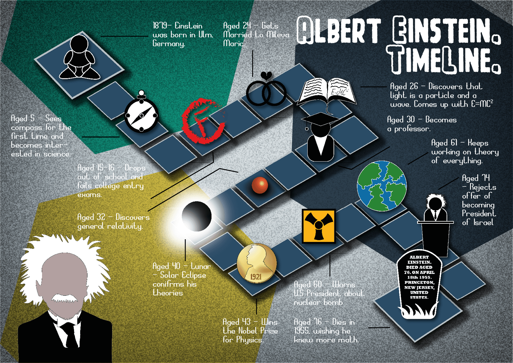
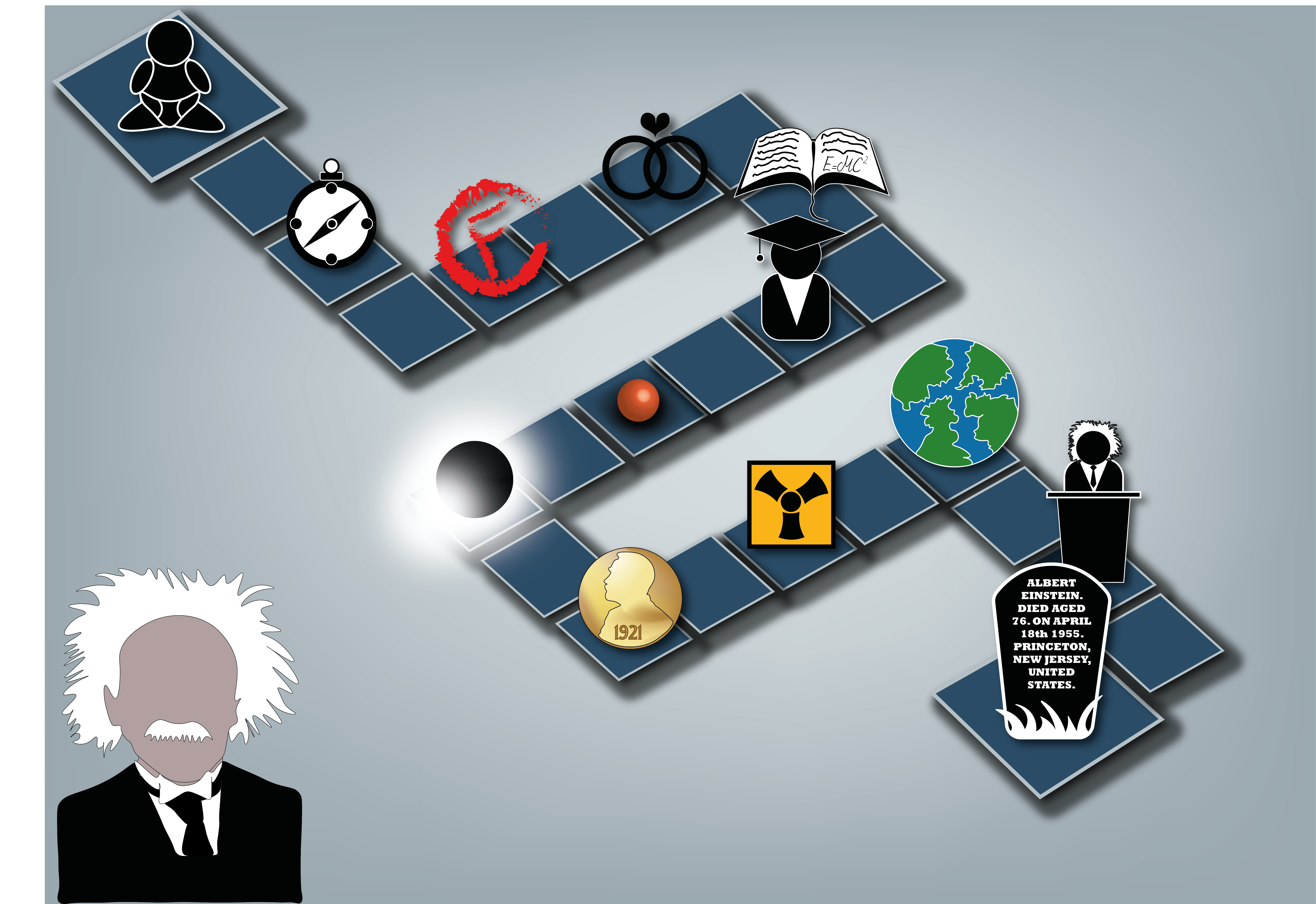
After some feedback from Chris in the workshop, I decided to add the colour scheme and the ‘noise’ style from my web design to make sure each design relates to each other. I also changed the annotation lines to make them darker and more symmetrical. I am very happy with my end result, I feel its simple yet very aesthetically pleasing. From a 14 years old opinion I think it doesn’t go into too much detail and it’s not over complicated. I tried to design it so it could go in a physics text book, or equally in a text book on Einstein as well as being related to my ‘website’. I also made it to be more of a ‘fun fact’ about Einstein, but also keeping it educational. I created all the icons and the timeline in Illustrator. I then added the text through InDesign, using the SpaceCard and Space of Time font that I downloaded from dafont.com. I then had to place the text back into Illustrator to create the background and colour scheme.

A higher quality pdf can be found using this link: FINAL A2 POSTER

FINAL A2 POSTER BLOG

A2 POSTER INFOGRAPHIC DEVELOPMENT.

I have finally finished my first initial design for my A2 poster and info graphic, inspired by Rae Hoffman. Whilst doing this design I decided to not use placeholder text and write my own facts about Einsteins theories and his life on the timeline so the icons make a little bit more sense. However when typing out the text in my poster, I noticed that the font I was using in my website design had a lot of glitches in it, which caused the font to look very messy and odd.

Screen Shot 2015-11-24 at 20.23.05


So I went into Da Font and I chose another typeface that I thought would like nicer and neater. This is my design for the A2 poster:

Infographic poster

I really am pleased with what I have so far as a design. Im going to ask for feedback from fellow peers and see if they would want to change any of it, and I also may add some shapes and ‘noise’ similar to the website and mobile design.


INFOGRAPHIC POSTER DEVELOPMENT

I have finished my design layout for my poster, keeping it being influenced by Rae Hoffmans design  on ‘How Affiliate Marketing Works’. I really like this poster and I feel like it works really well with my idea overall. I haven’t added the text to it yet however I added all the graphics and icons, keeping them a similar style to the icons and graphics in my Website and Mobile Device graphic. This is my final design.

Inofgraphic Poster


I’m going to put this into indesign and create the text and where the text will be placed. I may also change the design slightly to make it more central.

TRANSFERRING MY WEB DESIGN TO MOBILE DEVICE.

I have finalised both my website prototype and mobile device prototype. I didn’t want to have any difference so I simply moved over the files and matched the mobile design to my website. It was quite difficult to get an exact match, as the layouts are very different and the background couldn’t match exactly and look tidy. However I am happy with the outcome of this design. With my design it is also important to remember that page 1 and 2 of my design would be on the exact same page if it was website. To look at the image as a pdf click on the link below:

Phone Device


MORE WEB DEVELOPMENT.

After a bit of more research into ‘good web layout’ I found some inspiration on Pinterest. 4b35ff2fe6f209471e412f21cef2bf29

I really like this example, it is very visually pleasing and it uses a very simple layout and colour scheme. I decided to change my layout and style, inspired by this piece. I decided to scrap the idea of a one page website and decided to go for separate pages, I kept all my graphics, icons and infographics. I also decided to keep my fonts that I chose. This was my result:

Design idea 32

I really like the outcome of this design, I also feel it relates well to my A2 poster. I also decided to add hexagons in the background to give the design a bit of colour into it, which works really well.