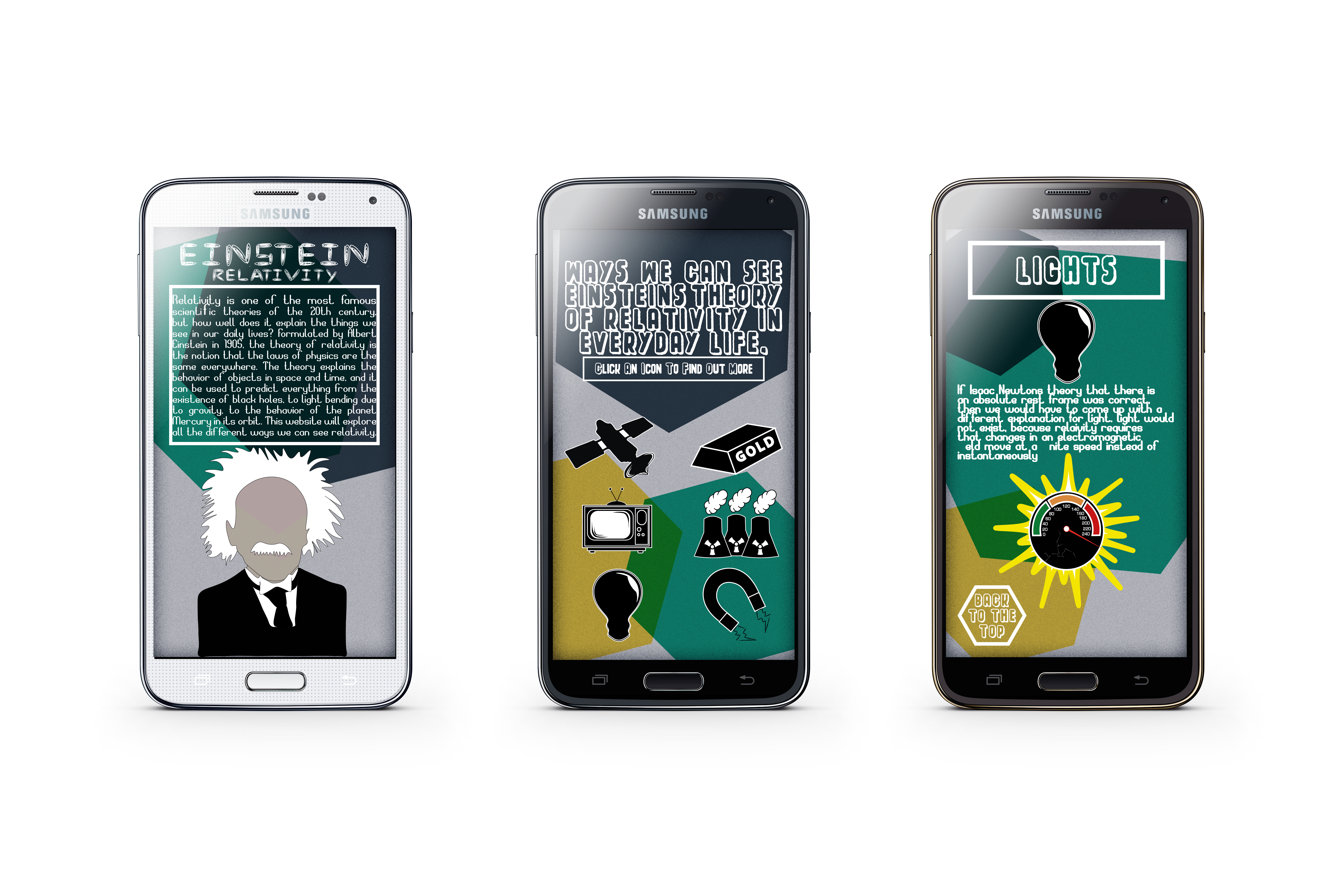
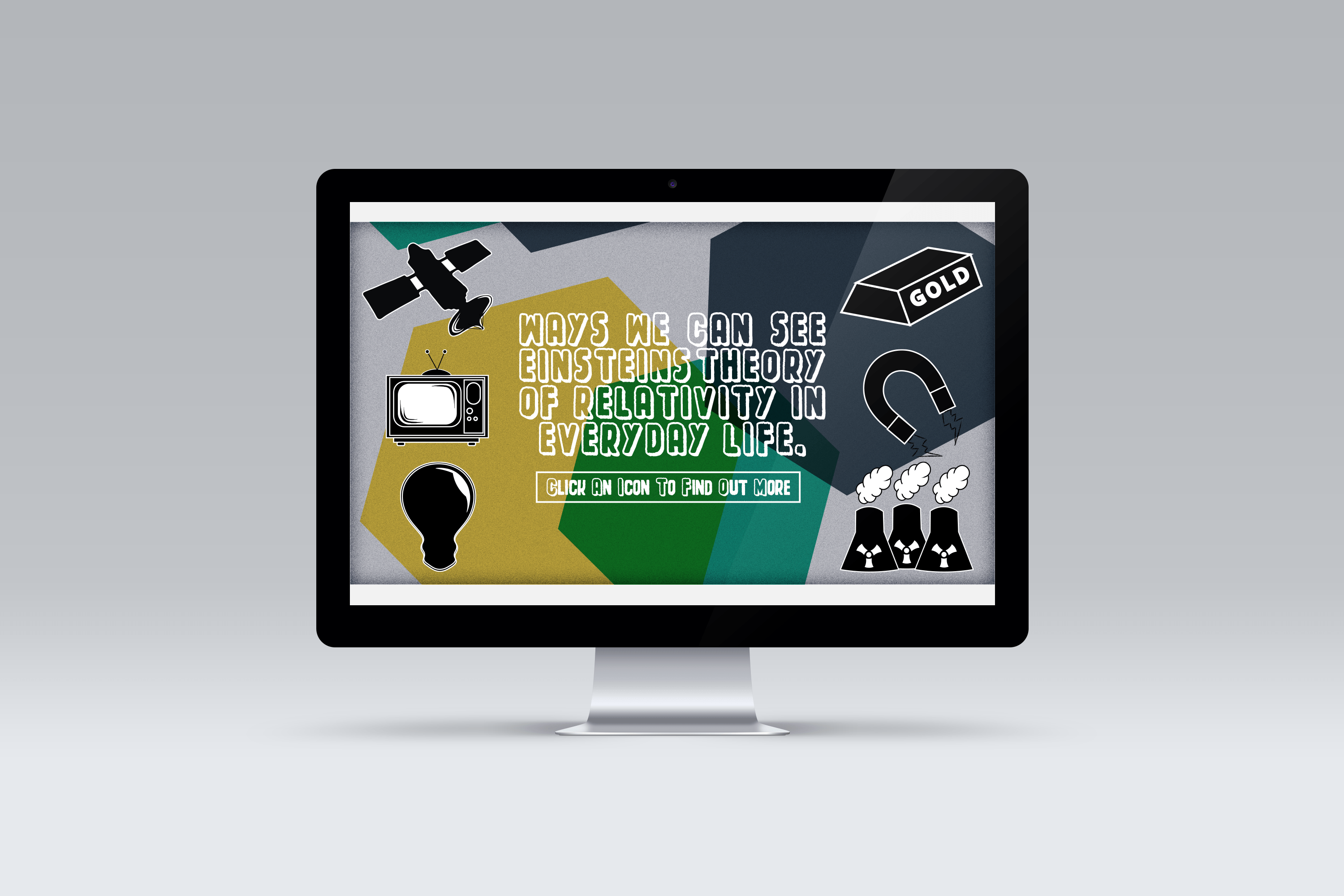
As I have my final designs, I decided to include my designs on mobile and desktop mock ups, so I could get the real feel of what my designs would look like in context.
Category Archives: Final
FINAL POSTER.
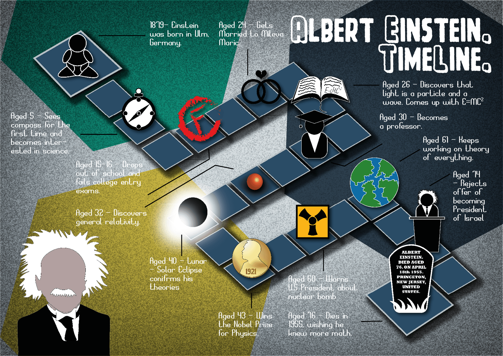
After some feedback from Chris in the workshop, I decided to add the colour scheme and the ‘noise’ style from my web design to make sure each design relates to each other. I also changed the annotation lines to make them darker and more symmetrical. I am very happy with my end result, I feel its simple yet very aesthetically pleasing. From a 14 years old opinion I think it doesn’t go into too much detail and it’s not over complicated. I tried to design it so it could go in a physics text book, or equally in a text book on Einstein as well as being related to my ‘website’. I also made it to be more of a ‘fun fact’ about Einstein, but also keeping it educational. I created all the icons and the timeline in Illustrator. I then added the text through InDesign, using the SpaceCard and Space of Time font that I downloaded from dafont.com. I then had to place the text back into Illustrator to create the background and colour scheme.
A higher quality pdf can be found using this link: FINAL A2 POSTER


