Finalised Picture Book.

I have finally finished my children’s picture book “The Anxious Alligator”. The style I went for was inspired by the book “Monkey Nut” – Simon Rickerty and the illustrator Steve Simpson. Combined my overall style was kept simple but vibrant by keeping the background completely bare and going into details in the actual alligator image. Also another style from Rickerty was the scribble effects on the supporting graphics. I feel that it reaches the audience well and keeps it modern.

I have tried to relate every illustration to the text so the images could potentially read the story even without the text. The dimensions of my book are 28 cm x 28.5 cm. The reason why I went this big is because of the amount of detail that went into page 2 and 9, plus all the details on the alligators themselves. When it comes to children’s books I also used to prefer he bigger books as the images were also big. Unfortunately due to the file size WordPress wasn’t allowing me to include it in this blog.


Finalised Alligator Illustrations!

I have finally finished my illustration for the picture book, I took the same image and applied different emotions that I could use in my finalised book. What I like most about this design is the use of the gradient and colours. I really makes the character stand out. I also feel like this illustration is very flexible and will allow me to create different emotions and hopefully will be able to recreate different characters, like a whole family of alligators. I have also decided to keep the grain effect for this as I felt it really does create a really nice texture to my overall design and will allow me to keep my supporting graphics. ALLIGATOR EMOTIONS-05


ALLIGATOR EMOTIONS-04ALLIGATOR EMOTIONS-03ALLIGATOR EMOTIONS-02ALLIGATOR EMOTIONS-01

Business Cards

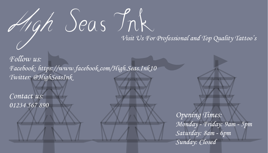
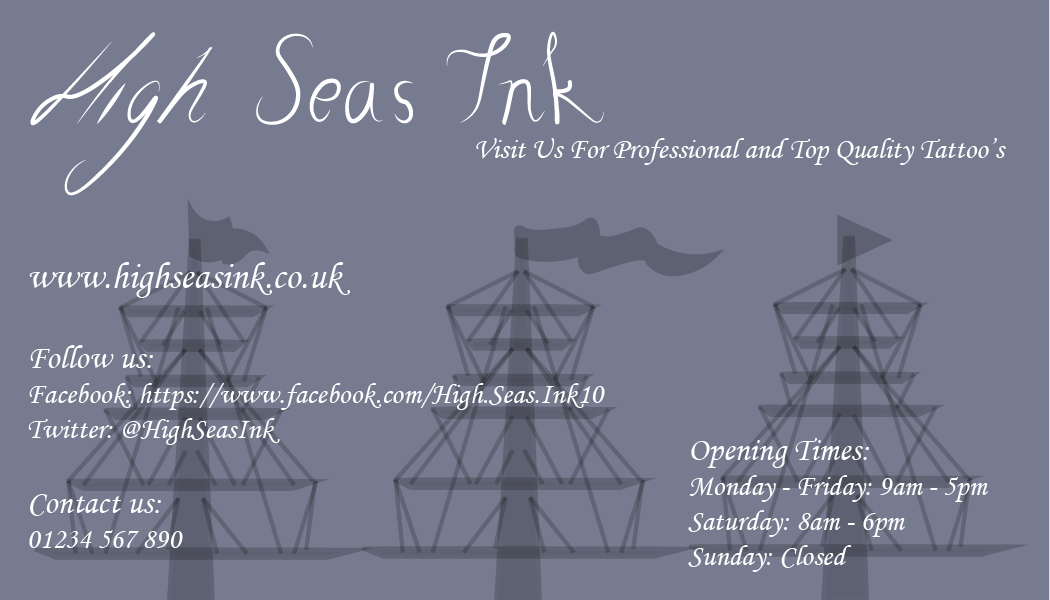
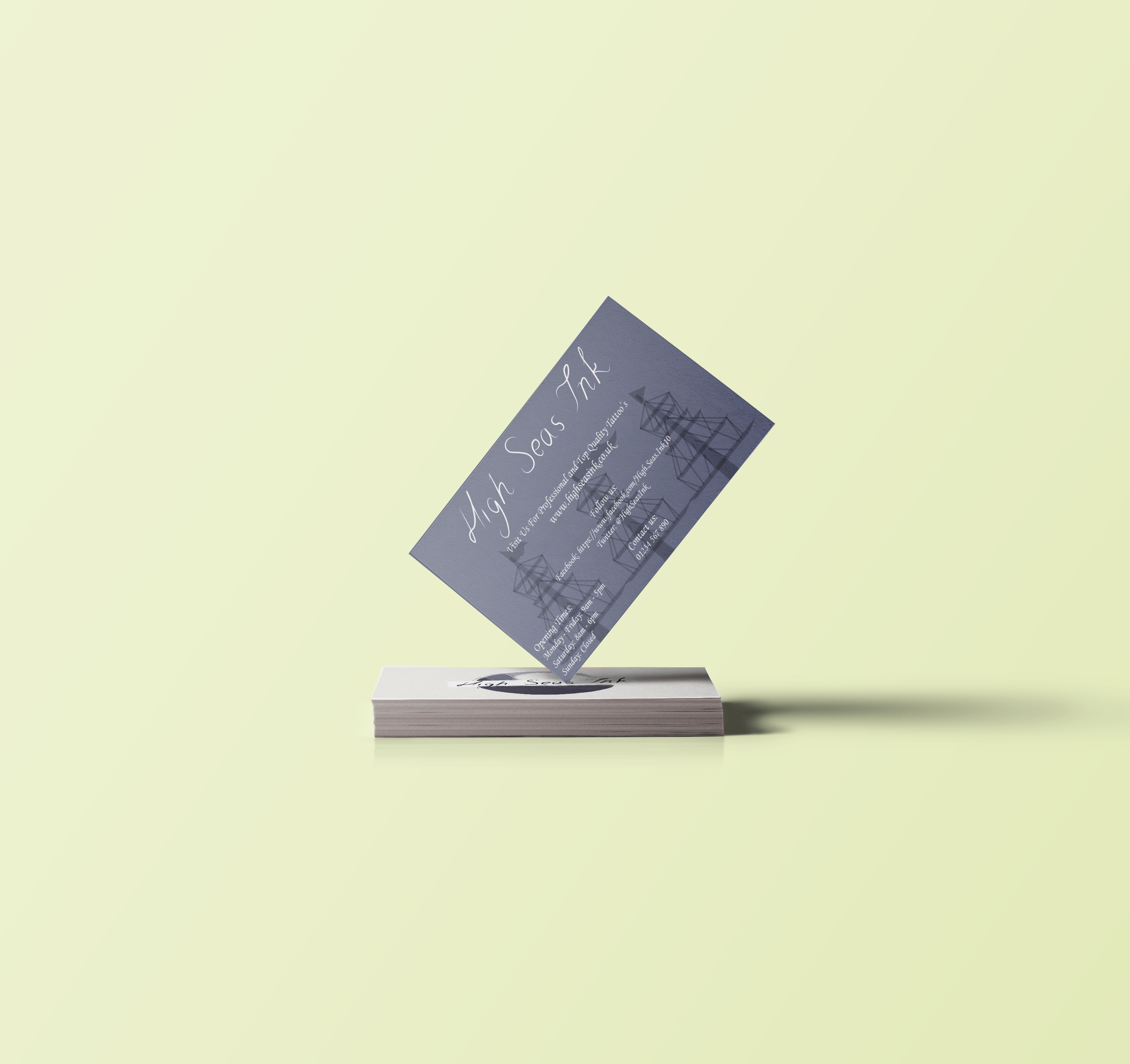
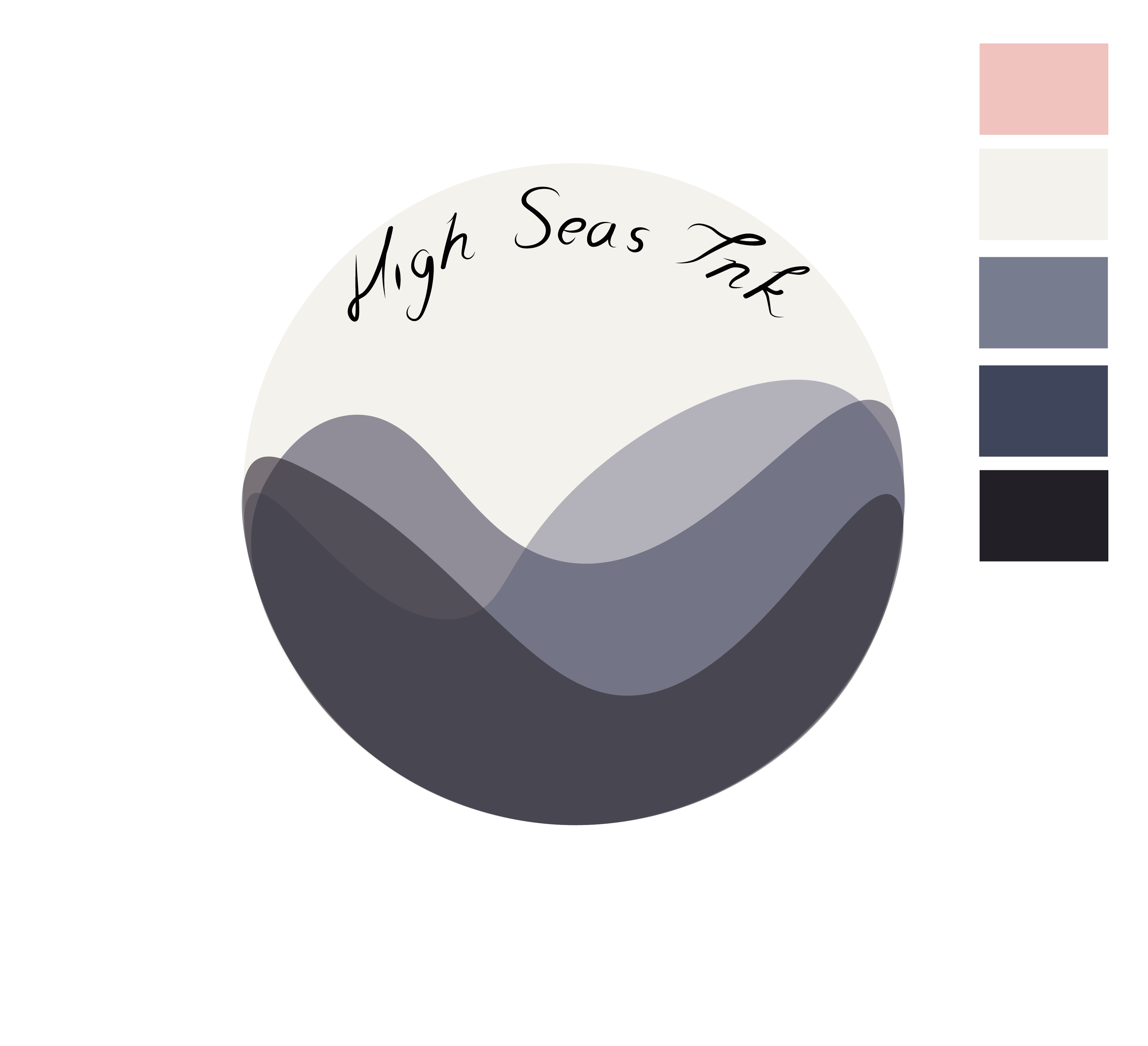
I started designing business cards for my company, using my colour scheme, logo and supporting graphics I experimented with earlier in the project. I showed my initial business card design in the workshop group review and their was a couple reviews and mistakes that I needed to look over, the mistake was that I stretched the company font to make it look slated which I amended and then I changed the font of the text for the information at the back of the card. The other critic was to use a different font, so I used one more basic, however I’m not sure if I liked this as it didn’t fit with the rest of the theme, so I will keep the calligraphy font for the basic information:

business cards2-01

BUSINESS CARDS-02

BUSINESS CARDS-01-02

business cards 2-02

business cards2-02


Business-Card-Mockup-Presentation