SCALE AND GREYSCALE LOGO TEST

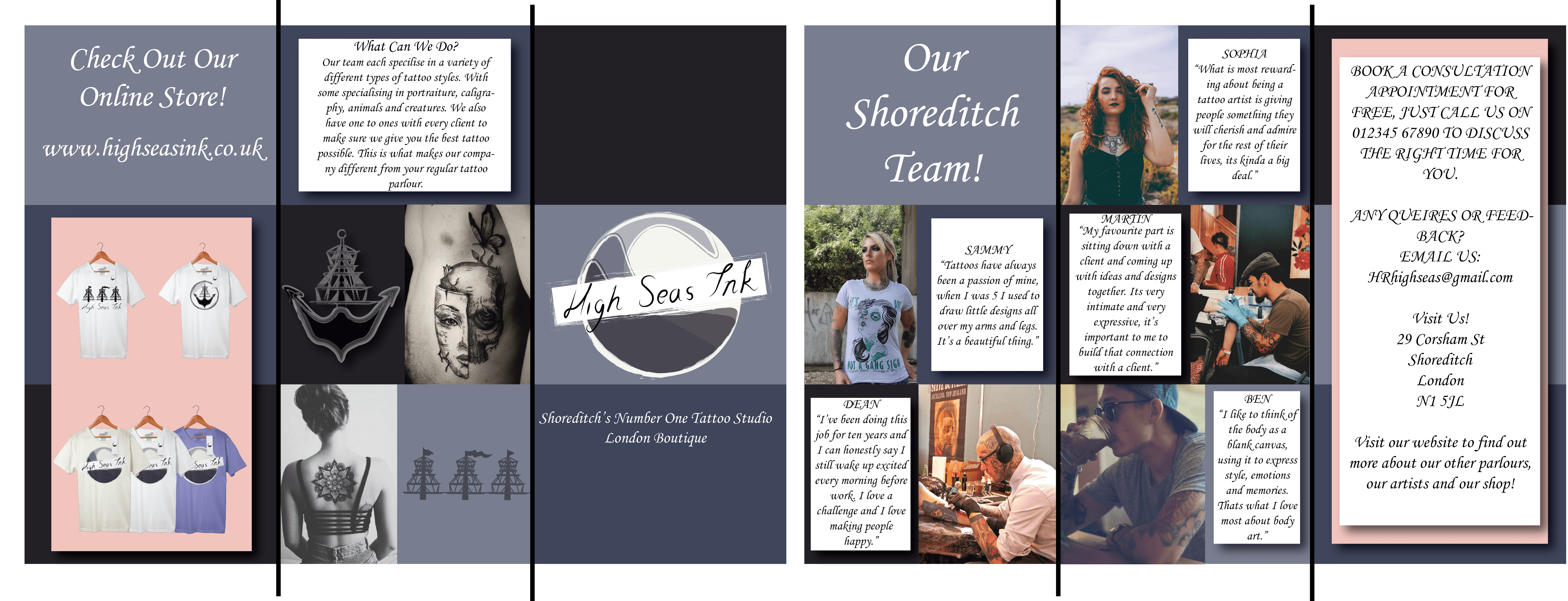
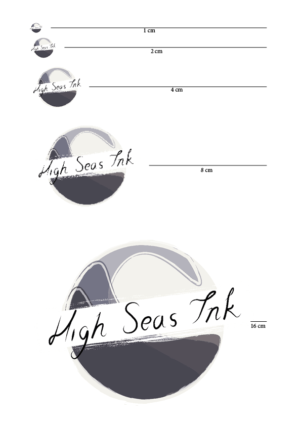
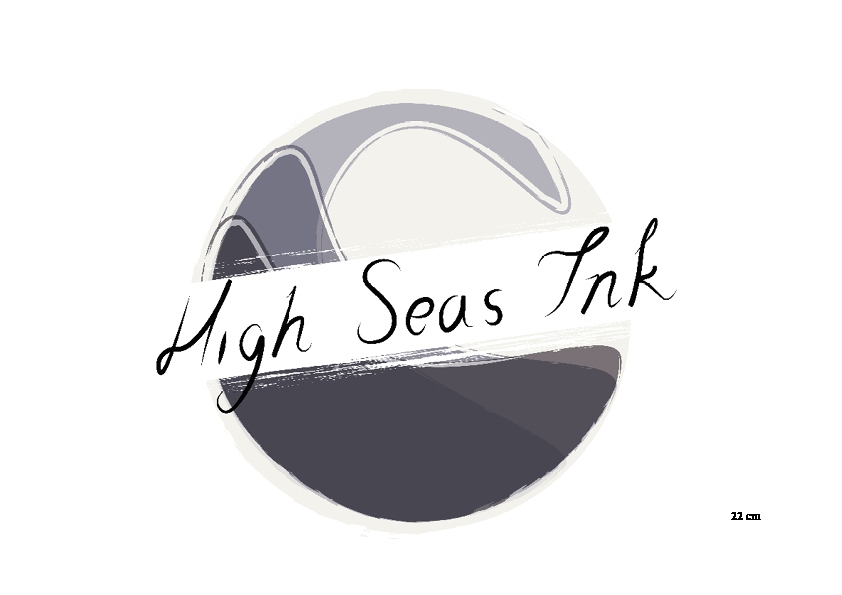
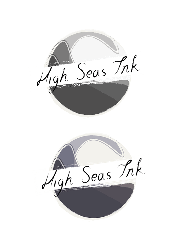
I decided to test my finalised logo when it was shrinked down to 1cm up to enlarged at 22 cm which was largest I could fit on a A4 spread. I did this to ensure that the logo would be suitable for being printed on letters or printed on a large poster without any confusing on what the logo is. The one problem I found my logo had was that as it has the name of the company across the middle of the logo, it was difficult to read. However I feel that the colouring and the pattern of my logo aids this and depending on whether you have seen the logo before you will be able to notice what company it is. I feel that my logo has no issues when it is enlarged, due to its level of detail and because it does the font across it, it can take up as much space as no supporting text is needed. I then took the image and put it in greyscale to see how it would look if it was printed out in black and white. I feel that the logo is quite light however its still eye-catching due to the four different tones in the image.

If I was to improve this logo I would have placed the companies name next to it so it could be visible shrunk down to 1cm. However, I don’t think the logo would have the same effect due to the fact it compliments the text and the wave effect.

Scale and Colour Test Scale and Colour Test 2 Scale and Colour Test 3


I have added a PDF of a Branding Booklet which goes into more detail of the uses of my logo design:

High Seas Ink Branding Booklet.

Brochure

I made a brochure that was a similar design and layout to the website that I created, keeping it to the colour scheme and the use of box layout. I kept the information on the brochure relevant, for example where they are based, website information, the online shop, promotion of the artists themselves and what they can do. I feel like doing this I have provided not only information that customers would need but also leisure reading when they take it away or in the waiting room of the parlour. I have also kept it strictly to do with Shoreditch’s parlour itself as the others will have different information on it so I didn’t feel it was relevant to the project.

Brochure

Story Research

The main overall topic that I wanted to cover in my children’s picture book was about mental illness, in particular, Anxiety and Loneliness. I found a few books that have already covered these issues in children’s books specifically aimed at 3-12 year olds. I wasn’t taking illustration ideas from these books, just story plots as I was quite worried that mental illness would write well in a book. Stories I looked at were:

Sweet Dreams and Monsters by Peter Mayle:

cade9cb0d7025418fc98b73859ae8914


Feelings, Aliki:

316891 41S08Z653NL


Tim and the Blanket Thief, John Prater:

61eHW99FOQL._SL500_SX258_BO1,204,203,200_


Aldo, John Burningham:

Unknown parsons_1


I think I’m definitely going to try to convey the topic about anxiety as it is a very common mental issue that kids have in todays culture and society. Its also something something personal to myself, as I know the symptoms so I feel that I could convey it well.

Steve Simpson – Influence

To prepare for project four I had a look over one of my favourite illustrater and graphic designer, Steve Simpson. He has won over 50 awards for his package design and illustrations and his style is inspired by 50’s advertising and the arts and crafts movement. What I like most about Simpsons work is the use of colours, shapes and lines. Its a very unique style which I like, it is quite similar to Tim Burtons film style and touching on Mexico culture. I like his character drawings the most, as he is able to give them all personality through style and colours, whenever I look at his character illustrations I also seem to see the full personality and back story. I also like his typography and the placement of this typography, which is shown through the book cover design of The Wordsmith.

001-beautiful-illustrations-package-design-steve-simpson 005-la-palma-steve-simpson b5710225393095.56344944971b2 simpson-3 croc-art-copy


I have taken this style and done a couple of pastiches to grasp his illustrative technique onto my work. I feel that this would go really nice in a children’s picture book, due to its detailed, bright and imaginative feel to it.

Scan 160570001


Scan 160570004-1 Scan 160570004

WEBSITE LAYOUT AND DESIGN

I have finished my website design which consists of 4 pages and following the same layout on each page. I included a navigational bar that ran along the top with the Logo on the top left, and each page having a dominant image under the navigation, on the “Home” page, this will be swiping to different images with different links to either a portfolio blog page or information on the artists. I then included some information which is crucial to convey to your customers which will be offered to them on the home page, this included who they are, what they do and a little information on the artists as a whole. By including these details offers trust and reassurance that this is the right company. I then added an image of a, attractive tattoo and some supporting graphics that I made previous as potential logos.

The next page was the ‘Shop’ page. When I did my research into Shoreditch Tattoo Websites that already existed, I noticed that most of them had an online shopping option, which sold their own branded and designed tshirt’s, bags and other items of clothing’s and accessories. So I decided to download some PSD mockups and includes a page dedicated to items that High Seas Ink could sell. Again, I kept this linked with my style, by keeping the items a purple, white or cream colour, and sticking with designs I have made previously.

I then had a a ‘Contact Us’ page, which gave social media links, contact information and a made up address in Shoreditch, which I added a screenshot of Google Maps just as an example of what it would look like. I should point out that I have said on my website that there are High Seas Ink Parlours in Bristol and Durham already, and I haven’t added in this information as they would ideally have their own website for their store, which would be linked in the words “Bristol” and “Durham”. I didn’t feel it was necessary to include this information into my designs as I am focusing on Shoreditch itself.

Finally, I included a page dedicated for the “Artists”, which show artists from all the parlours, not just Shoreditch, however they all travel around. Ideally, when a customer clicks on one of the circle images, it will link to that artists portfolio and blog, so the customers can see what they specialise in and where they are based. This again was another feature I saw on other tattoo websites. The images I have used are stock images from Pixabay and a couple from Pinterest as there wasn’t many decent stock images on the internet.

Below is a PDF Link to my final website design!

PDF WEBSITE