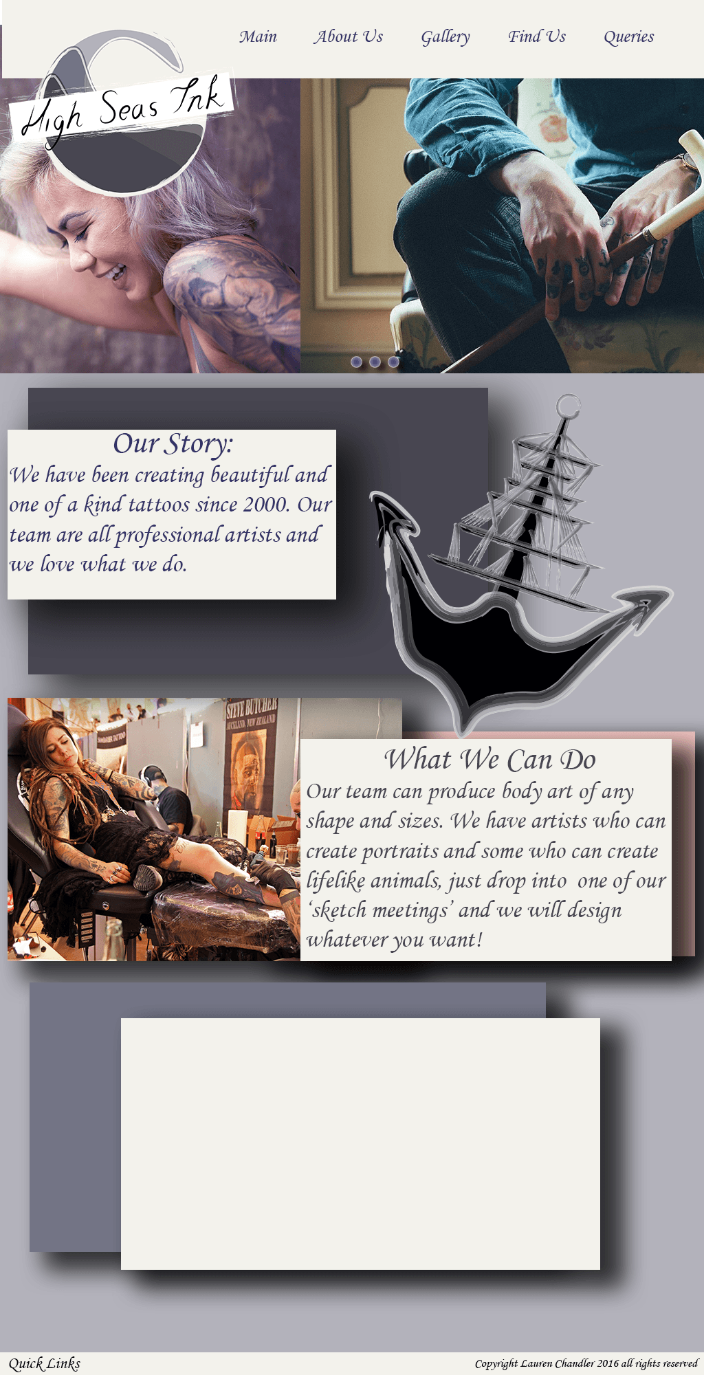
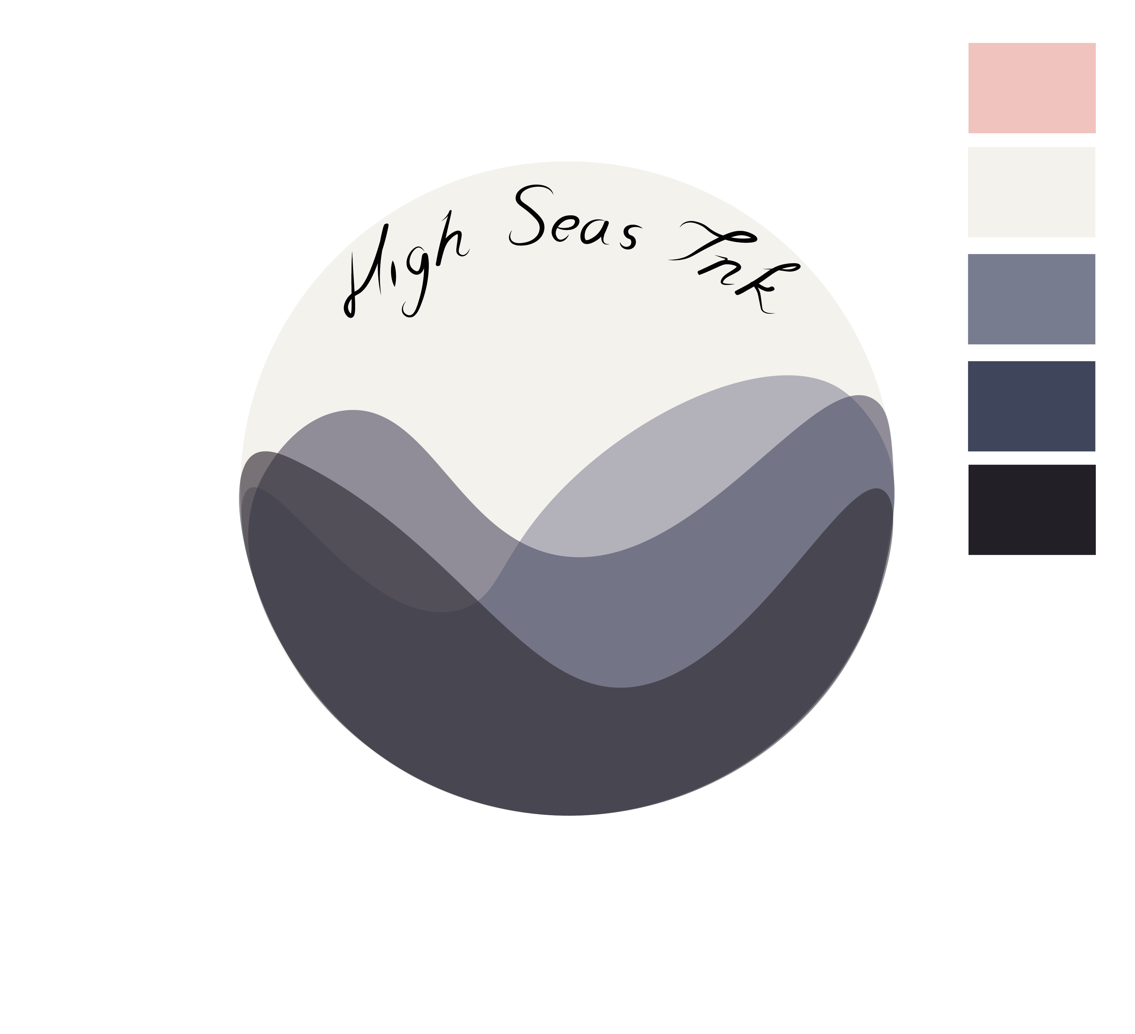
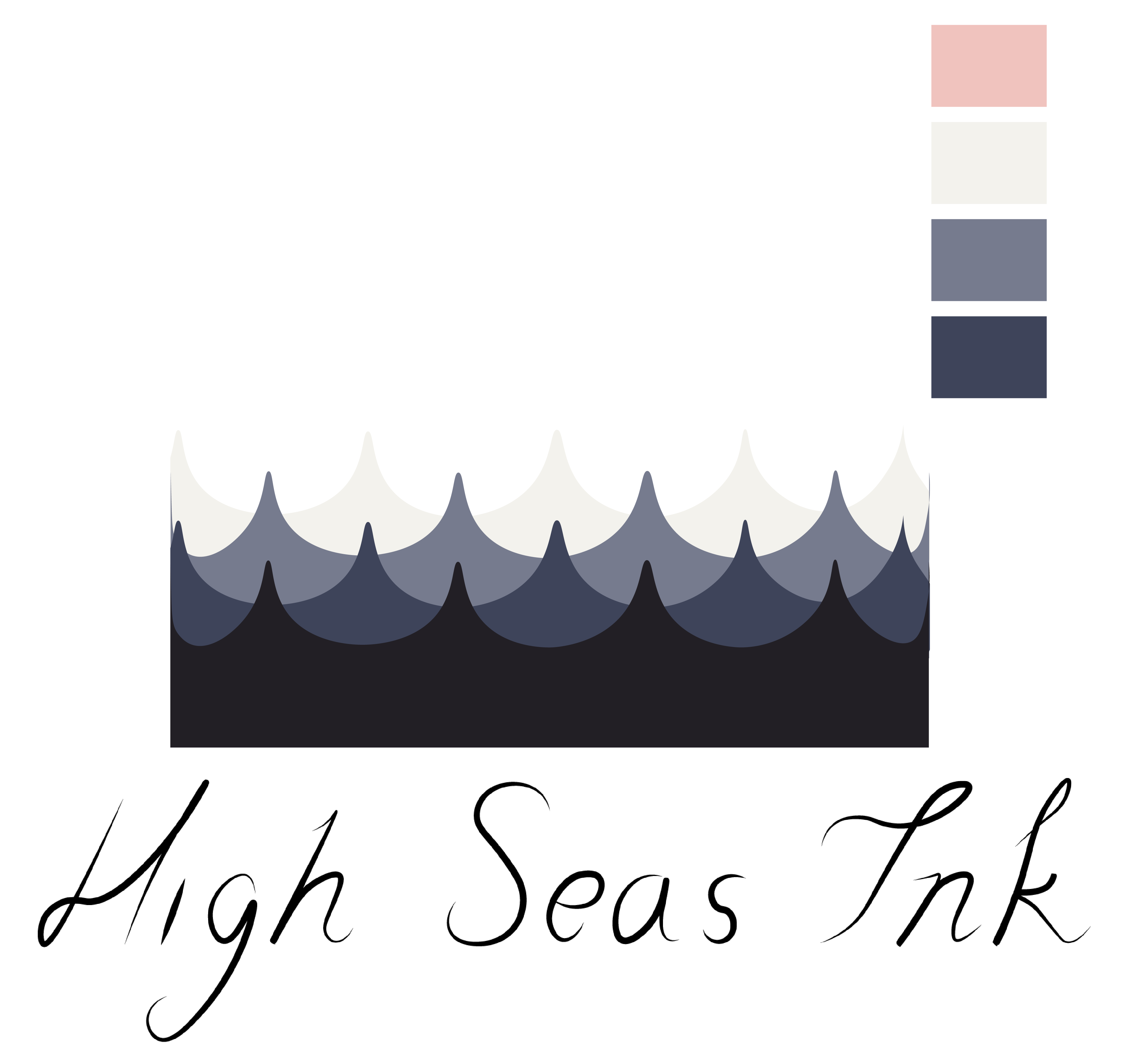
I have finished my website design which consists of 4 pages and following the same layout on each page. I included a navigational bar that ran along the top with the Logo on the top left, and each page having a dominant image under the navigation, on the “Home” page, this will be swiping to different images with different links to either a portfolio blog page or information on the artists. I then included some information which is crucial to convey to your customers which will be offered to them on the home page, this included who they are, what they do and a little information on the artists as a whole. By including these details offers trust and reassurance that this is the right company. I then added an image of a, attractive tattoo and some supporting graphics that I made previous as potential logos.
The next page was the ‘Shop’ page. When I did my research into Shoreditch Tattoo Websites that already existed, I noticed that most of them had an online shopping option, which sold their own branded and designed tshirt’s, bags and other items of clothing’s and accessories. So I decided to download some PSD mockups and includes a page dedicated to items that High Seas Ink could sell. Again, I kept this linked with my style, by keeping the items a purple, white or cream colour, and sticking with designs I have made previously.
I then had a a ‘Contact Us’ page, which gave social media links, contact information and a made up address in Shoreditch, which I added a screenshot of Google Maps just as an example of what it would look like. I should point out that I have said on my website that there are High Seas Ink Parlours in Bristol and Durham already, and I haven’t added in this information as they would ideally have their own website for their store, which would be linked in the words “Bristol” and “Durham”. I didn’t feel it was necessary to include this information into my designs as I am focusing on Shoreditch itself.
Finally, I included a page dedicated for the “Artists”, which show artists from all the parlours, not just Shoreditch, however they all travel around. Ideally, when a customer clicks on one of the circle images, it will link to that artists portfolio and blog, so the customers can see what they specialise in and where they are based. This again was another feature I saw on other tattoo websites. The images I have used are stock images from Pixabay and a couple from Pinterest as there wasn’t many decent stock images on the internet.
Below is a PDF Link to my final website design!