New Colour Scheme.

After experimenting around with my last colour scheme mixed with the font, I felt as if it didn’t fit into the context of my company. So I went back into my colour mood board and decided to take a different route for my colours. My new colour scheme has a lot more darker tones and colours in which goes well with the ‘tattoo’ style and fits into the theme of ships a little better, making it less ‘cartoonish’ and more sophisticated.

New colour scheme-04 New colour scheme-05

Second Logo Idea

I was a little worried my original logo wouldn’t look as good when shrunk down in size due to the lines of the ship, I also didn’t majorly like the anchor part of the logo. So I decided to create something a little different to see if it would look better and experiment it with the colour scheme:

Logo backup


This design still needs a lot more work to do to it before its finalised however I have decided that I don’t want to use this colour scheme as I feel it looks too cartoonish and in my opinion it appeals to a much younger audience. I feel this logo would look a lot better shrunk down however I do prefer my previous logo idea and I have decided to work on that one as it fits a lot better with the context of the project.

Developing Digital Watercolour Splats.

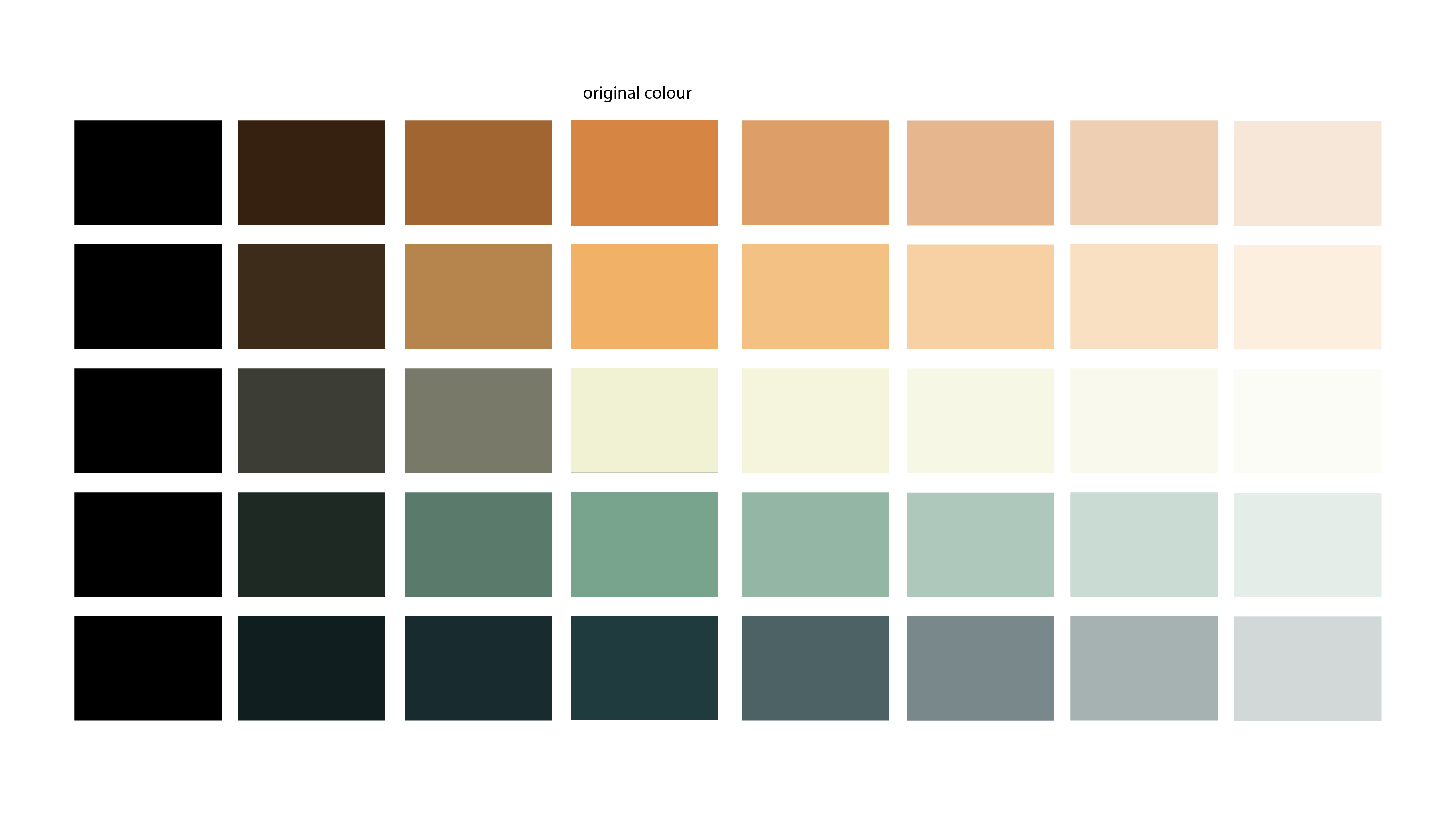
One major part of this project that I was really excited to develop and learn how to do was the create ink splats or watercolours marks through illustrator without using actual watercolours. I watched a couple youtube tutorials and then experimented myself with the methods, my first attempt showed good colours and contrast between these colours, however there wasn’t that watercolour effect that I wanted to get out of it. Experimenting with digital paint-01


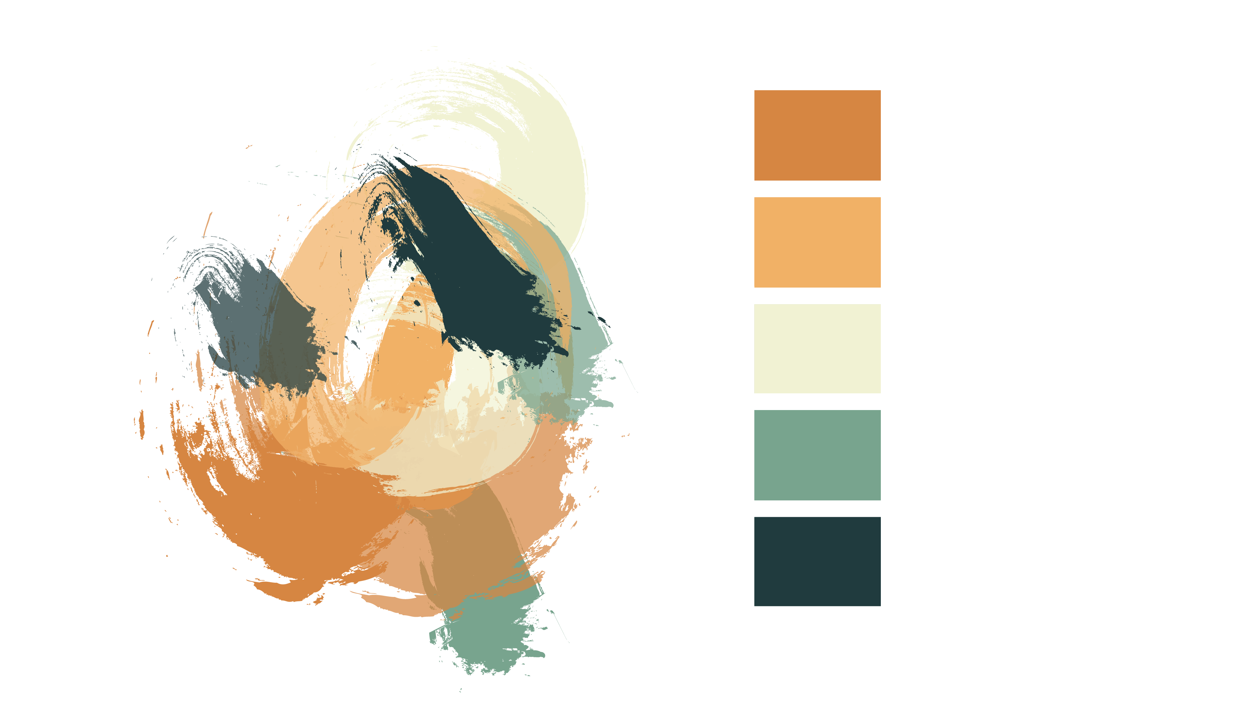
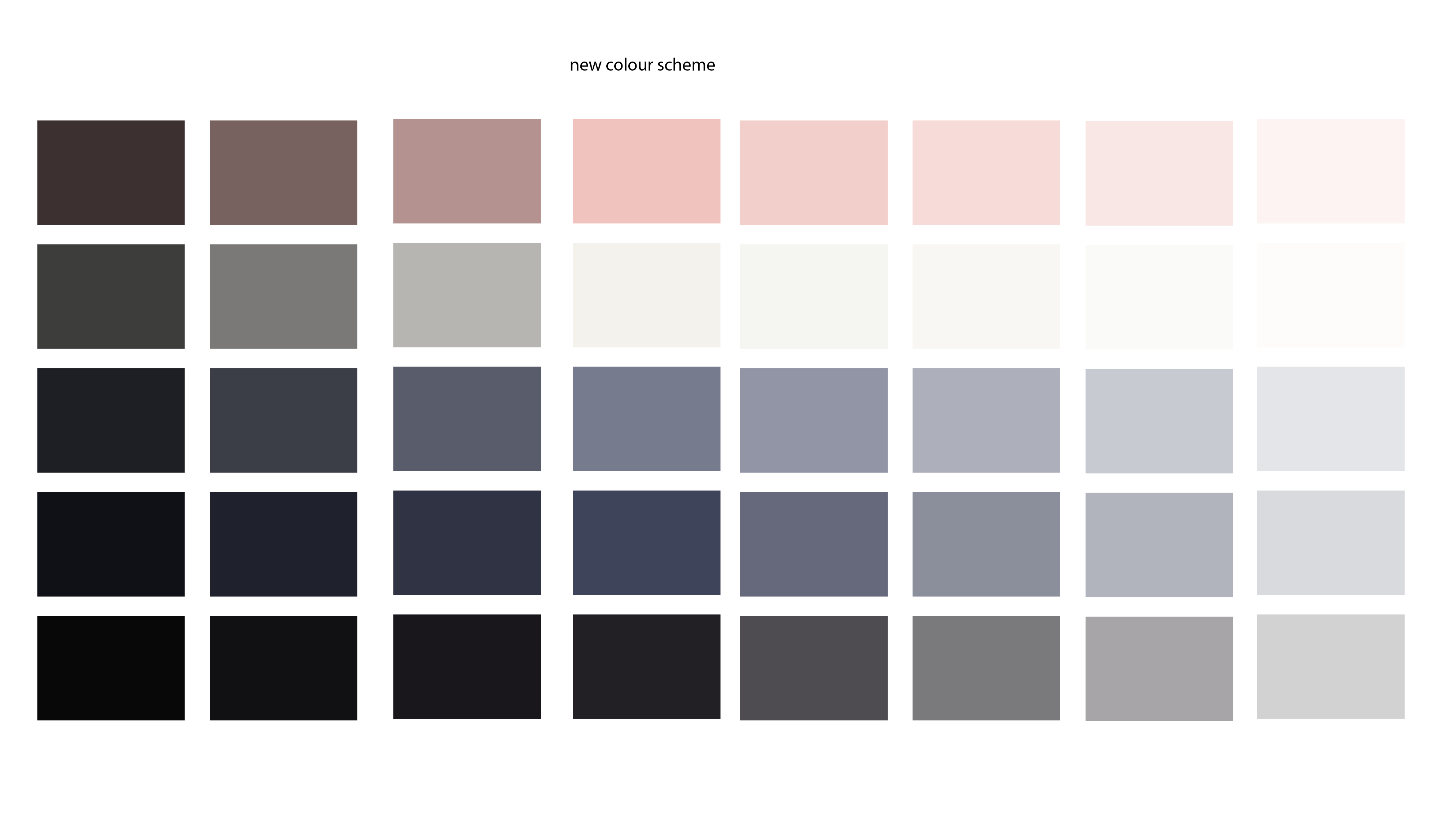
I then started experimenting with the gradient of each individual shape. I isolated each shape and worked on them individually. This was the outcome from this:

Experimenting with digital paint-02


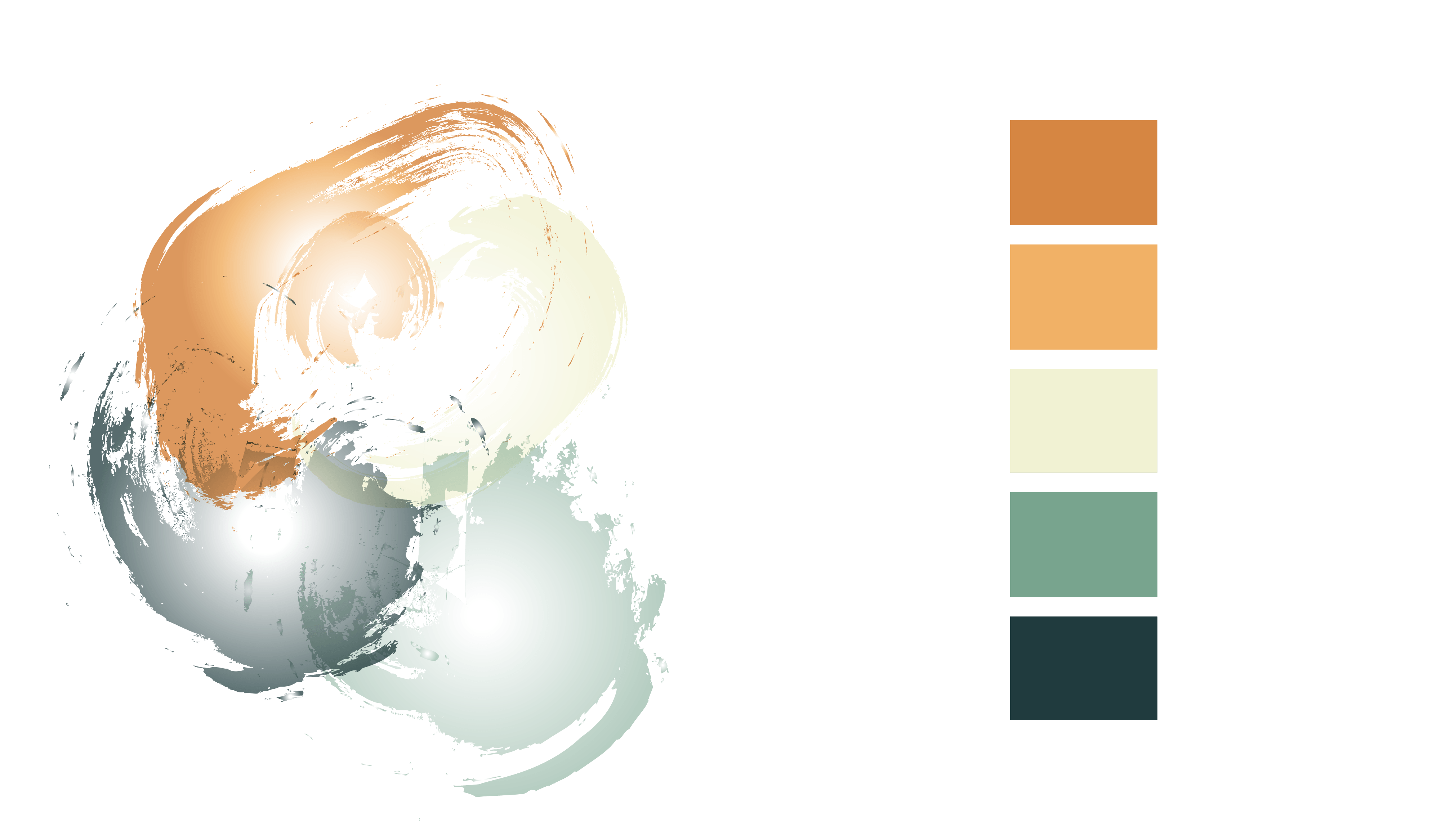
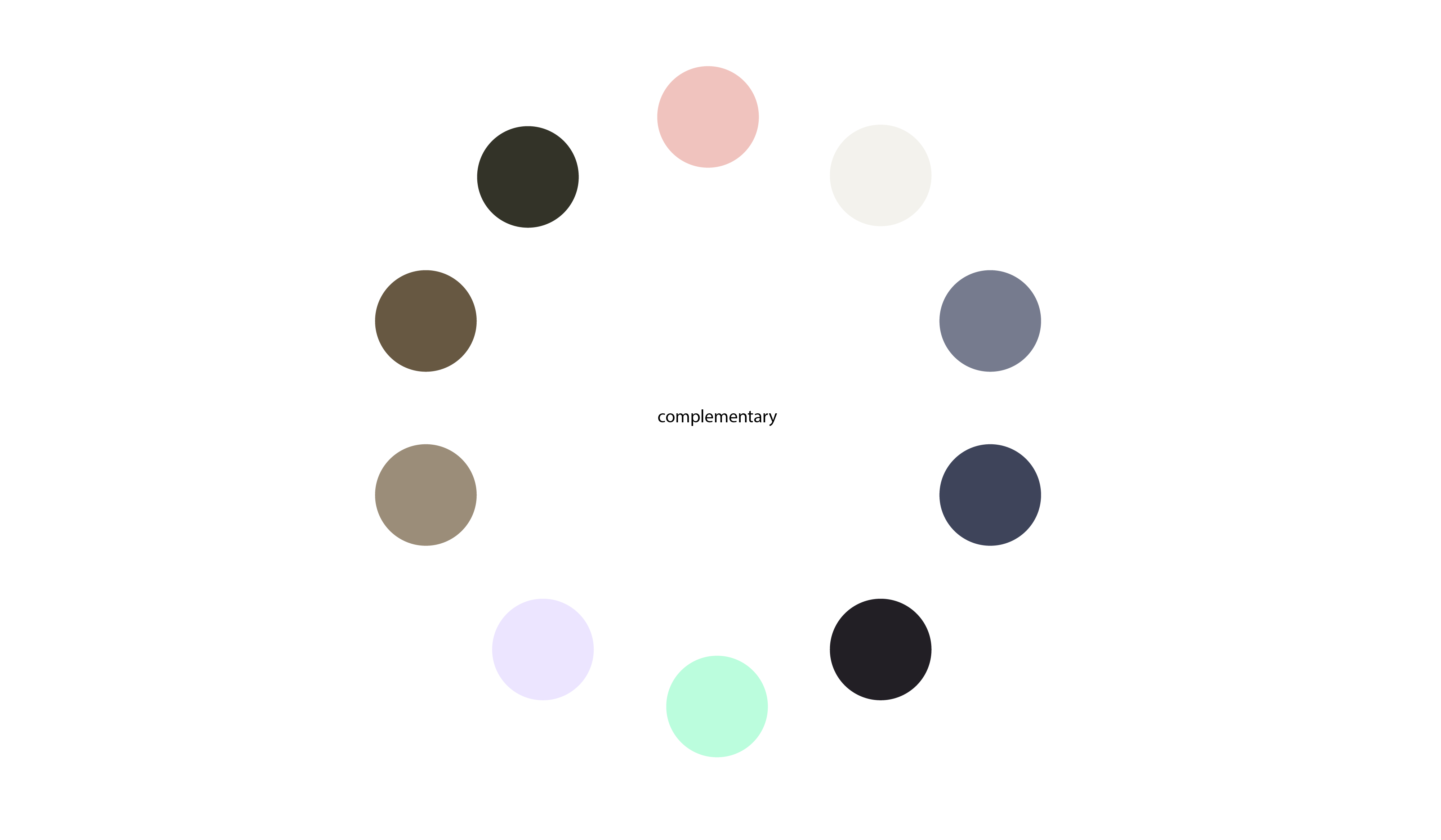
I liked this outcome, however I felt that having the darker shades on the outside of the shapes didn’t have the same effect as actual watercolour naturally does, and the white in the centre of each shape is too obvious, when I realised this I swapped the colours around and got this result:

Experimenting with digital paint-03


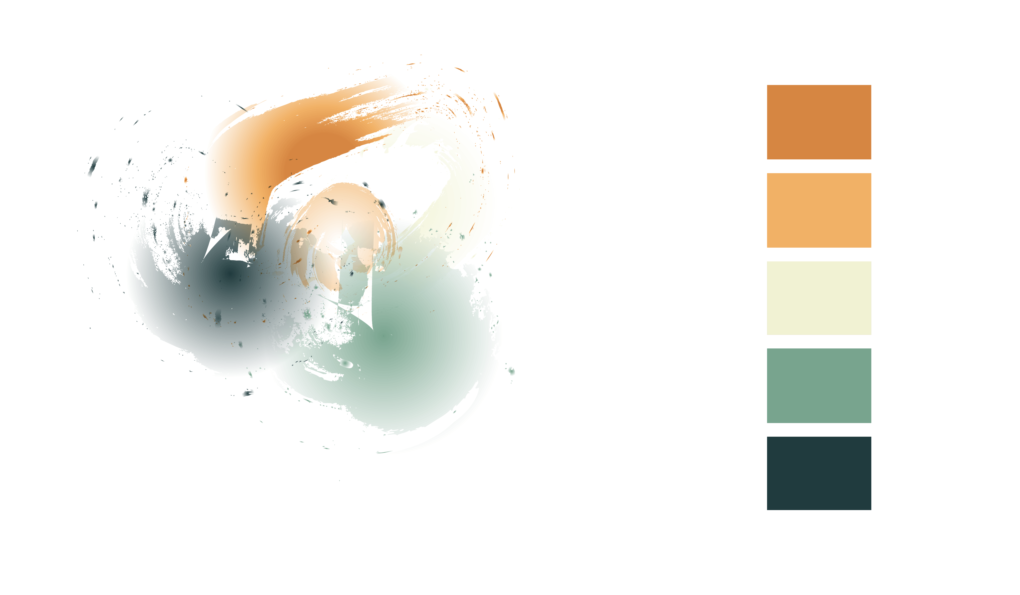
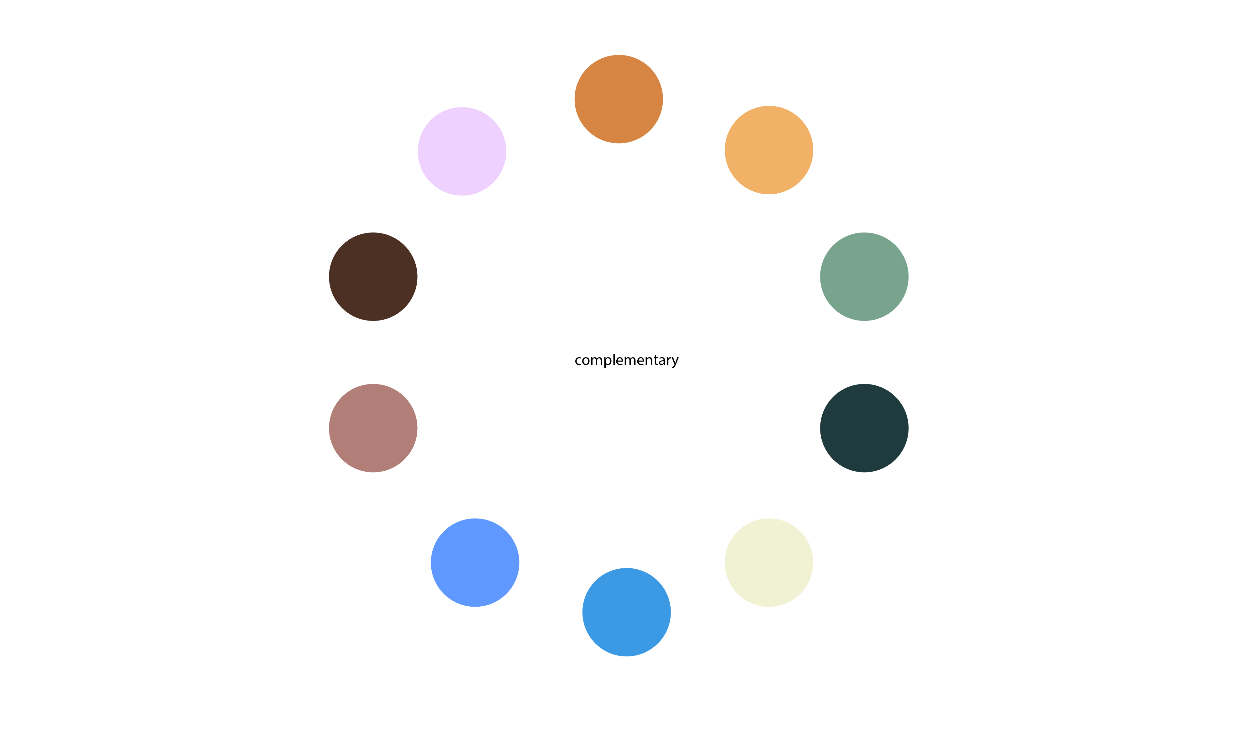
This is exactly what I wanted my result to be. I want to develop this further, using different colours and hopefully using it in my logo and brochures. I am very happy with the outcome of this experiment and I am definitely keeping this in my designs.

Colour Experiments.

In todays workshop we were focusing on colour play. This included learning the difference about RGB and CMYK. We then went off to experiment ourselves. I went straight onto Pinterest and looked onto images that I was drawn too specifically for their colour schemes. I then downloaded these into Indesign and with using the eyedropper tool I was able to select the images and it came up with the strongest colours that it could pick up. I then put these into a presentation pdf:

Colour moodboard

My favourite one out of all of these experiments was the last one of ‘The Wanderer’ which I have included already in my research for my logo. I really like the major contrast in the colours, however they work really well with each other. I placed these colours into Illustrator and experimented with Shades, Tints, Complimentary Colours and Saturation / Desaturation.

Colour Shades-01 Colour Complimentary-02 Colour Saturation-03


I really like this colour scheme and I am going to experiment with this one when creating more content for ‘High Seas Ink’. I will also develop another a colour scheme I like for a back up.