WEB DESIGN DEVELOPMENT

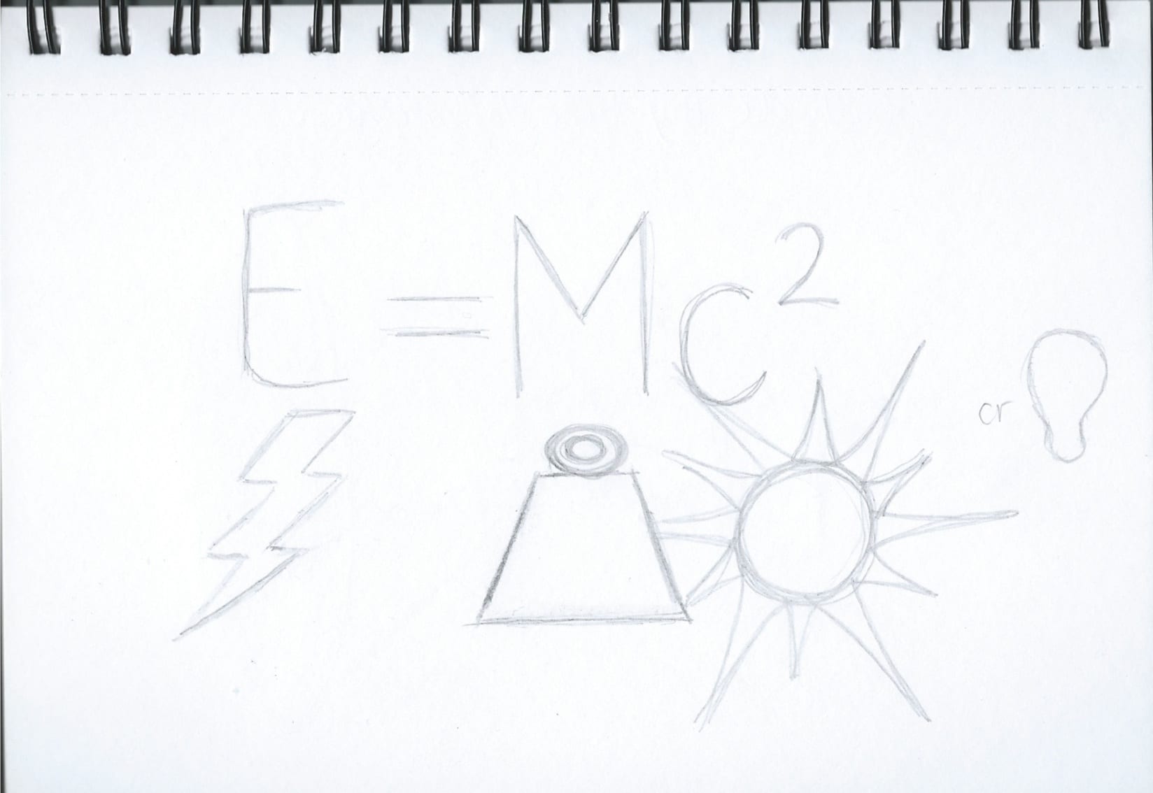
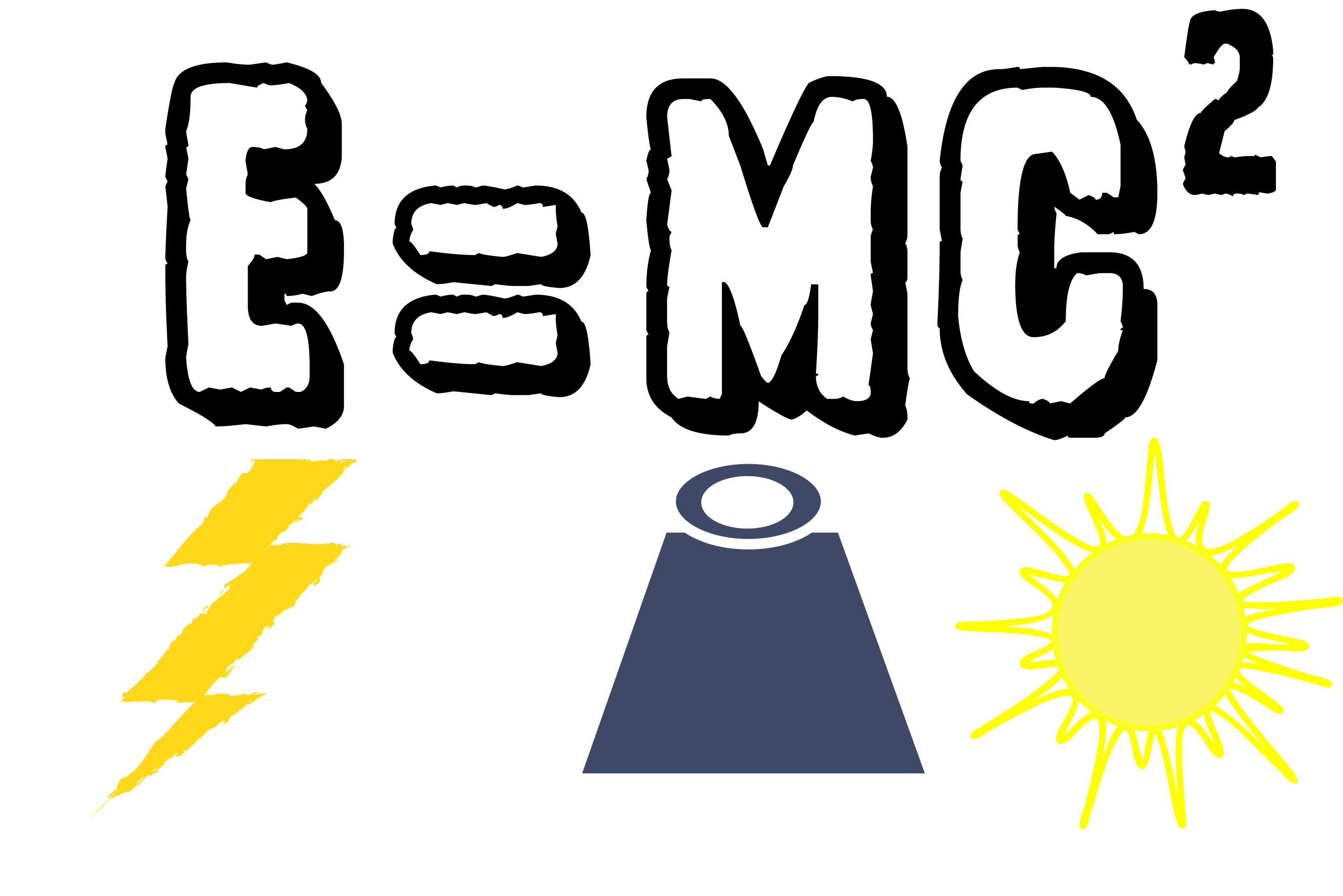
After a bit of repositioning I got a template for my website layout. I have kept the icons as a ‘navigational’ tool on the left hand side, and made the main body of information just off centre slightly. I made sure I gave clear dominance in the titles and made it easy and straight forward for the user to navigate the page. I sketched my infographics then scanned my drawings into illustrator, and modified them.

Scan 153210003


Light infographic


Scan 153200001Electromagnet infographic


Scan 153210001

Cathode Ray Tube infographic


Scan 153190001Satellite Infographic


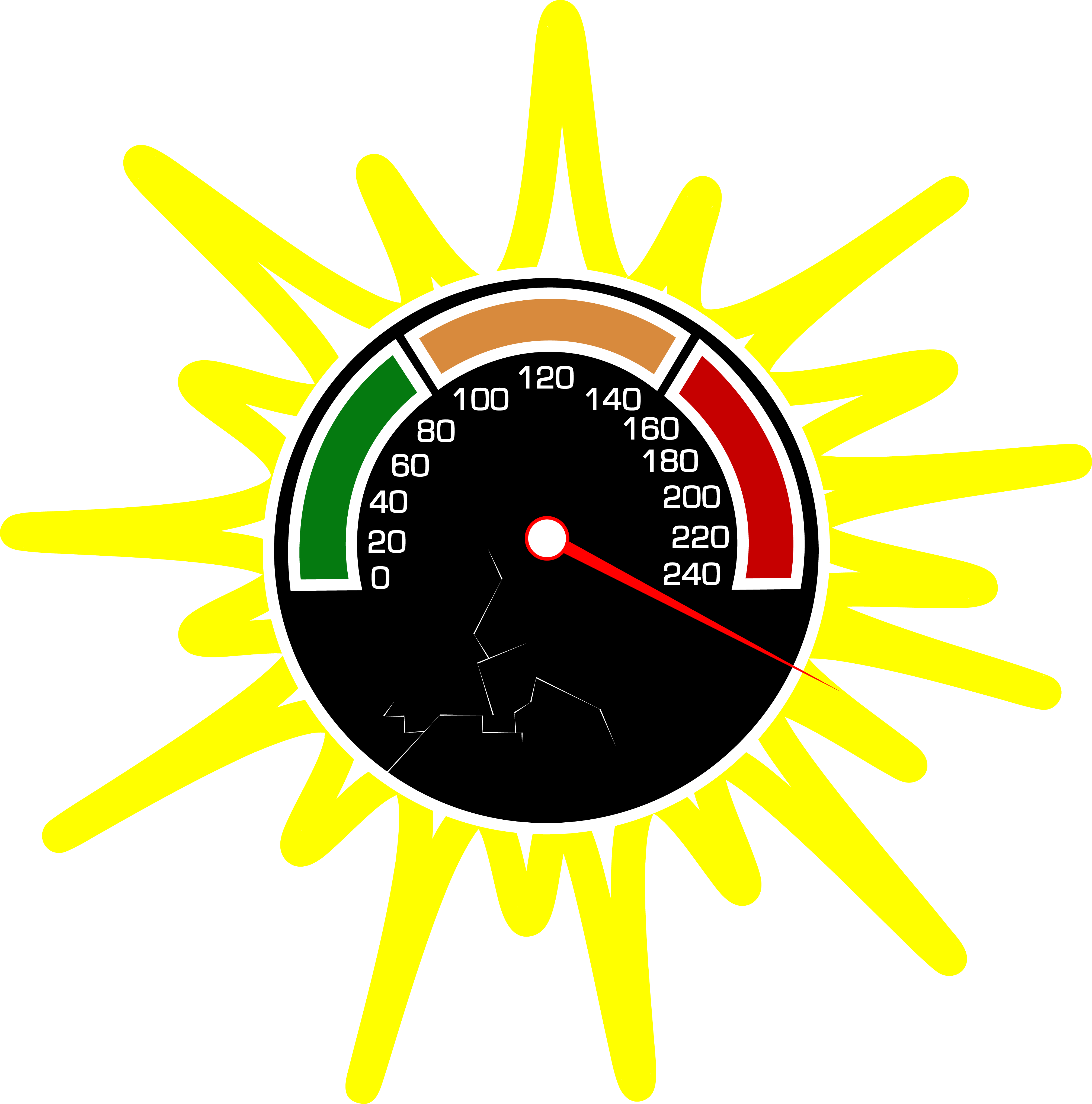
For my graphic for speed of light, I did not sketch before I created this, I got my inspiration by looking at simple Speed-O-Metres icons on google, then I created it off of memory.


Speed of Light graphic


I placed all these in InDesign, using the a grid template.

Design Idea 2 example of idea

I am not sure if I am 100% satisfied with this design, I am going to do some more research on good website layouts and see if I can move some parts around. However I do really like my choice of infographics.

WEB PROTOTYPE DESIGN IDEAS.

For my online desktop design, I started to create a design that is suitable for children aged 14 and under. I wanted to use a blue and white colour scheme as it relates to the idea of space and ‘blue’ being one of the most popular colours. My initial idea was to create a website that has different pages that explained ways you can see relativity in real life (based on website: http://www.livescience.com/48922-theory-of-relativity-in-real-life.html) and explaining these with infographics and icons that I will design. I made this design as my first initial thought:

Relativity Online Desktop

I then asked an opinion of a web design student from a different university of his opinion on my design and if it would work well. This was when he suggested that it would possibly work better if I kept it on all one page. I developed this idea further and decided to design another prototype with keeping the same layout but with different info-graphics when selected each sub heading.


ICONS!

I have done some research into the theory of relativity to see if I could get my head around it and hoping it would make this project a little easier if I actually had the knowledge of the actual science. Unfortunately, science is not my strong point. However, I found a website that told us some ways you can see the theory of relativity in real life. – http://www.livescience.com/48922-theory-of-relativity-in-real-life.html. This gave me a great idea for my online desktop prototype and I got to work at creating some icons and graphics. I wanted to stick to  simple black and white colour scheme for the icons however for my infographics I want to use bright and bold colours to make them stand out and look interesting to my audience.

Nuclear Plant Icon


Gold Icon


Einstein

MY IDEAS.

After some research and some messing around on Illustrator. I finally decided that I wanted to aim my multi format designs at children, specifically 14 years and younger. I feel that doing this I can create simple designs and I don’t have to dive into deep knowledge about Einsteins theories. I found an interesting list of ‘8 ways you can see Einsteins theory of Relativity’, I plan on creating simple, black and white icons to show this information.

I also thought that for my A2 poster, I am going to create a graphic of Einstein with a step by step info graphic of his life. Possibly similar to the info graphic by Rae Hoffman and possibly designing it with the use of isometric projection, giving it a 3D effect.

READING.

I went to the library and borrowed ‘Cool Infographics’ by Randy Krum. I really liked this book, especially the chapter on ‘Visual Explanations’ which shows what makes a good visual info graphic without using statistics and numerical data, which is what I was panicking about when we got the brief. My favourite info graphic that was shown was ‘Figure 2-13: A 10-step process designed as a visual explanation info graphic’ designed by Rae Hoffman. It showed simply three colour-coded characters on a path to show a certain sequence of events. (pg 78)

Affiliate-Marketing-FINAL1


This design has inspired me to do something similar with maybe the events on Einsteins life, or the 8 years of developing his theory of relativity.