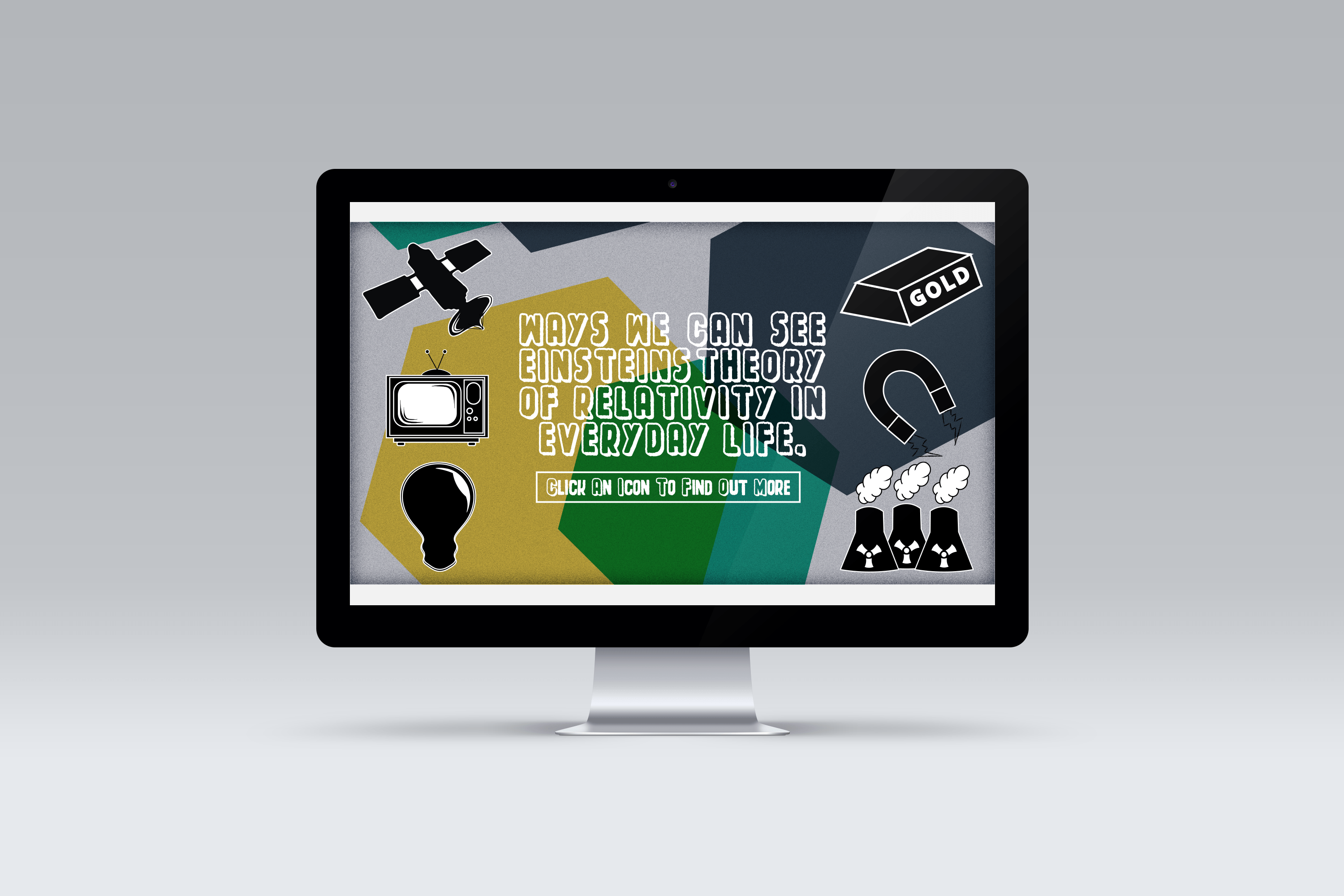
I started to really like my idea of the the circular waves, so I thought I would develop this idea more and further. I included my other design of the ship but there was too much going on and I felt I needed to make is as simple as I could to make it look professional and for it too look at a high quality at a small scale and large scale and when I change it to greyscale. ![]()
![]()
![]()
![]()
![]()
![]()
![]()
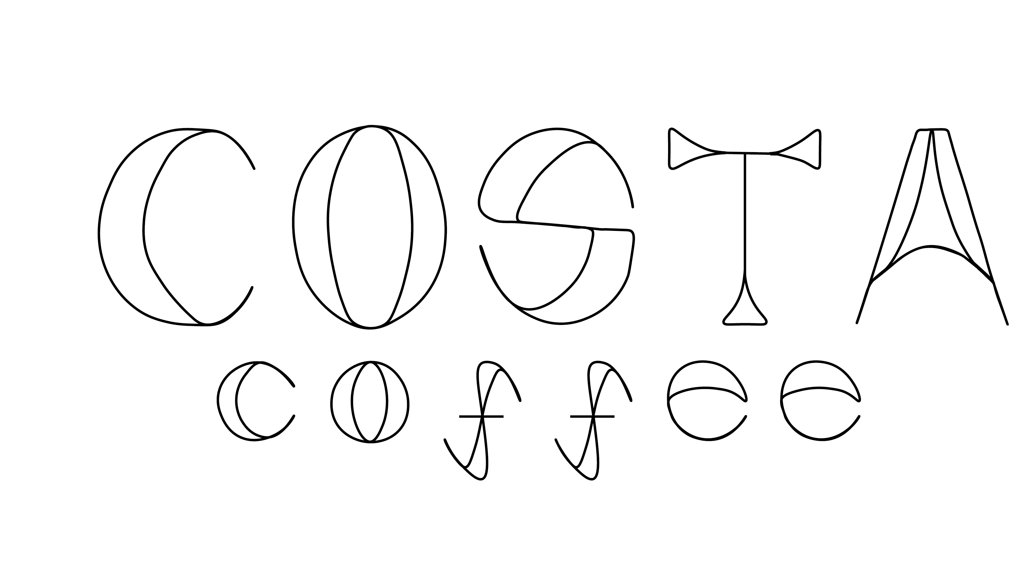
For my final logo I have decided to go for the middle design, it follows my colour scheme really well. I am going to experiment this further in different scales and in black and white.