EXPERIMENTING WITH STENCILS / FOLDING AND PENS.

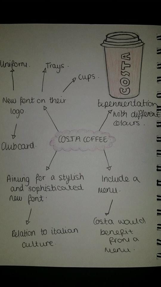
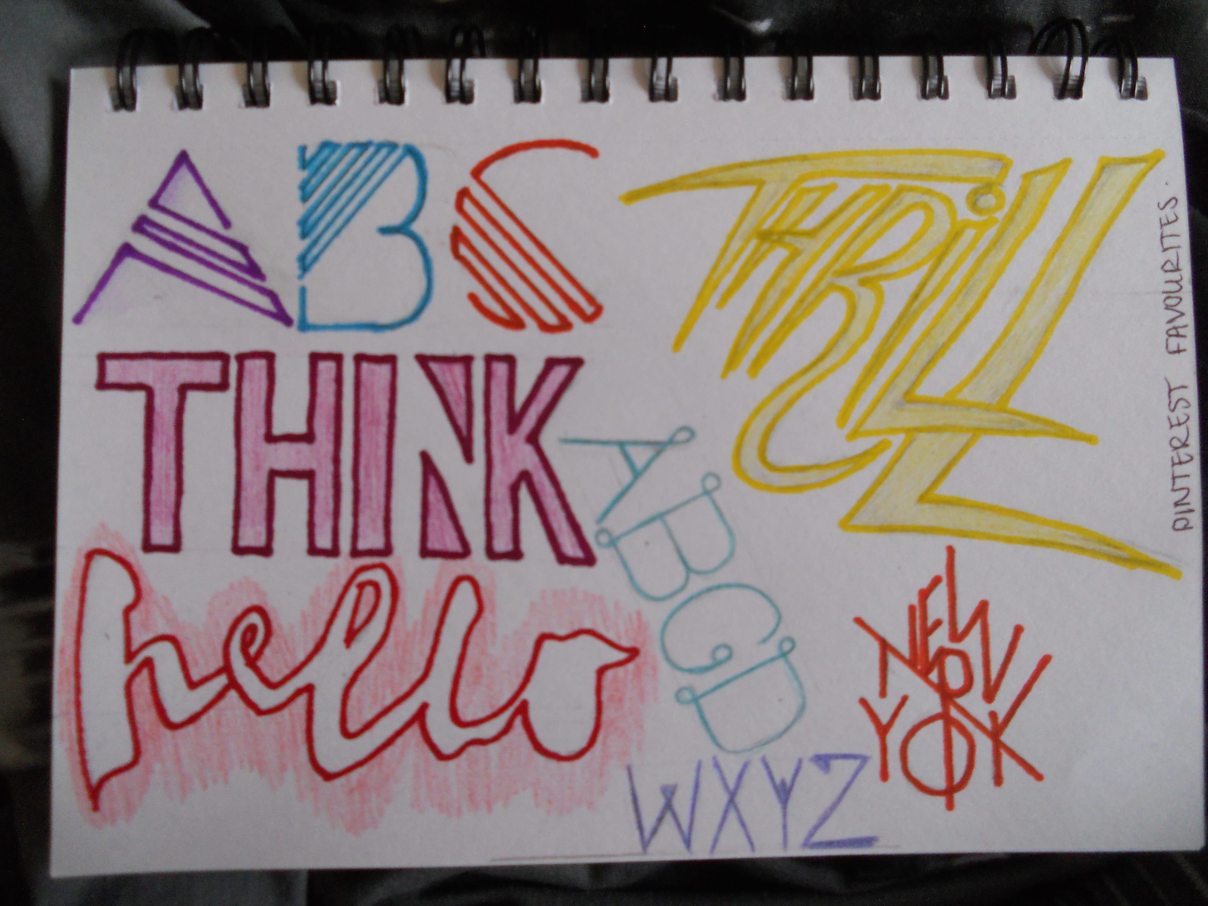
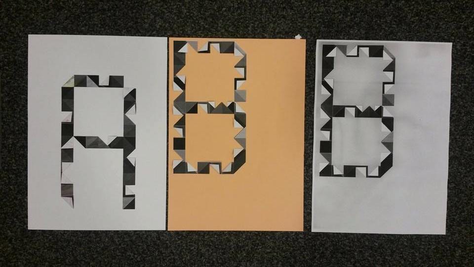
In todays workshop I decided to combine the craft of stencils and folding together. It was very useful to do this with the triangle style font that I picked. I first experimented with the ‘A’, I then photocopied it a few times, and experimented with holding the paper to give a textured style on top of the final font.


                                                      12077524_406805686110651_992084237_n                                  12087573_406805719443981_680984151_n


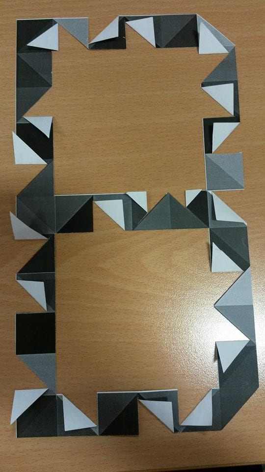
I then did the same with  the letter form ‘B’, however I included more folds with a couple different sizes,  I then photocopied it on a coloured piece of paper so it came out with a darker shade behind the font, I liked the smokey cloud effect it created. This was a great way of experimenting with stencils as it was different and unique from the others.

12081625_406805676110652_531085593_n

12064277_406805649443988_550479927_n


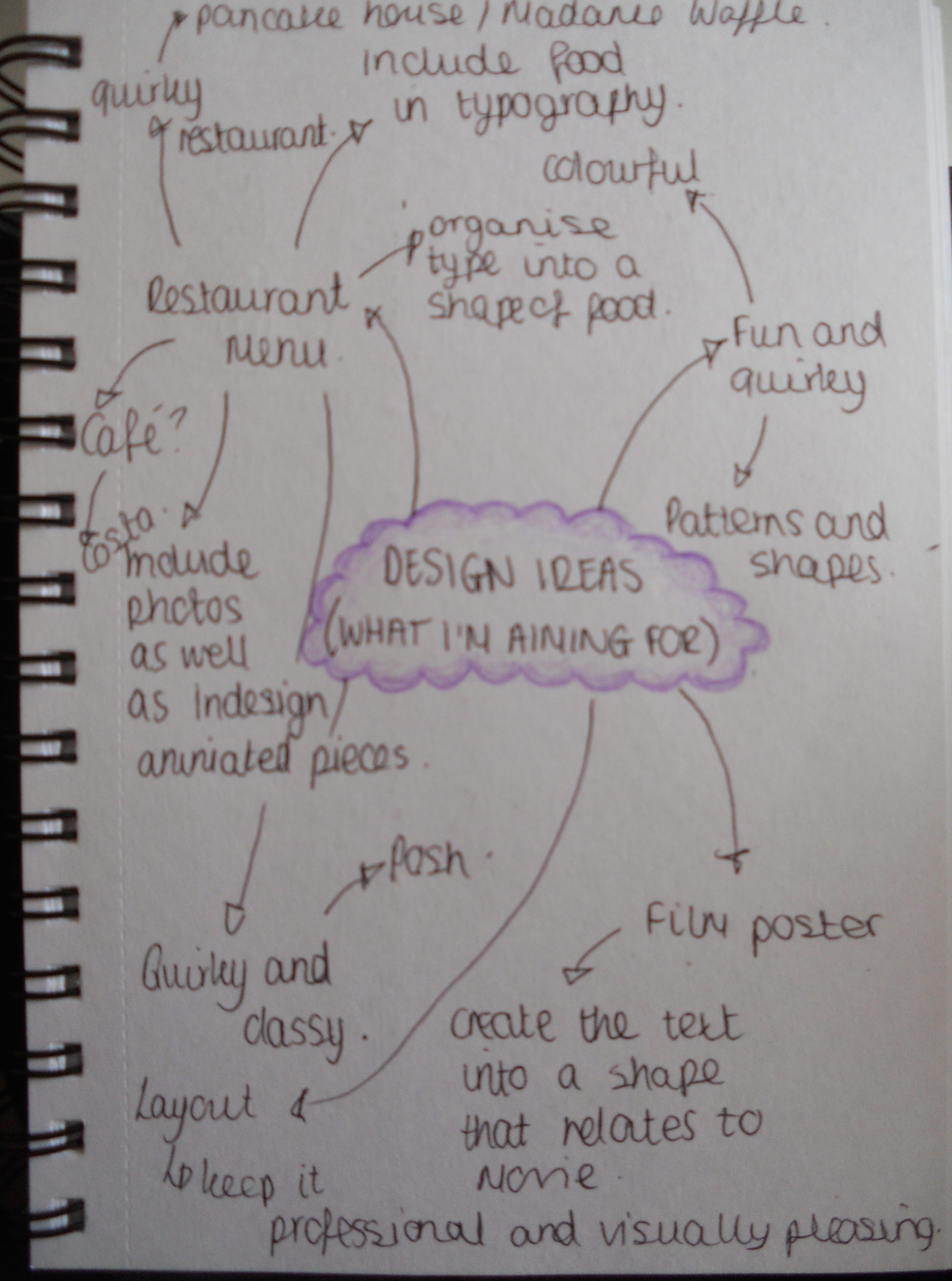
This workshop enabled me to experiment different ways of using hand on techniques and step away from the digital way of creating. This was really useful and made me think of new ways on how I would be able to include food in my designs, and one of those ways I would like to try is by using stencils and instead of using pens / pencils, I could use foods such as coffee beans / powder or flour.

27th September, 2015

COSTA COFFEE TYPE REVIEW.

I have recently been brainstorming ideas of what restaurant or cafe I want to create a new font for. I thought it would be a good idea to create a new font for Costa Coffee as they are a huge company and they have multiple products within the company that show off their name, for example, cups, napkins, uniform, menus and advertisements. Image below shows my ideas surrounding the recreation of the Costa typeface.

12064465_406466779477875_1589933946_n

 I also feel that I could experiment with this idea a lot, including using coffee beans and food into my design, also I could experiment with a traditional Italian style type to relate to their culture and relevance of where the coffee comes from. In particular I am very fond of the ‘Stiletto’ shown in the below picture. I am going to explore this in more detail and expand on this style.

 fontsinspiredbyItalybyWanderlustDesigner

Type+Place: 35+ Fonts Inspired by Italy

COSTA FONT CONTEXT.

I did some research and I started looking at the Costa font and typefaces, I found out that they (Costa Coffee) usually use ‘Clarendon’ / ‘Clarendon-esque Rosewood’. The reason for this is to remind us of the two Italian migrants who came over to England and stated that they ‘couldn’t find a decent cup of coffee’ by showing us a traditional English background ‘for large prints of Roman cityscapes’. Unfortunately I couldn’t find any other information on the actual logo and who created it.

25th September 2015

This week was the first week of lessons, we were introduced to the course and to our first brief, which is Typography. The aim of this brief is to create six original letter forms in both upper and lower case and also create example of the type being used in context. In our workshop we spent time looking on Pinterest searching for typography. By doing this I was able to get a rough idea of what kind of style I wanted to take on and what kind of ‘context’ I would like my font to be related too. I took time away from the work shop to carry on looking through Pinterest and then drawing some of my favourite fonts that I saw.


DSCN0018

Out of all the fonts I really liked ‘Thrill’ I thought it was a fun, expressive and very unique font style, it definitely grabs attention and I think any bold colour would work really well with this. This helped me narrow down that I wanted to create a font that was very expressive and striking. I would also prefer to use lots of colours or a bold colour that really jumps out to the spectator. I then went on to brainstorming ideas of context for my font, as I think if I have an idea on what item, product, advertisement etc that I am going to create the font for, I will work much better when it comes to creating the type.

DSCN0020

Overall, I have narrowed down, what I believe are the strongest ideas. These ideas are to create a font to go into either a restaurant or cafe menu. I think this is very unique to the brief and I can relate the font onto loads of products such as uniforms, napkins, cups, plates etc as well as the menus themselves.