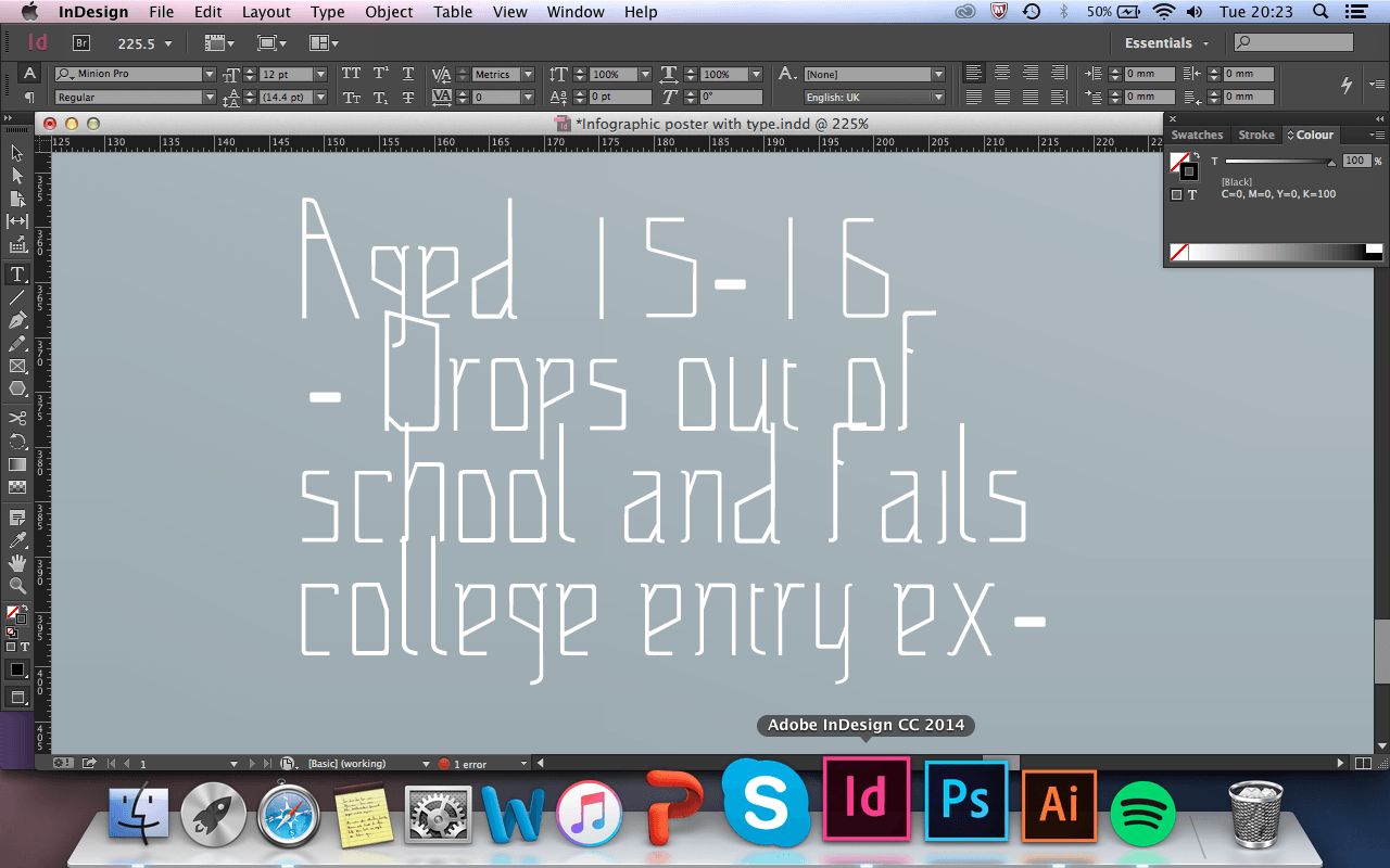
I have finally finished my first initial design for my A2 poster and info graphic, inspired by Rae Hoffman. Whilst doing this design I decided to not use placeholder text and write my own facts about Einsteins theories and his life on the timeline so the icons make a little bit more sense. However when typing out the text in my poster, I noticed that the font I was using in my website design had a lot of glitches in it, which caused the font to look very messy and odd.
So I went into Da Font and I chose another typeface that I thought would like nicer and neater. This is my design for the A2 poster:
I really am pleased with what I have so far as a design. Im going to ask for feedback from fellow peers and see if they would want to change any of it, and I also may add some shapes and ‘noise’ similar to the website and mobile design.
