Initial Alligator Design.

For my initial alligator design I took on the style from my first pastiche from illustrations I found on Pinterest. Firstly I drew out my alligator to make sure I get the right proportions before I make it digital. I then stuck with the colour scheme when putting the illustration all together.


I then decided I still like the grain effect and applied this to my design. I also decided that I didn’t want to add any drop shadows and just keep it as a flat image. I then darkened the colour of the alligators body and added eyes. I then went back to look at the other illustrations I created and really liked the effect of the two tone gradient colour scheme of the body so I added this effect to my alligator in the main body, feet and spine. I also added more teeth.

Digital Illustration Pastiches.

From the research I did recently on alligator/crocodile illustrations from Pinterest, I decided to have a go at copying these styles in Illustrator to see if I liked any of the styles or techniques. I really like the style of the first image and I feel that the quality is much better with this one. I had to use photoshop effects to recreate the watercolour effects however this appeared to really blur the illustration as a whole and I want to keep my illustrations sharp. I think I am going to develop this style further in different positions and different appearance.alligator pastiches-01 alligator pastiches-02 alligator pastiches-03 alligator pastiches-04

Alligator Illustration Research.

I have decided to go back to research and see what other styles I can apply to my alligator design. I did some realist Alligator research drawing, however I feel that if I want to add character and a fun element to my designs I will have to stick to basic and cartoon illustrations. I searched on Pinterest to see if I could find some fun illustrations that showed lots of character to the drawings, these are my favourite:

b9505c27fc4cde2515c876091672e4a6 e5fd5bad1a40f28019d061e1ec67c9ca d99584b00f42f8da2978a2e128546eff 400661ecb839b989eecdf6dae5464f6a 794ffc8f3cf765bb2077954b838d712c 879ab40b20c55e196606f9a24ce0389b c58f922b02ceed00b9c9045244b9157a 8d7fc8d10f896baa001deebb7ba0dc36 d5a99e4d95e57a2fe62f7493a0252e80


What I like most about these illustrations was how they portrayed the alligators as being friendly, cute and harmless which I what I want to show in my illustrations too. I also like the use of watercolour effects to relax to the fact Alligators habitat is lakes and water. When I am home over easter I would like to get the watercolours out and experiment with paints, as I feel it would give a different effect than if I made it digitally, even though I prefer digital work overall. I plan to experiment most, if not all of these styles so I am going to create some pastiches and see which style I enjoy the most and looks the strongest.

The Anxious Alligator, Typography Research.

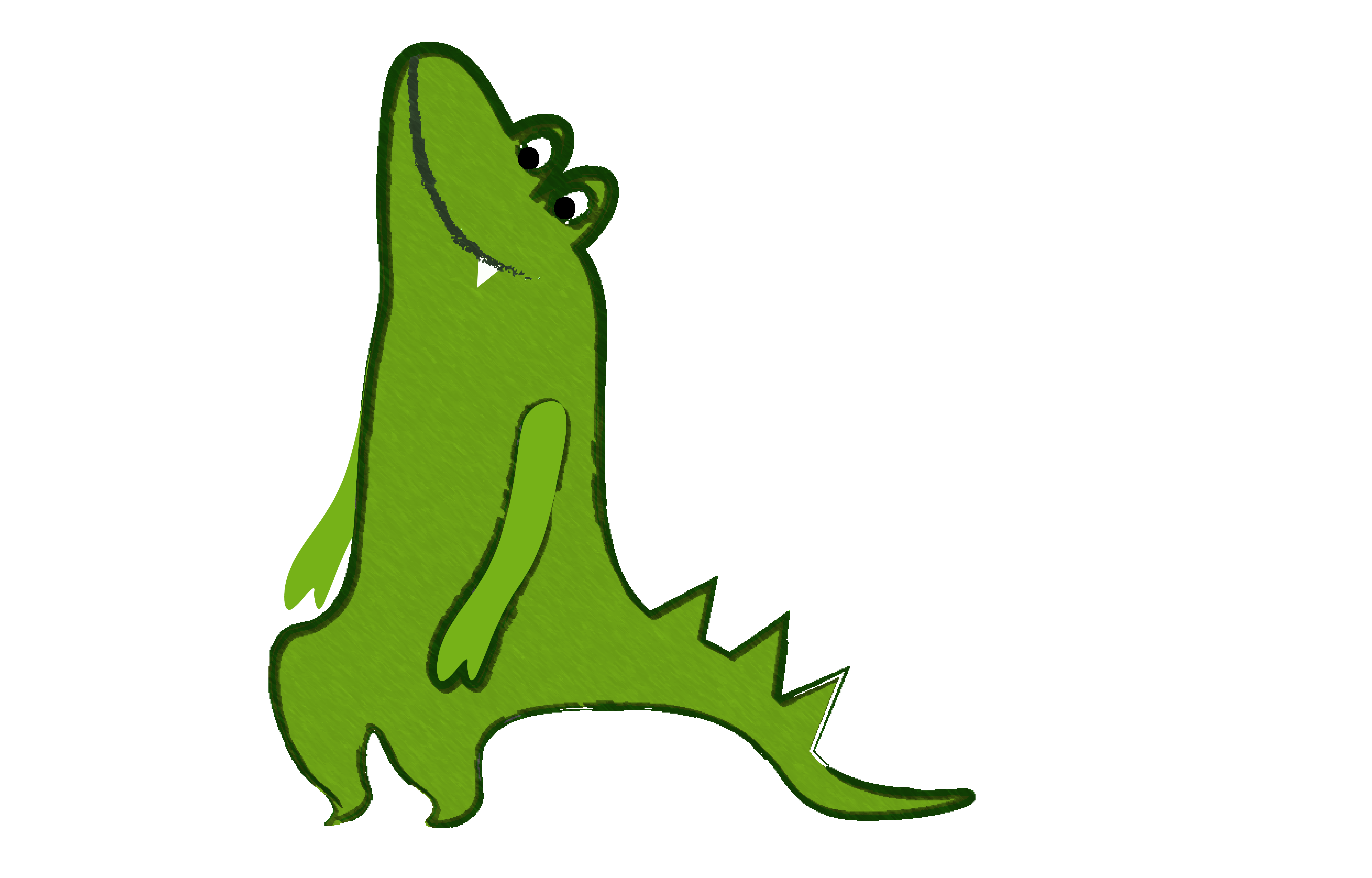
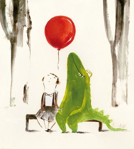
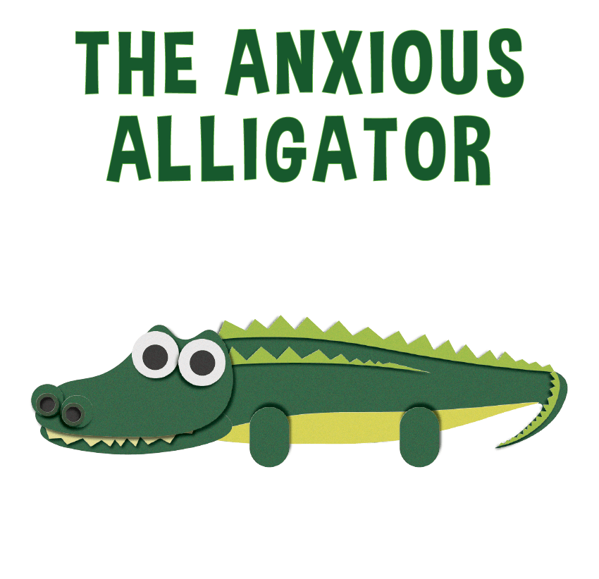
I have passed my design around and decided to focus a lot more on the Anxious Alligator story. So I felt I should research and practise into some other fonts that would compliment the look on the front cover of my picture book and also keep the theme of simplicity and cartoon like. I went onto dafont.com for all of my fonts as I have previously seen some really good fonts that will compliment against my designs, I am including the “Ice Age” font as a consideration however my analysis of that isn’t in this post as its in the previous one.

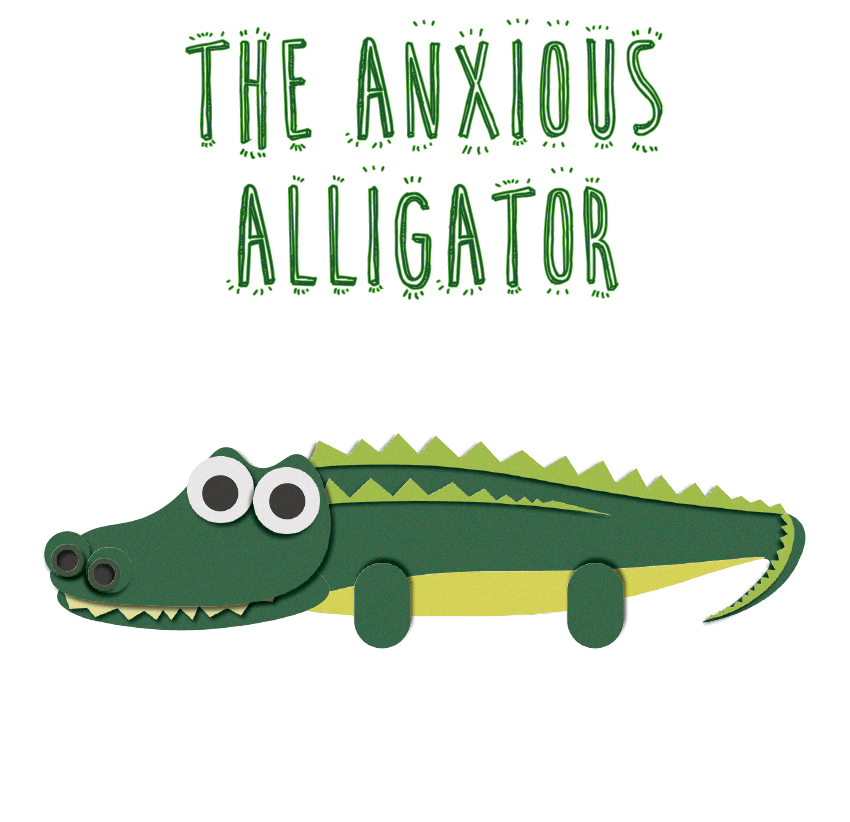
The first font I downloaded was “Cute Cartoon”. This font stood out to me as its very different, without using too much detail. However, compared to my alligator design, I feel as if it doesn’t match the style of my book. I also feel like each letter is quite narrow and it doesn’t fill out the front cover as much as I want it too. However I do like the coloured outline and keeping a transparent/ white fill on the each letters.


Anxious Alligator Front Covers


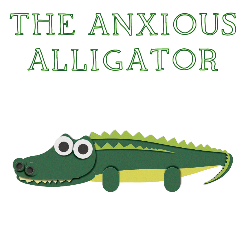
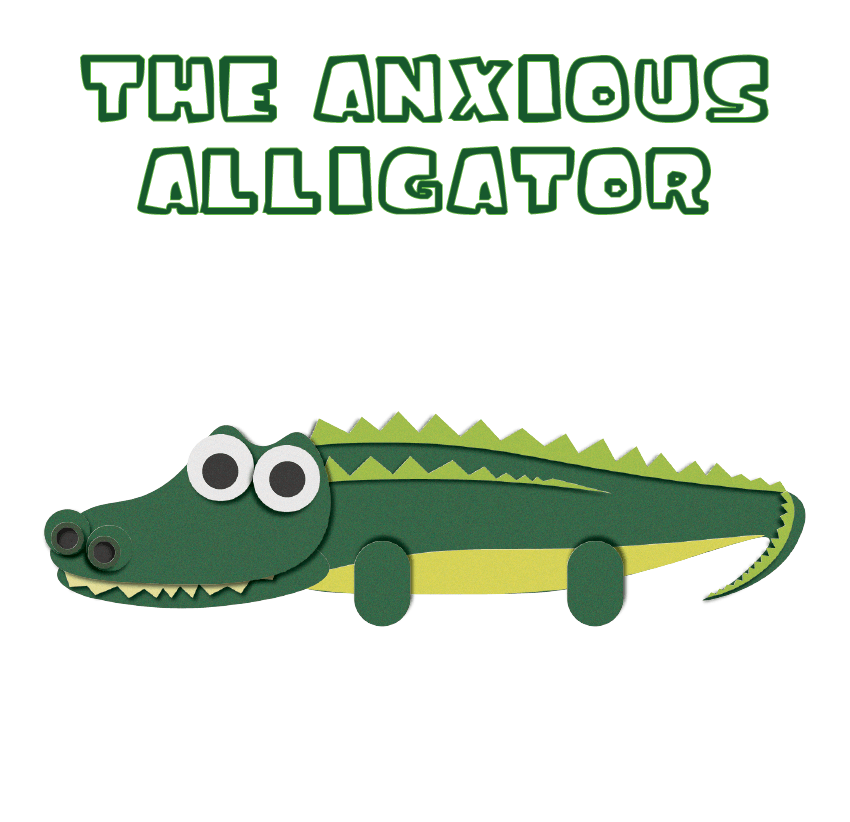
I really like this typeface. Its called “Orange Juice” and I really like how its fit on the page. I feel it compliments the design of the alligator and it stands out a lot without complicating the text. It also keeps the element of the white fill and letting the outlines stand out. To improve I think I need to make each letter have a bit more space between each other, to avoid any overlapping of the letter. I think if I was to choose this font I will have to look into another font for the writing inside the book depending on how much I plan on writing in the story as its very bold.

Anxious Alligator Front Covers2


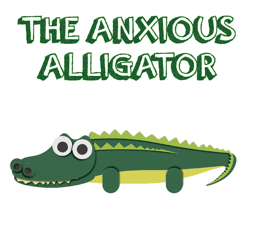
This font is called “Dimbo”, I downloaded it originally as I thought it was very bold and it would go well with my design. As I think it would be suitable for the cover and the inside of the book. I really like the shape of each letter and how its slightly crooked, I feel that this font would be very practical for my demographic and it doesn’t out stand the design.

Anxious Alligator Front Covers3


This typeface is actually called “The Childrens Book”. I really do like this font in terms of style and the space it takes up on the page. However I feel as if I should go for something a little more unique and different as when looking at this design I do feel like I have seen it before. I also think the outline is too thin, and when its next to the animation its actually quite hard to read as there is a lot of white space.

Anxious Alligator Front Covers4


Animal Designs.

I have spent the last few days animating different animals on illustrator in the same style as the chick. I first made a dog and a caterpillar just to try out the technique out more and also experiment with shapes and colours.

Dog

I then went onto relating it to the theme of the story. As I was going along the lines of “loneliness” or “anxiety” I chose to create animals that started with an L or an A, as alliteration is quite traditional and common in children’s books. So the four animals I animated was a Lion, Lemur, Alligator and Antelope. I then downloaded a bold and simple font which was called “Ice Age” (from the Ice Age films)

Picture Book Front Covers Picture Book Front Covers2 Picture Book Front Covers3

Picture Book Front Covers44


What I am really enjoying about this style is the different textures, colours and tones. I am still undecided on which animal out of the four to chose from and I still have a bit of work to do on the antelope illustration, despite the fact I am leaning towards The anxious alligator design and the lonely lion. I am thinking of still using these other animal designs as supporting character designs, despite which one I pick. I also like the idea of having a complete white background. I may however, illustrate grass and some minor features for the background, however I do really like how its bare, I think it brings out the colours in the title and the animal really well.