I downloaded some psd mock ups and added my design onto them:
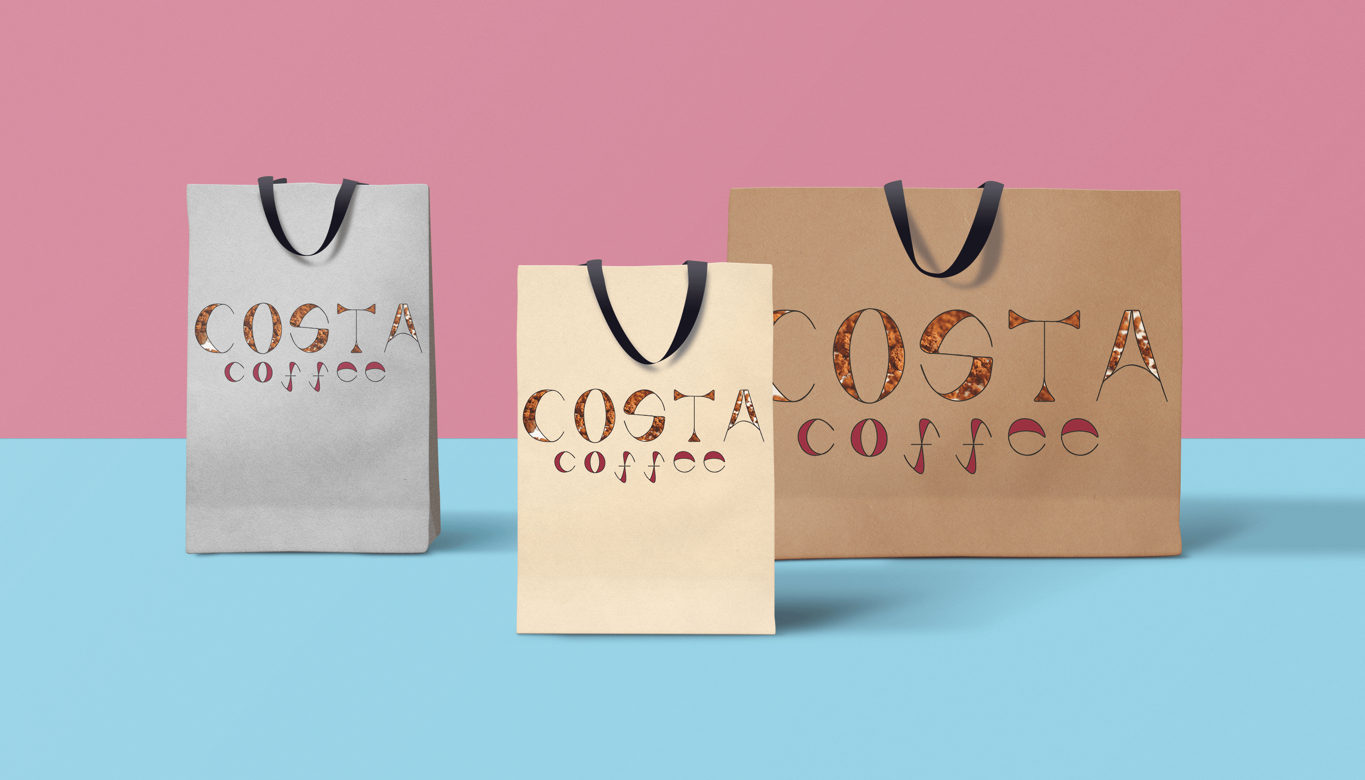
I downloaded some psd mock ups and added my design onto them:
After editing the outlines in Illustrator, I started again applying the stencil effect into it. I placed a professional photo of coffee granules that had some blurry parts in it to create distance and texture behind the font. I made the lower case ‘coffee’ have the original ‘Costa’ coffee colour (magenta). I really do like this font, making all the letters lower case kept the design a lot more continuous and flowing. Keeping the style of ‘stencils’ and the background of coffee granules keeps the font relevant to the market but also I did it because I liked the theme of using food integrated with letter forms. The only thing I feel that would have been good was to carry on with developing the idea of physical design of the stencil behind actual coffee granules and taken professional photos of it.
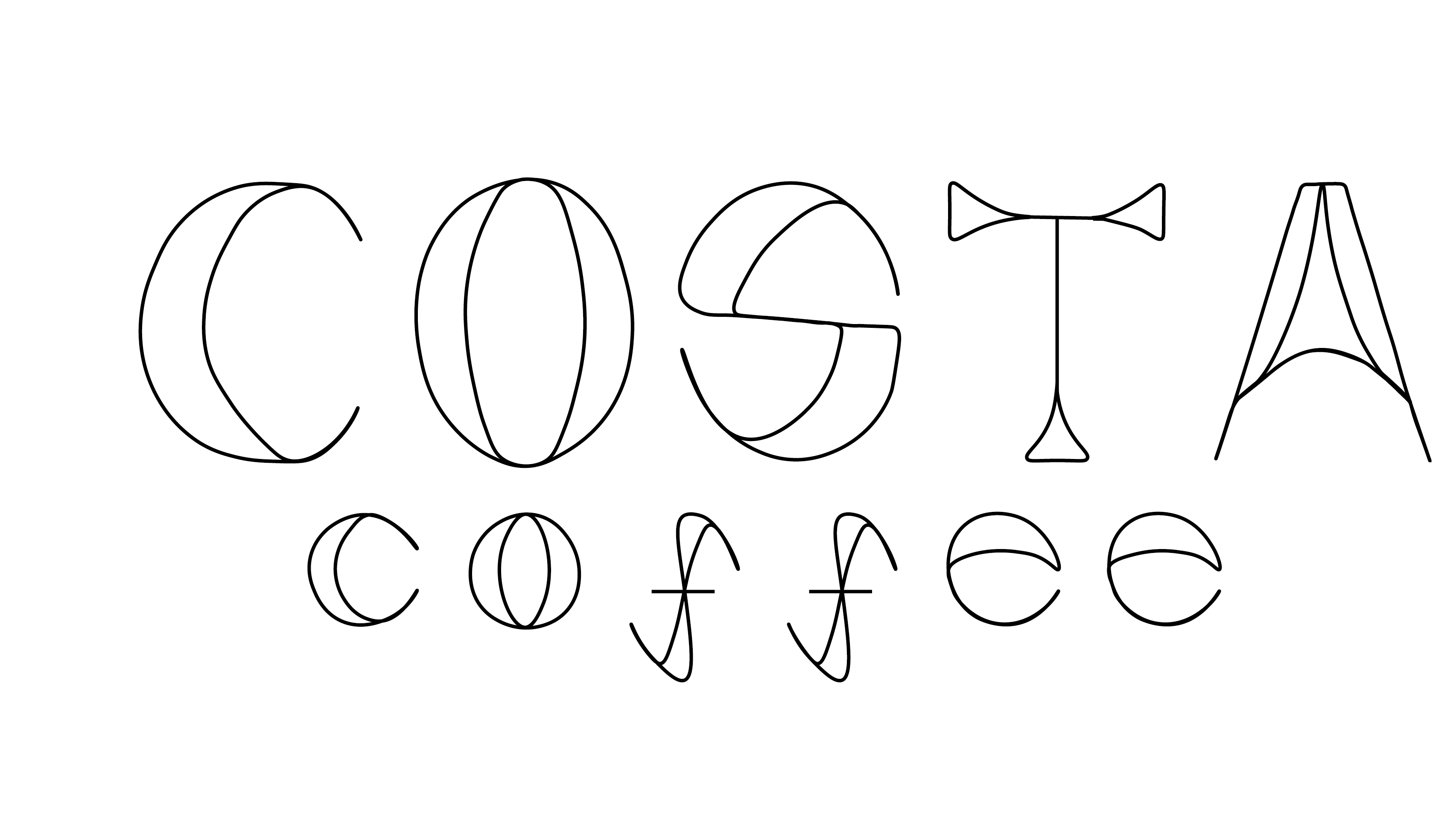
FINAL FONT (PDF of the font with background)
In our workshop today we looked at creating professional presentations using Indesign. We did this by following a step-by-step guide that Chris made prior the workshop.
First we typed our name and experimented with different adjustments and placements.
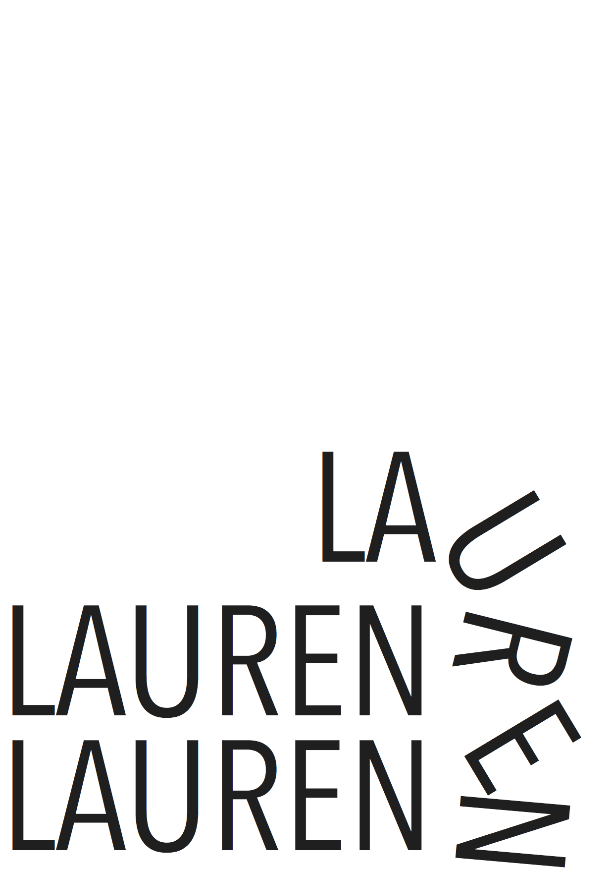
After we did this, we printed the image and cut it into shape so we had no excess white parts. I then scanned the image back through the the computer with the scanner lifted up so it created a nice effect on the letters.
![[Untitled]](https://laurenchandlerdesignlevel2.blogs.lincoln.ac.uk/files/2015/10/Untitled.png)
After doing this I opened up Indesign and created a 6 page practise presentation, including images from Indesign and scanned images.