Alligator Illustration Research.

I have decided to go back to research and see what other styles I can apply to my alligator design. I did some realist Alligator research drawing, however I feel that if I want to add character and a fun element to my designs I will have to stick to basic and cartoon illustrations. I searched on Pinterest to see if I could find some fun illustrations that showed lots of character to the drawings, these are my favourite:

b9505c27fc4cde2515c876091672e4a6 e5fd5bad1a40f28019d061e1ec67c9ca d99584b00f42f8da2978a2e128546eff 400661ecb839b989eecdf6dae5464f6a 794ffc8f3cf765bb2077954b838d712c 879ab40b20c55e196606f9a24ce0389b c58f922b02ceed00b9c9045244b9157a 8d7fc8d10f896baa001deebb7ba0dc36 d5a99e4d95e57a2fe62f7493a0252e80


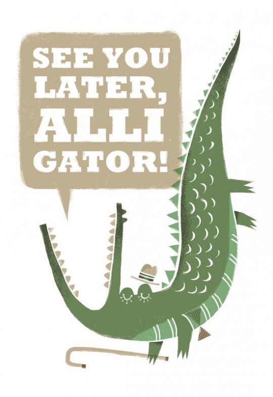
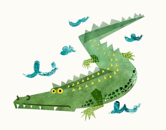
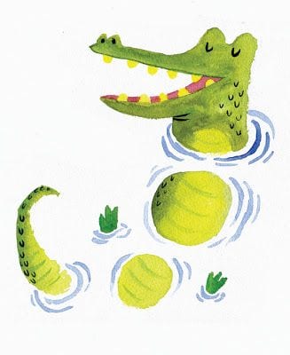
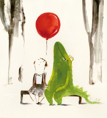
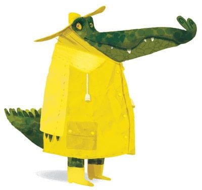
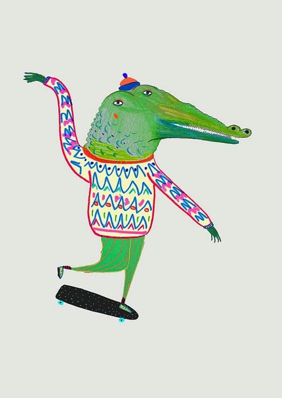
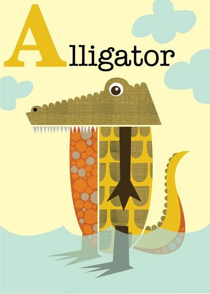
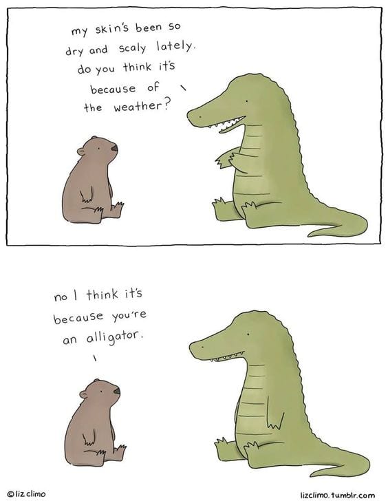
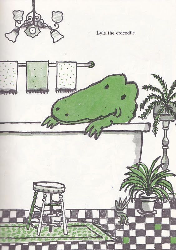
What I like most about these illustrations was how they portrayed the alligators as being friendly, cute and harmless which I what I want to show in my illustrations too. I also like the use of watercolour effects to relax to the fact Alligators habitat is lakes and water. When I am home over easter I would like to get the watercolours out and experiment with paints, as I feel it would give a different effect than if I made it digitally, even though I prefer digital work overall. I plan to experiment most, if not all of these styles so I am going to create some pastiches and see which style I enjoy the most and looks the strongest.

Website Layouts

For my company website layout, I wanted to keep mine a simple grid layout to show text box’s and images in a clear manner. For inspiration I looked at website layouts on Pinterest to see what worked well and keeping it modern in terms of style and trends.

0152e3d8fd91eca574ae227cd184a9e9 ae81b6a85e38551eaf1e9c4d8fdd1e52 7cd3797bccbeed75569c7ceb13d52f9f


I realised that most of these designs stuck to a grid layout and used a lot of images. I took these designs in mind and started designing my own website. I used my colour scheme and placed my logo on the top left of the page with the navigational bar along the top. I need wanted images that swiped across the page and hyperlinked to different pages. I also searched for free stock images to include in my webpage of people with tattoos and tattoos being created. I did my first website draft in photoshop, this is what I was working on, however I stopped and started it again but developing it in InDesign:

HIGH SEAS INK WEBSITE


PROJECT 3 – BRANDING AND IDENTITY

For Project 3, we were given examples of several made up companies and asked to pick one to design and create branding medias for that company. The one example that stood out to me was the company ‘High Seas Ink’ as the theme and iconography of pirates, ships and the seaside came straight into my mind, which is one theme I would love to work on. I thought this was a great way to expand ideas on paper and digitally to create a mix of both modern and vintage materials to make ‘High Seas Ink’ appear like a successful company in its market area.

I have also taken advantage of critisms from my first and second projects, which stated I needed to develop my skills in layout and typography. I have started drawing and experimenting with paper and pen for my typography for my logo and the name of the company. I am also currently drawing my first draft for my logo, with the help of influences on Pinterest, mainly of images of ships and anchors:

45f60b48e3eff5a6dc507fe123183ae2

34c966ce22c5ff3bdd1ec7a481ead958

cadd8474bec66a6e5ddcd383e45ed500

6d7d520cf6a93e16c3340e546b5b5a1d

As I was looking for influences on my logo, I can across this image of tattoos, and I had originally thought about including paint and ink splatters onto my designs, I really like this idea and I want to experiment with this for this project, I love the effect all the colours have together.

810989193acf8344af02e094b9048705