For Project 3, we were given examples of several made up companies and asked to pick one to design and create branding medias for that company. The one example that stood out to me was the company ‘High Seas Ink’ as the theme and iconography of pirates, ships and the seaside came straight into my mind, which is one theme I would love to work on. I thought this was a great way to expand ideas on paper and digitally to create a mix of both modern and vintage materials to make ‘High Seas Ink’ appear like a successful company in its market area.
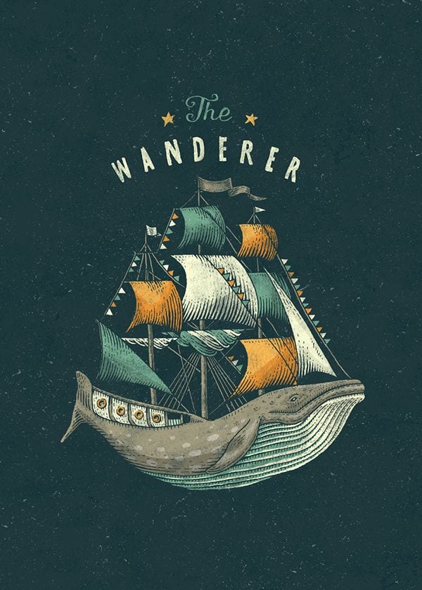
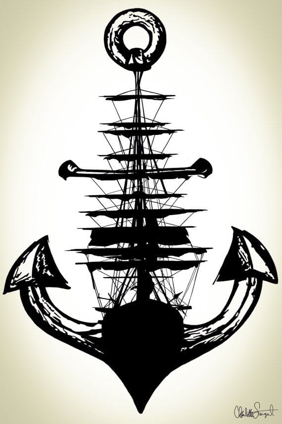
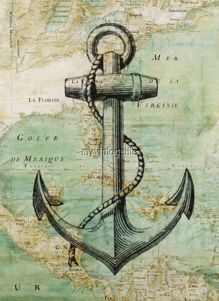
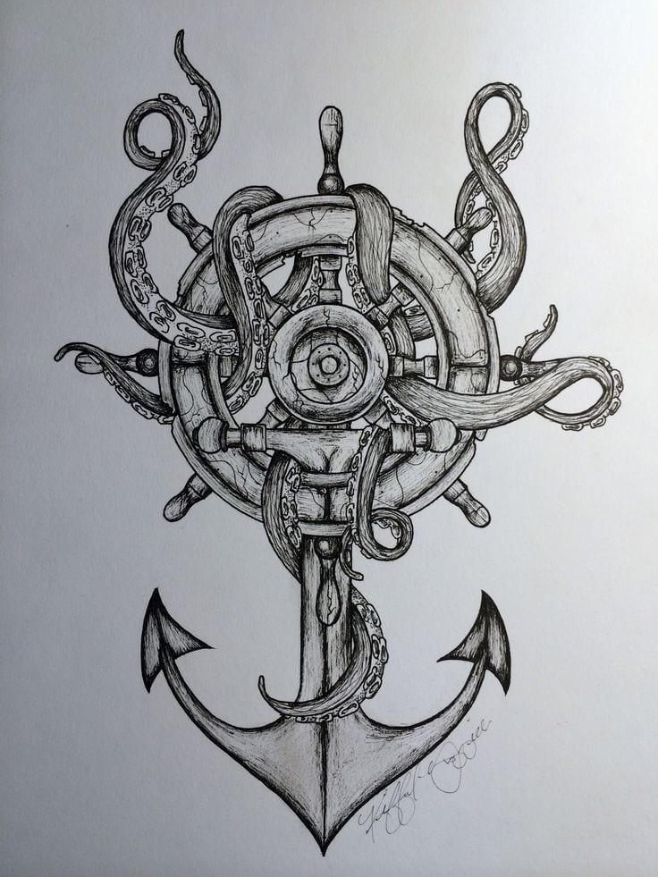
I have also taken advantage of critisms from my first and second projects, which stated I needed to develop my skills in layout and typography. I have started drawing and experimenting with paper and pen for my typography for my logo and the name of the company. I am also currently drawing my first draft for my logo, with the help of influences on Pinterest, mainly of images of ships and anchors:
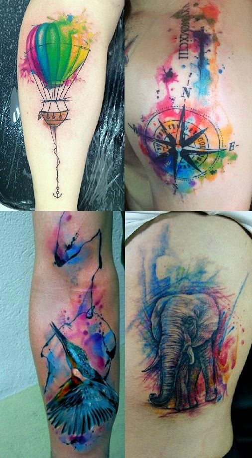
As I was looking for influences on my logo, I can across this image of tattoos, and I had originally thought about including paint and ink splatters onto my designs, I really like this idea and I want to experiment with this for this project, I love the effect all the colours have together.
