Business Cards

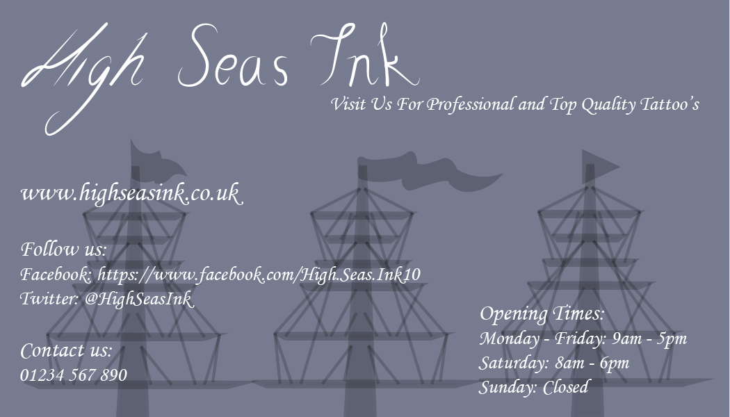
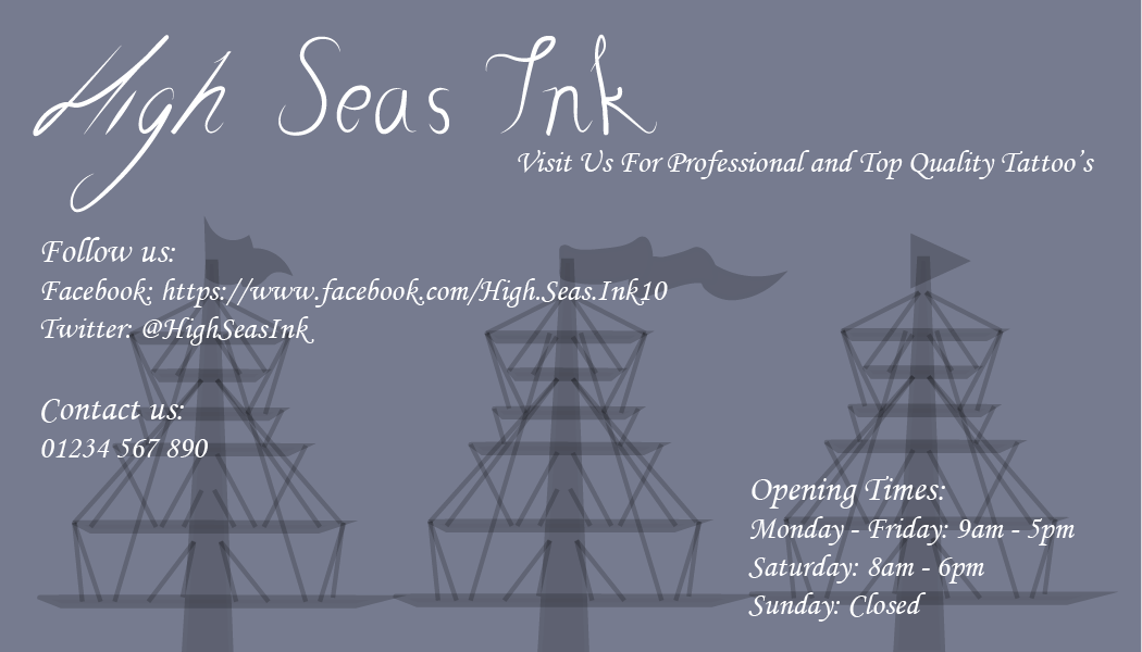
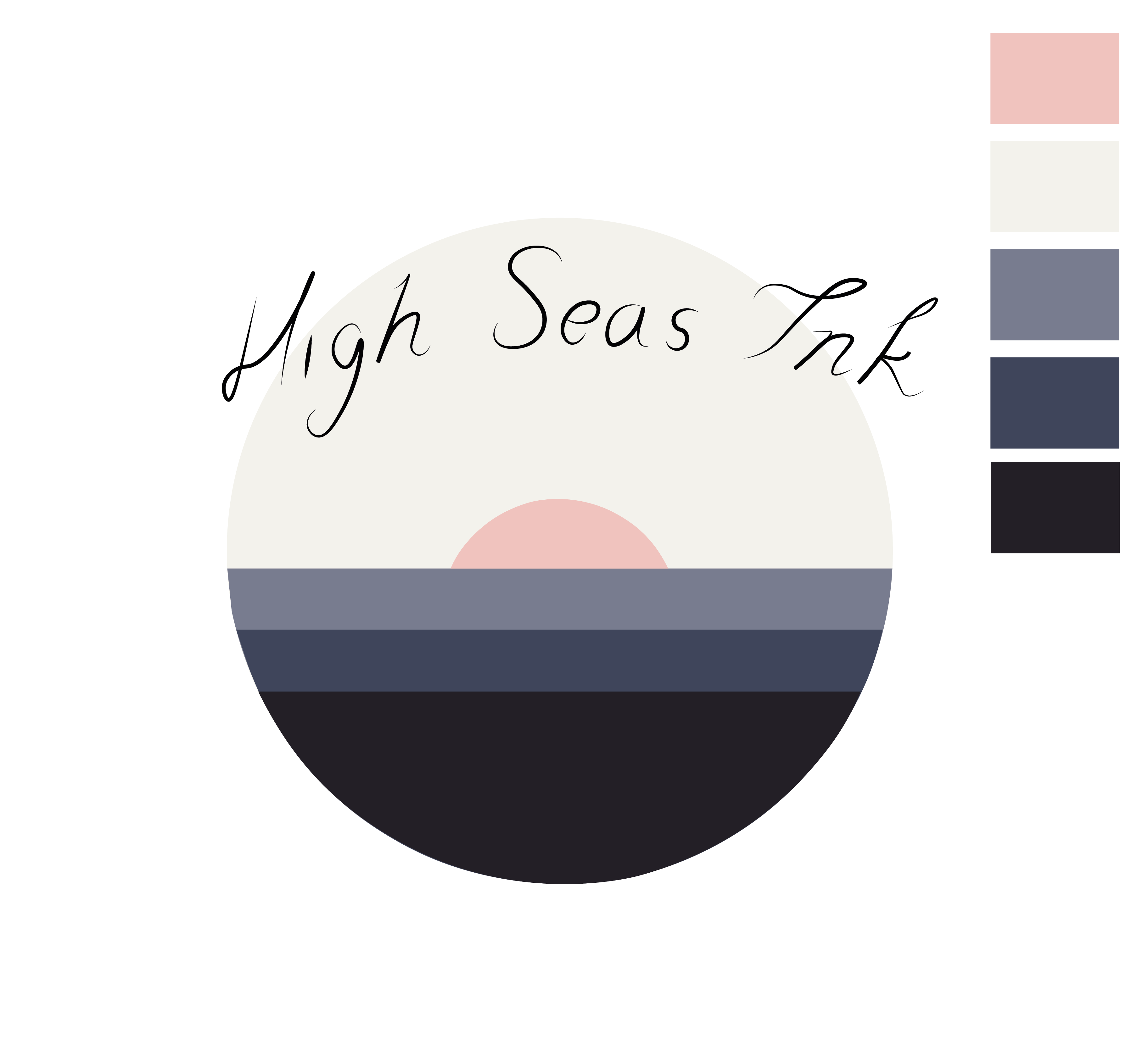
I started designing business cards for my company, using my colour scheme, logo and supporting graphics I experimented with earlier in the project. I showed my initial business card design in the workshop group review and their was a couple reviews and mistakes that I needed to look over, the mistake was that I stretched the company font to make it look slated which I amended and then I changed the font of the text for the information at the back of the card. The other critic was to use a different font, so I used one more basic, however I’m not sure if I liked this as it didn’t fit with the rest of the theme, so I will keep the calligraphy font for the basic information:

business cards2-01

BUSINESS CARDS-02

BUSINESS CARDS-01-02

business cards 2-02

business cards2-02


Business-Card-Mockup-Presentation

Website Layouts

For my company website layout, I wanted to keep mine a simple grid layout to show text box’s and images in a clear manner. For inspiration I looked at website layouts on Pinterest to see what worked well and keeping it modern in terms of style and trends.

0152e3d8fd91eca574ae227cd184a9e9 ae81b6a85e38551eaf1e9c4d8fdd1e52 7cd3797bccbeed75569c7ceb13d52f9f


I realised that most of these designs stuck to a grid layout and used a lot of images. I took these designs in mind and started designing my own website. I used my colour scheme and placed my logo on the top left of the page with the navigational bar along the top. I need wanted images that swiped across the page and hyperlinked to different pages. I also searched for free stock images to include in my webpage of people with tattoos and tattoos being created. I did my first website draft in photoshop, this is what I was working on, however I stopped and started it again but developing it in InDesign:

HIGH SEAS INK WEBSITE