For our next project we are looking into designing and illustrating our own children picture books aimed at a demographic of 3-7. I started looking at children books that were my favourite when I was younger and looked at their designs, I looked at books such as:
“Eat Your Peas”

“The Tiger Who Came To Tea”

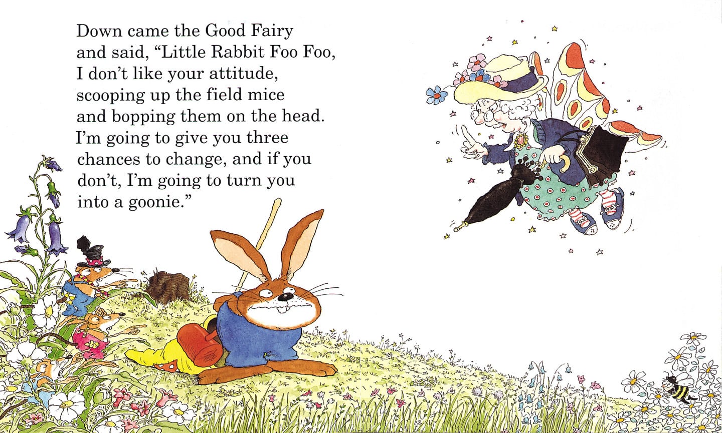
“Little Rabbit Foo Foo”
“Kipper”
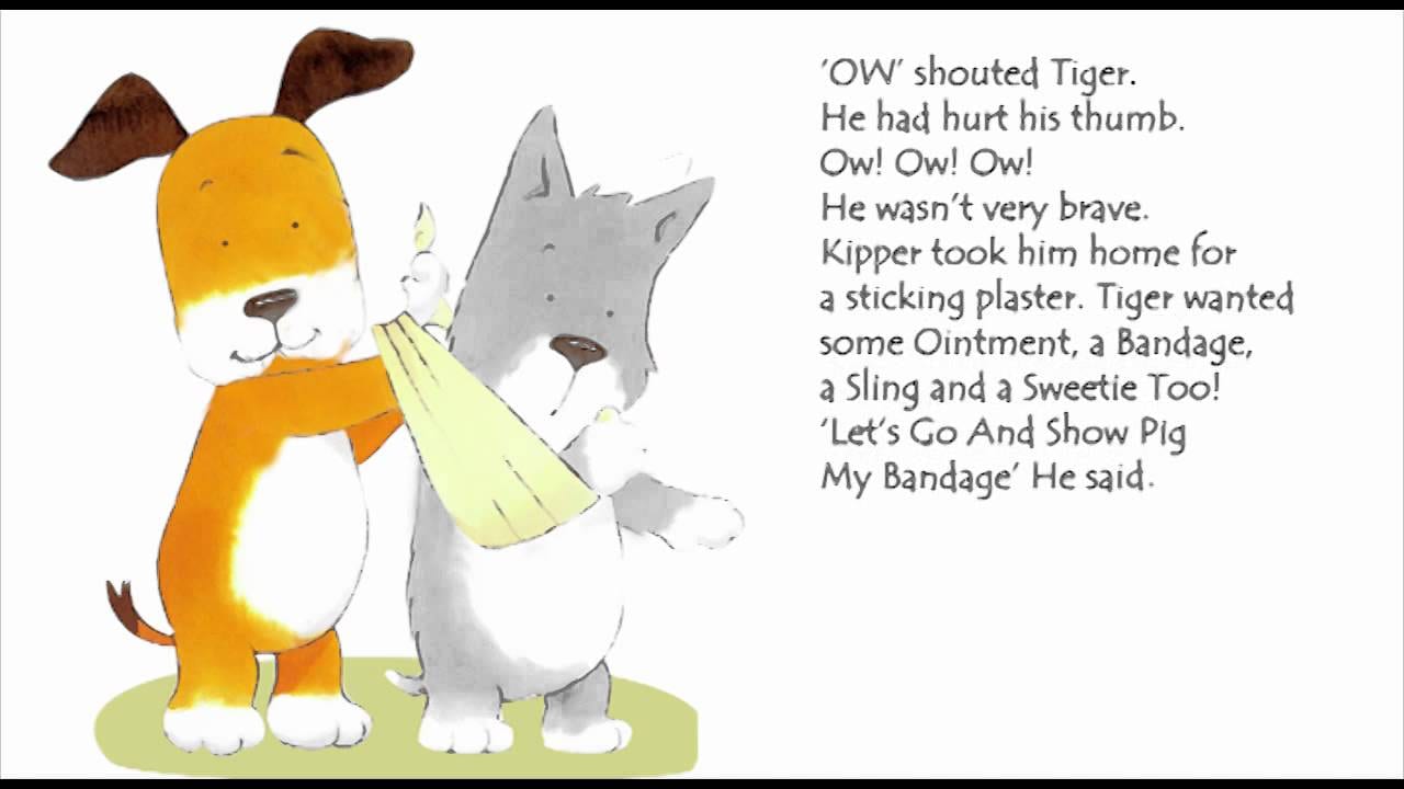
Looking at these designs are very illustrative and designs like the ones in “Little Rabbit Foo Foo” and “The Tiger Who Came To Tea” made me decide that I want to go down the simplistic and minimalistic route for my picture book. So I then went onto looking at the pictures books by Simon Rickerty, especially “Monkey Nut” and “Crayon”, I really like how simple these designs are and keeping a simple colour scheme.
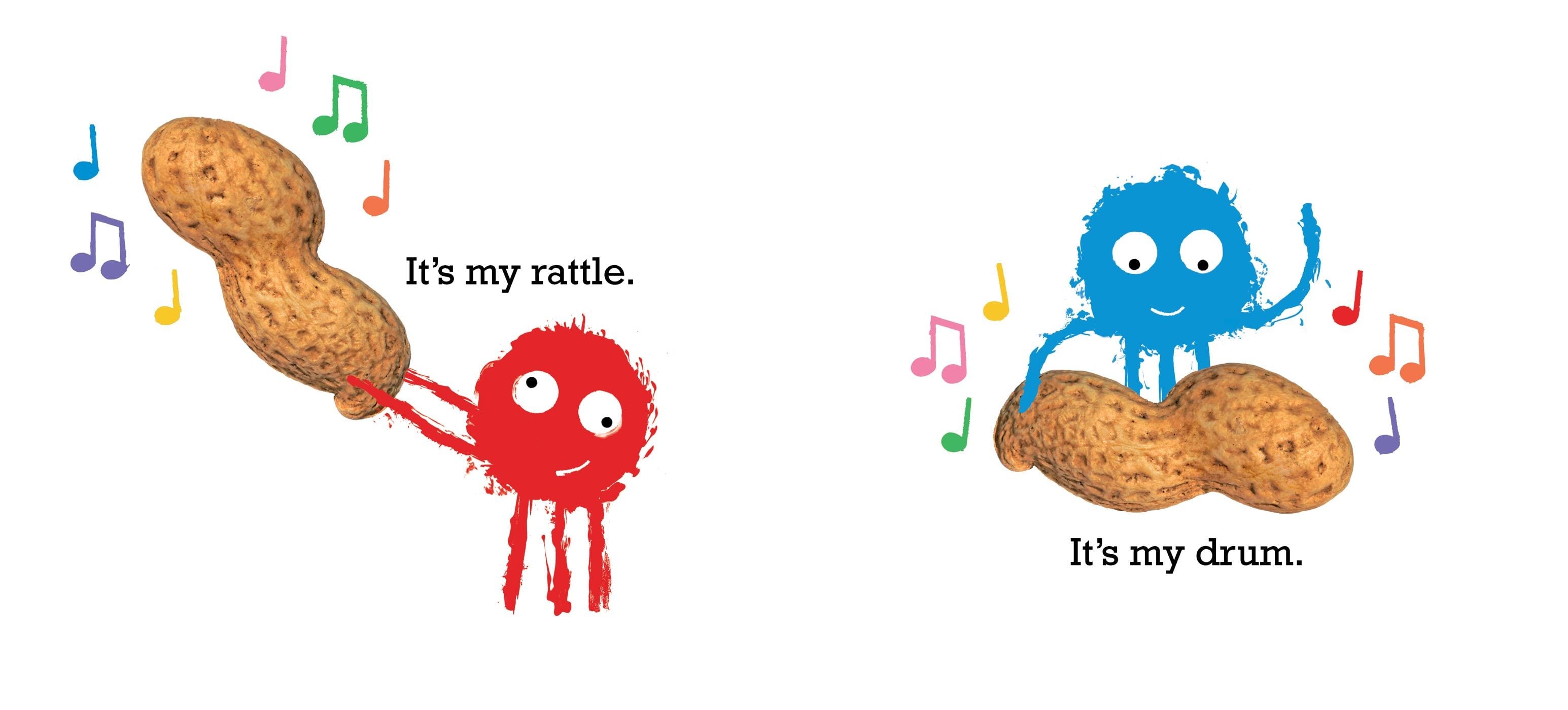

I also really like how he has added real photos of objects that are crucial to the story. I am going to keep my style similar to this as it is very visually engaging without being too overcrowded or busy.