Logo Development.

I looked back into my influences and took this image:


34c966ce22c5ff3bdd1ec7a481ead958


I really like this image and decided to created my own version on this on graph paper:

Scan 160260001


I then scanned my sketch into illustrator and used the line, curvature and pen tool to create this digitally, I really like this design and I want to develop this further. I am considering adding ink splatters to this design, and adding colours that I would like to be the companies colour palette.

High Seas Ink Logo Idea

Further Development on Font

I spent last night drawing each type separately to develop the companies name further. I kept it similar to my previous styles, however I combined the two:

Scan 160250001-1Scan 160250001-2

Scan 160250001-3 Scan 160250001-4 Scan 160250001-5 Scan 160250001-6 Scan 160250001-7 Scan 160250001

Scan 160250001-10Scan 160250001-8 Scan 160250001-9

I then took this font and compared it to an updated font draft I also drew, to see if it went well with the style. I do feel like the font is too fancy compared to the theme of pirates. I also am not completely satisfied with the logo design as there’s too many elements and I feel like the logo should be kept simple for it to be successful.

Scan 160250001-11

I want to re-design this and combine the anchor and a ship together, inspired by an image I saw on Pinterest earlier last week. I am also going to experiment with drawing the font in a rope style.

Shoreditch Existing Tattoo Parlours

I had a look at existing Shoreditch Tattoo Parlours to help me think about what kind of styles and layouts already exist so I can develop something new to that area. I found these websites which are tattoo parlours in that area and I looked at their different logos:

http://goodtimestattoo.co.uk

Screen Shot 2016-02-17 at 15.16.44

Home

Screen Shot 2016-02-17 at 15.18.20

Home

Screen Shot 2016-02-17 at 15.20.08

http://www.shalladoretattoo.com

Screen Shot 2016-02-17 at 15.22.10


Most of these companies take on a black and white colour scheme and either go with a gothic style or a simplistic design. I want my design to be simple but I also want to add some colour to it which will give it uniqueness, giving it a distinctive type and a colourful logo.

Developing A Font and Logo

I have been researching into popular tattoo fonts and also looking more into the possibly logo inspirations. I started drawing this weekend what my font and logo could look like, I decided I’m going to go for an anchor as my main base but somehow include elements of a 1800’s HMS Ship. This was my rough first idea:

Scan 160250025


I then started thinking in more depth about my typography that I wanted to use for the companies name. I looked on dafont.com and searched for ‘script’ types. I found two tattoo inspired fonts and then combined the two, this was my first sketch:

Scan 160250027


I really liked this style, however I was a bit too fancy for what I needed. I drew it again, with less curves and made sure the capital letters joined up to each other


Scan 160250027-1


I like the boldness of the font and the different thickness in the form of each letter. I like the fact it keeps in the ‘tattoo script’ style but strays away from it through the spacing and the different parts of thicker line. I plan on developing this more, focusing on each letter separately.

PROJECT 3 – BRANDING AND IDENTITY

For Project 3, we were given examples of several made up companies and asked to pick one to design and create branding medias for that company. The one example that stood out to me was the company ‘High Seas Ink’ as the theme and iconography of pirates, ships and the seaside came straight into my mind, which is one theme I would love to work on. I thought this was a great way to expand ideas on paper and digitally to create a mix of both modern and vintage materials to make ‘High Seas Ink’ appear like a successful company in its market area.

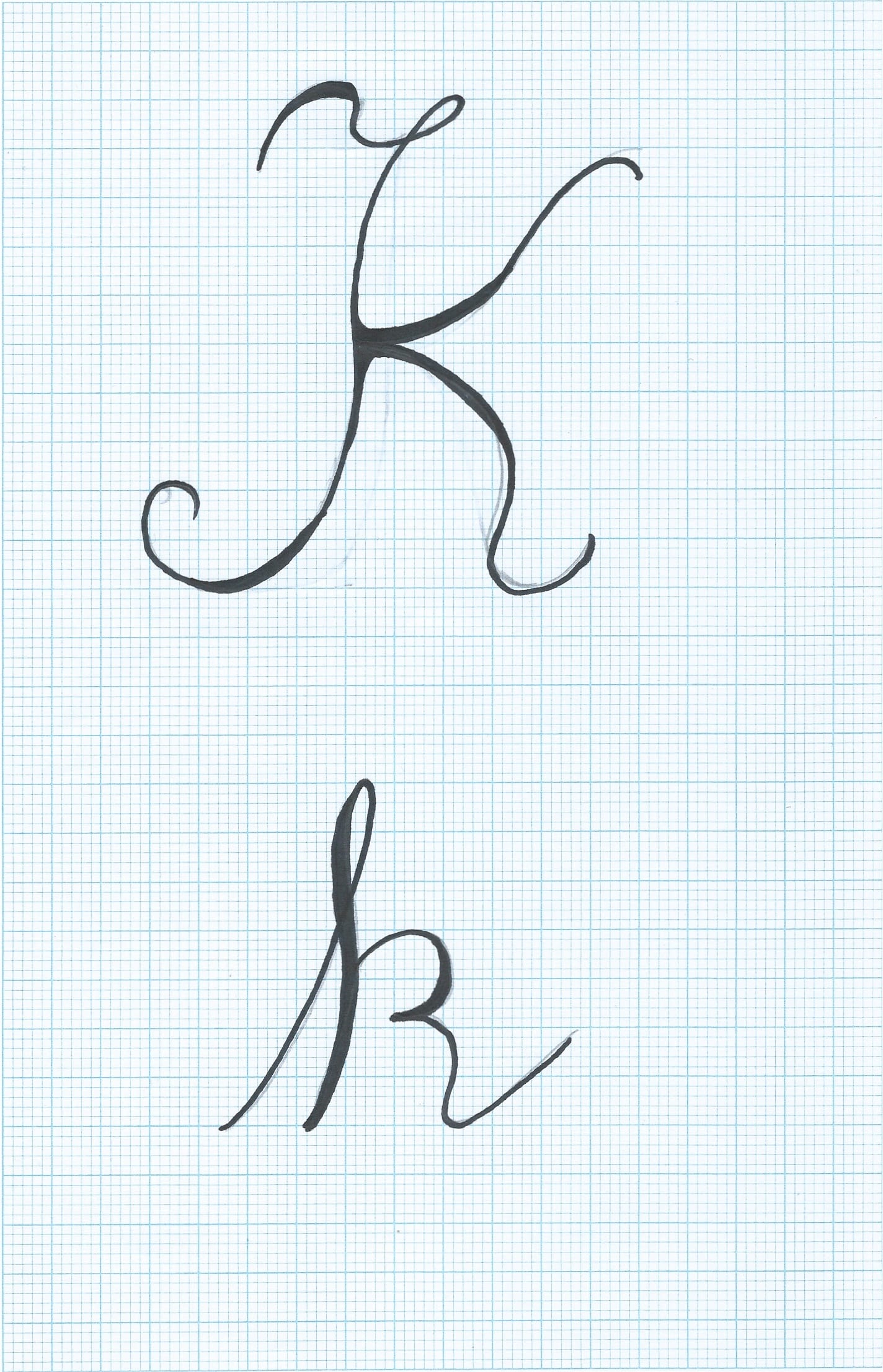
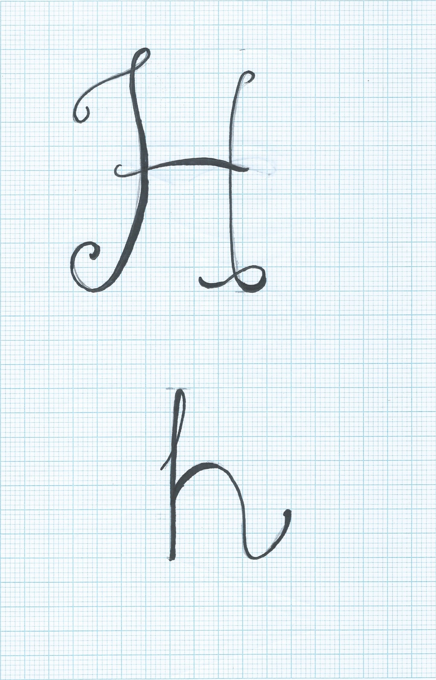
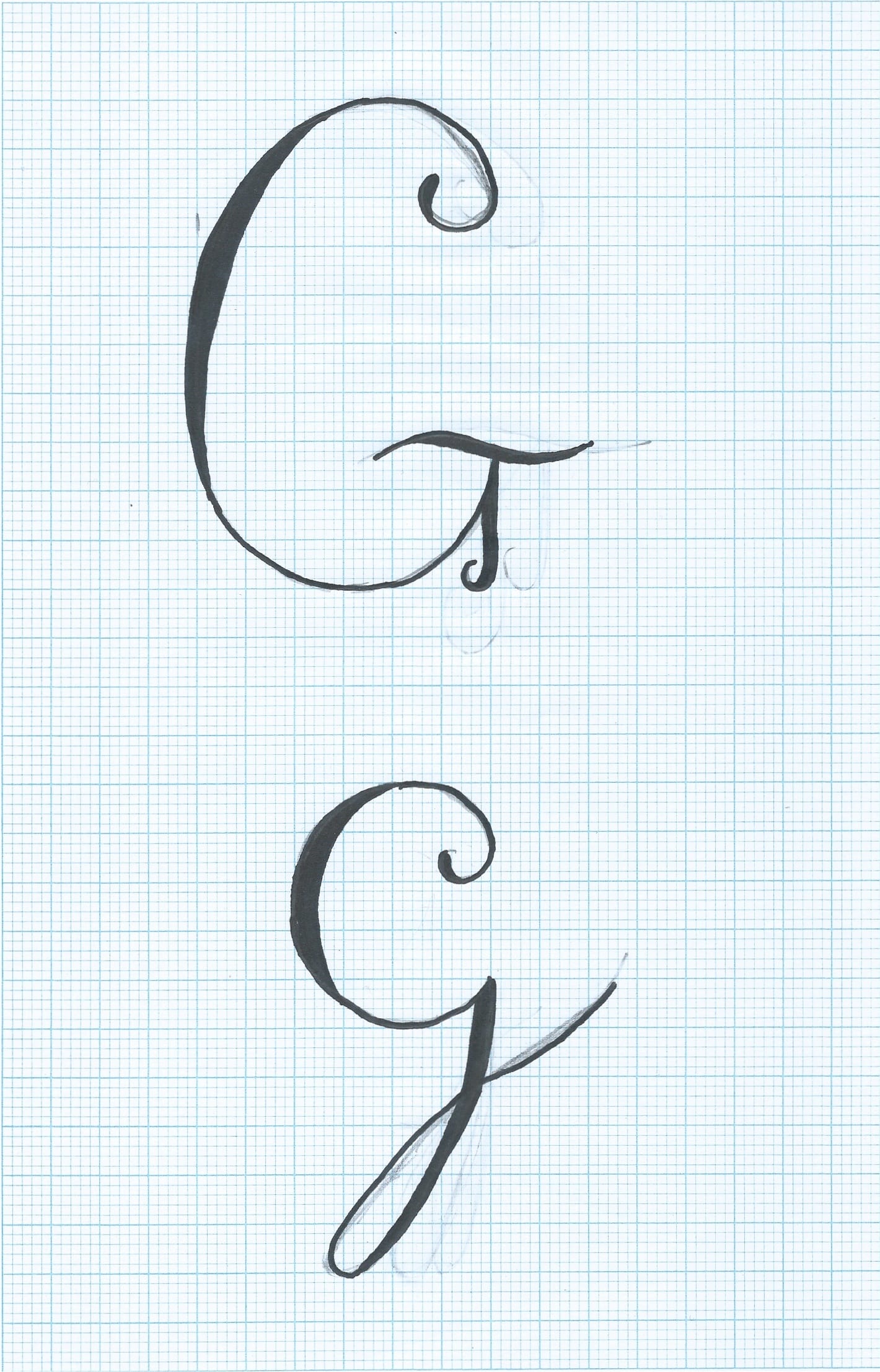
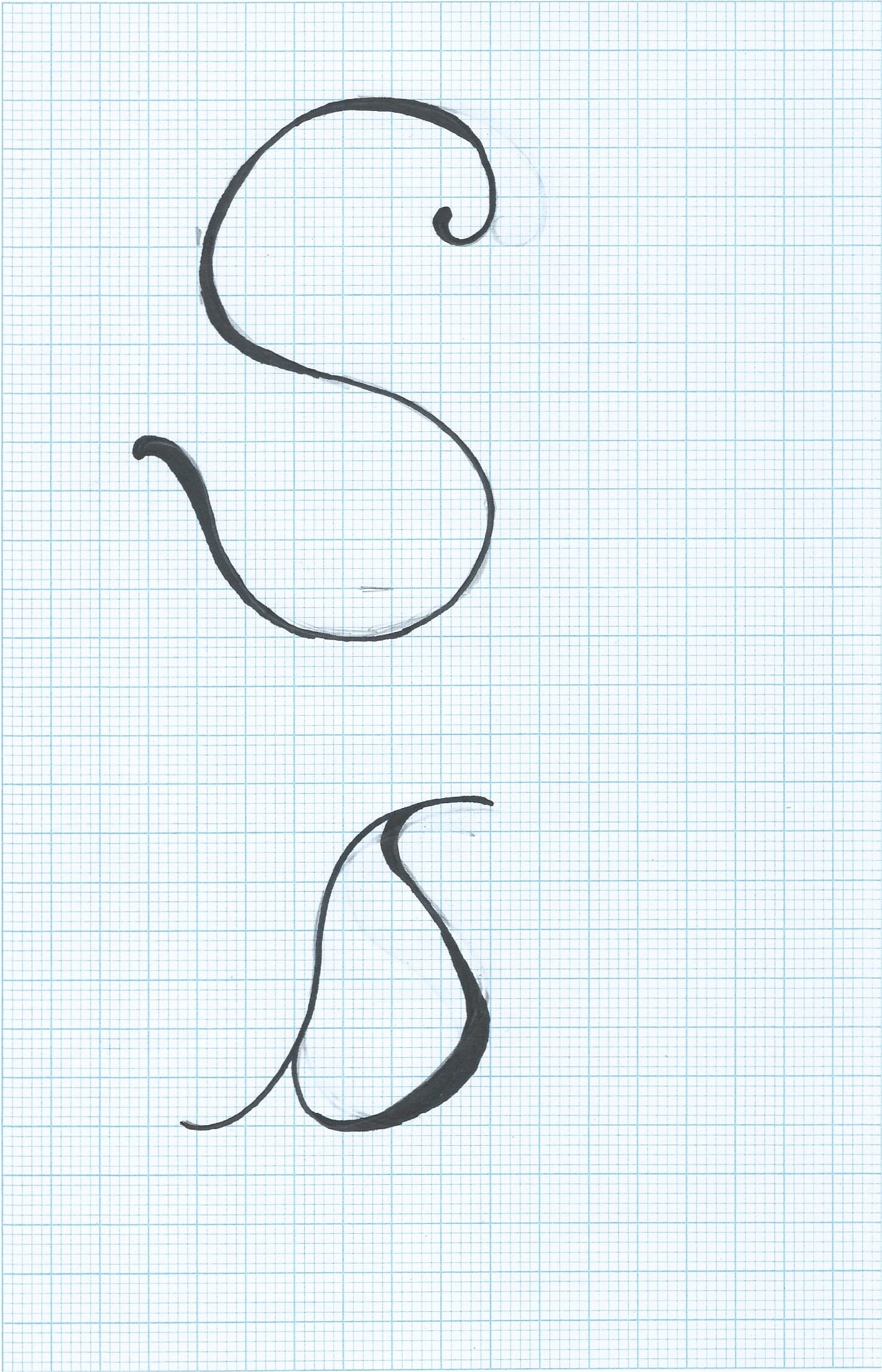
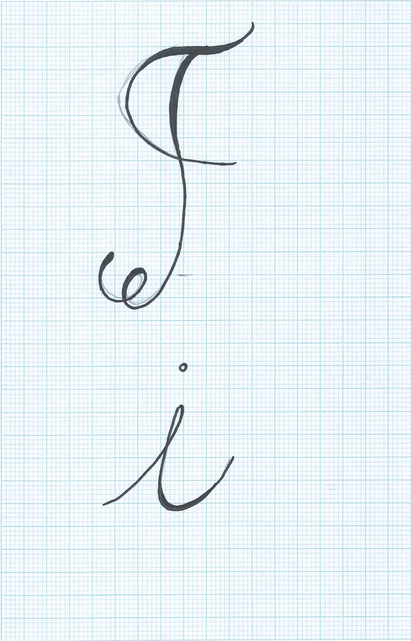
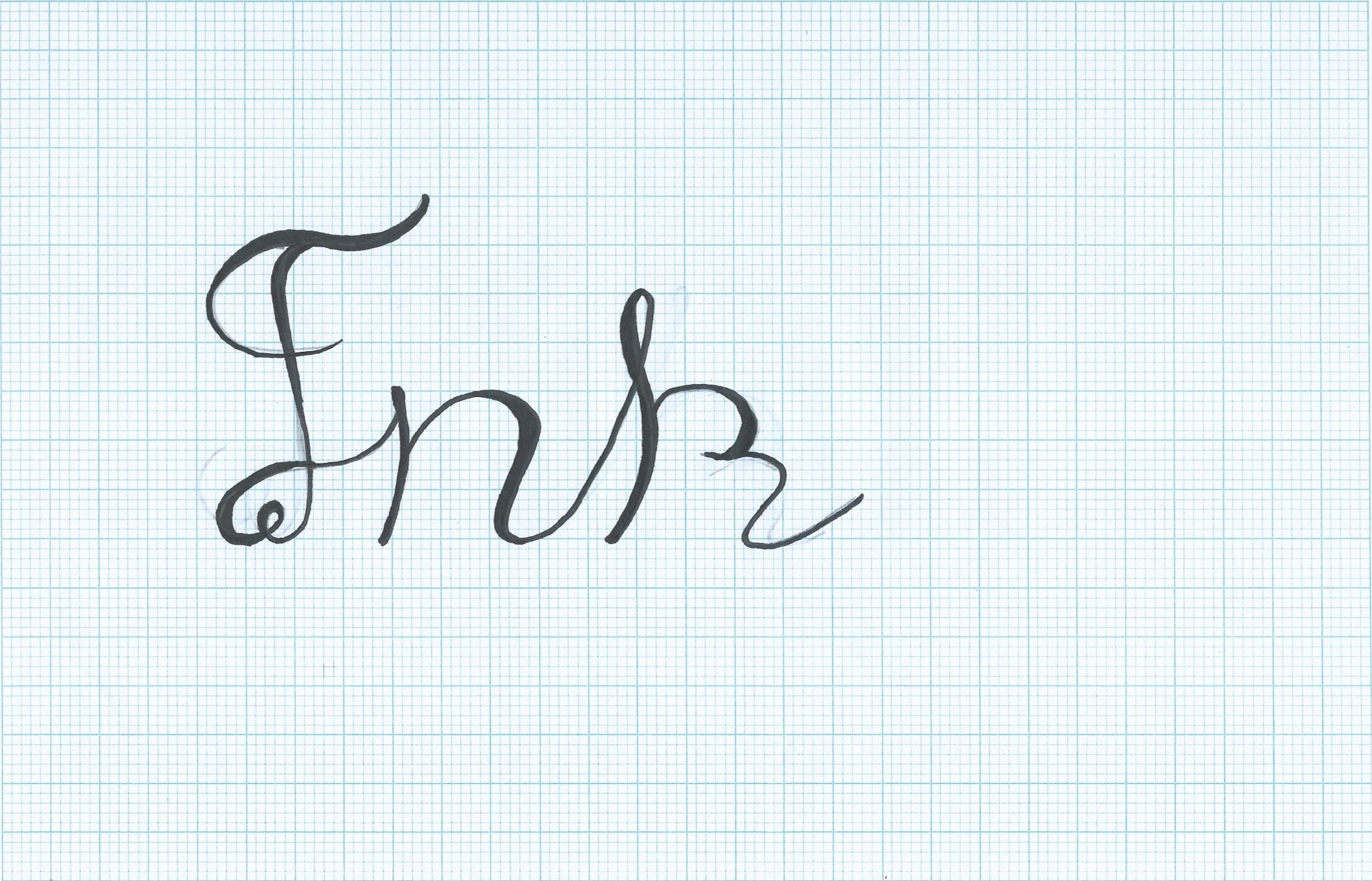
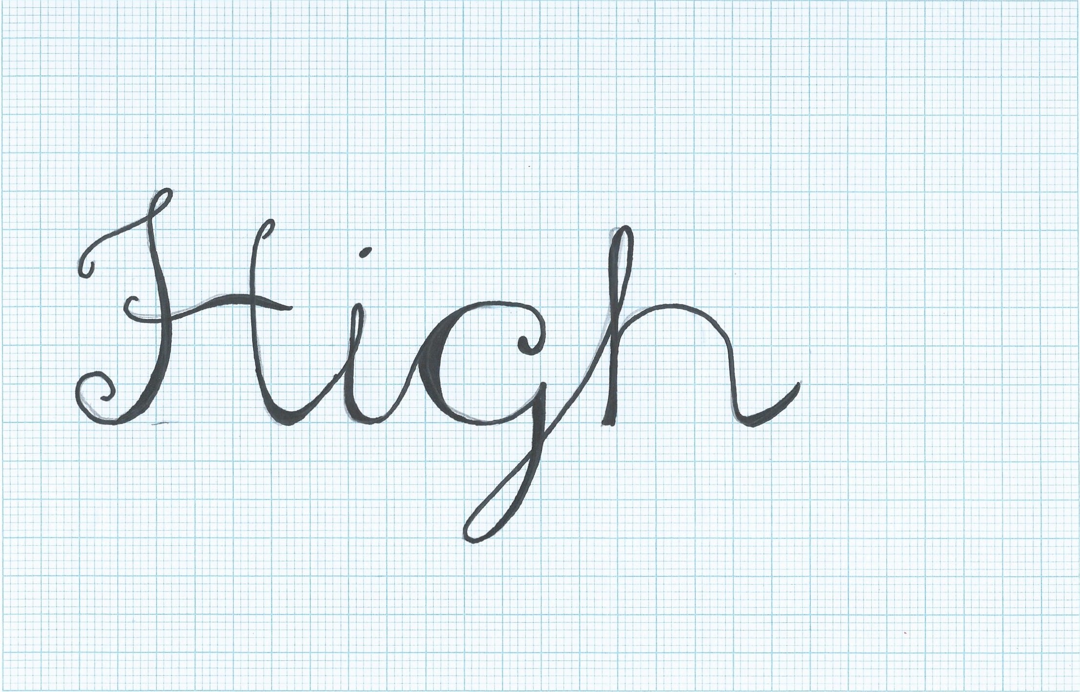
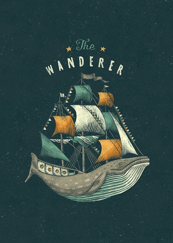
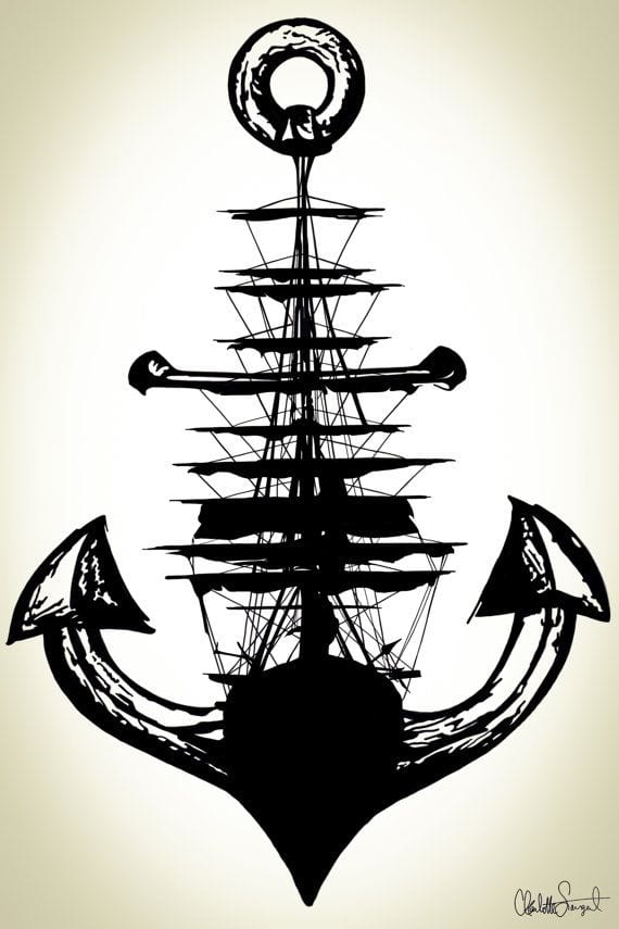
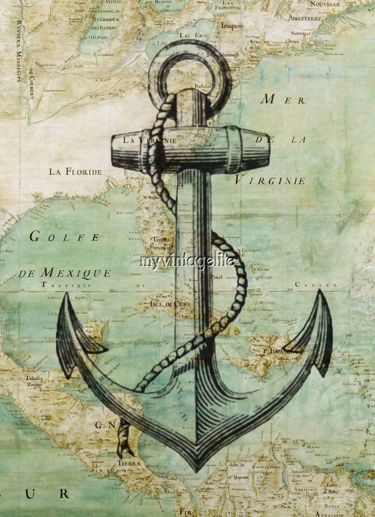
I have also taken advantage of critisms from my first and second projects, which stated I needed to develop my skills in layout and typography. I have started drawing and experimenting with paper and pen for my typography for my logo and the name of the company. I am also currently drawing my first draft for my logo, with the help of influences on Pinterest, mainly of images of ships and anchors:

45f60b48e3eff5a6dc507fe123183ae2

34c966ce22c5ff3bdd1ec7a481ead958

cadd8474bec66a6e5ddcd383e45ed500

6d7d520cf6a93e16c3340e546b5b5a1d

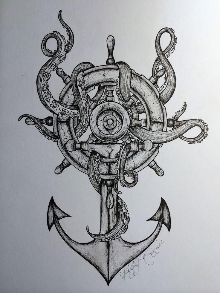
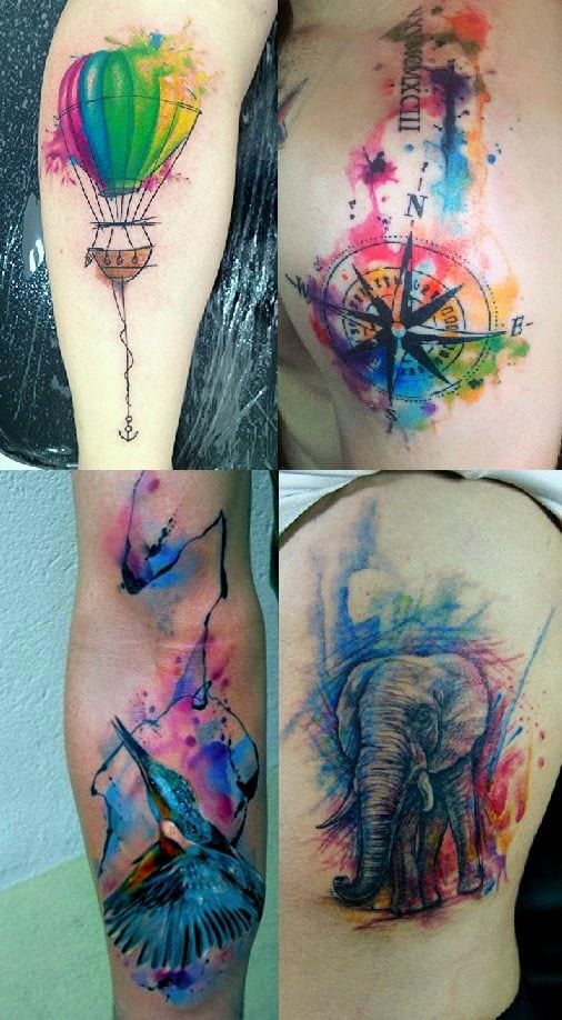
As I was looking for influences on my logo, I can across this image of tattoos, and I had originally thought about including paint and ink splatters onto my designs, I really like this idea and I want to experiment with this for this project, I love the effect all the colours have together.

810989193acf8344af02e094b9048705