Colour Experiments.

In todays workshop we were focusing on colour play. This included learning the difference about RGB and CMYK. We then went off to experiment ourselves. I went straight onto Pinterest and looked onto images that I was drawn too specifically for their colour schemes. I then downloaded these into Indesign and with using the eyedropper tool I was able to select the images and it came up with the strongest colours that it could pick up. I then put these into a presentation pdf:

Colour moodboard

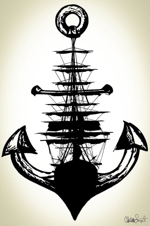
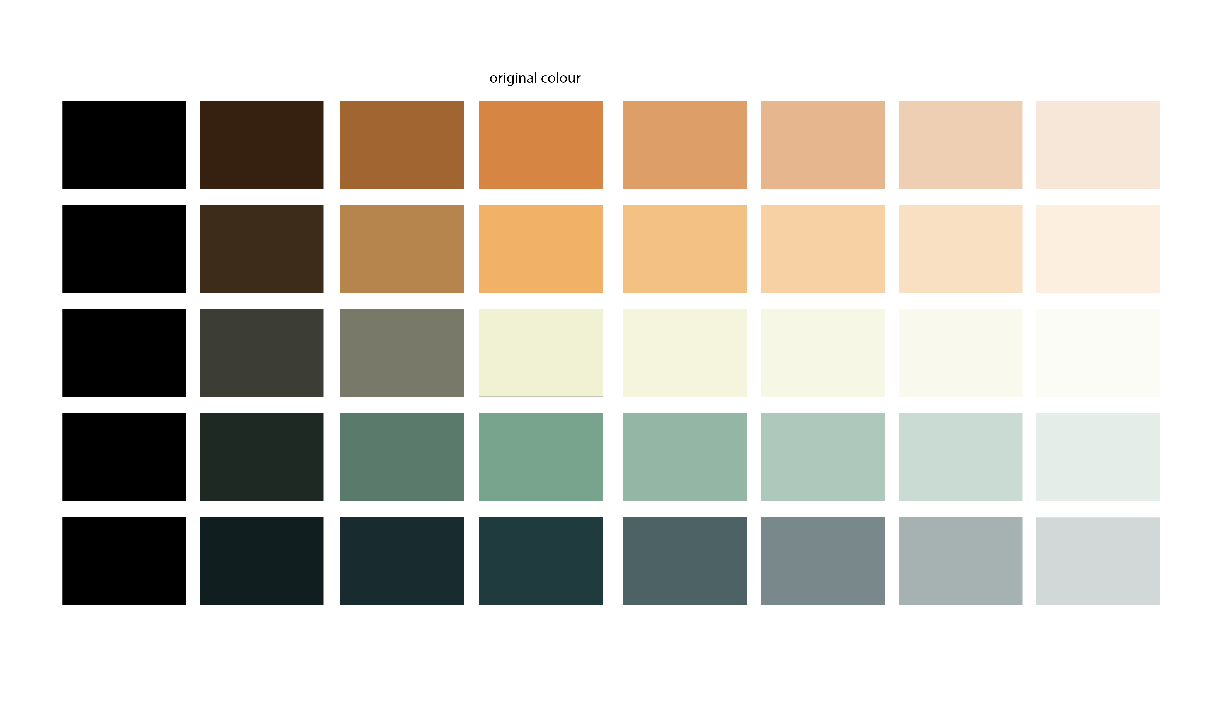
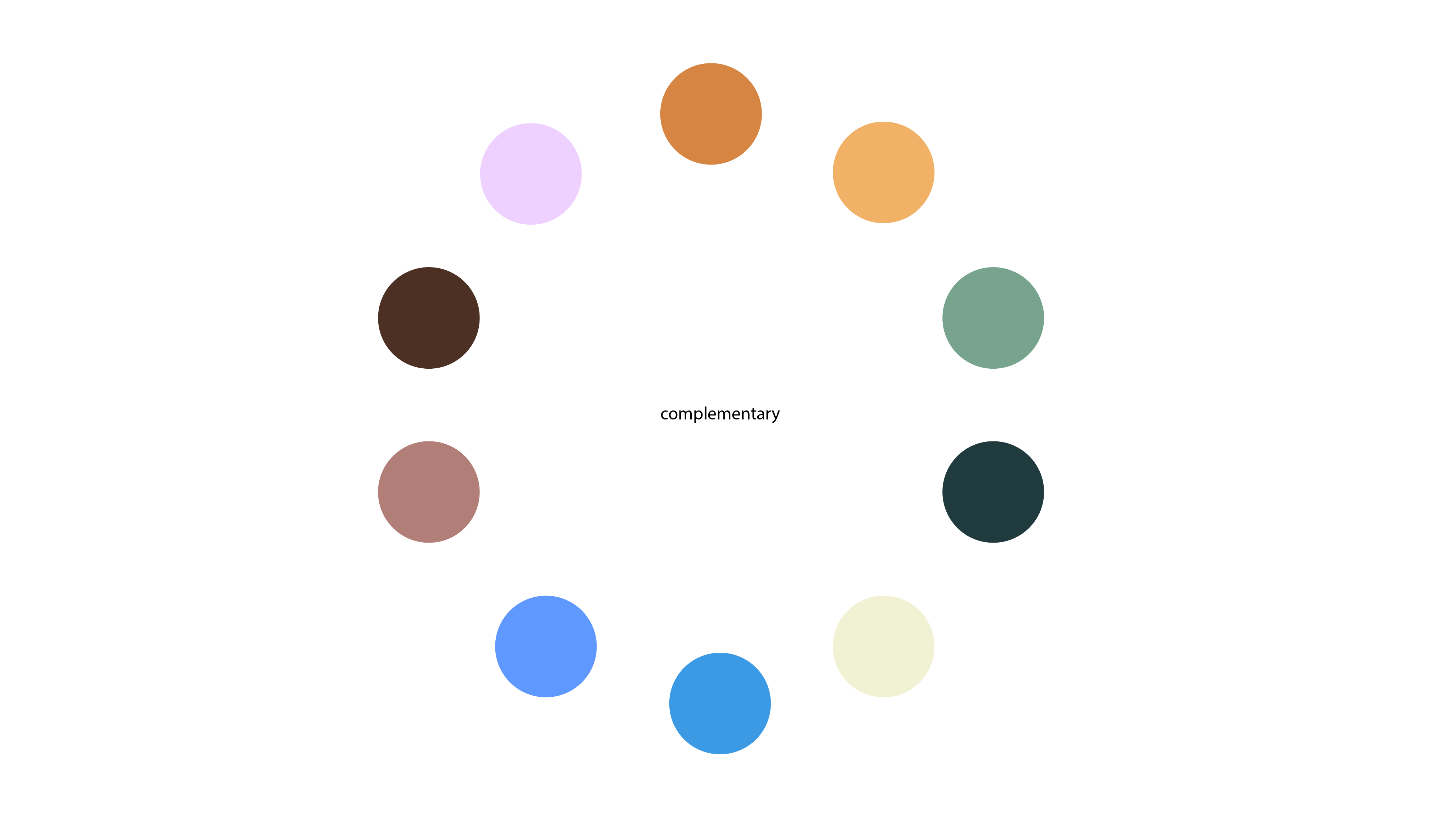
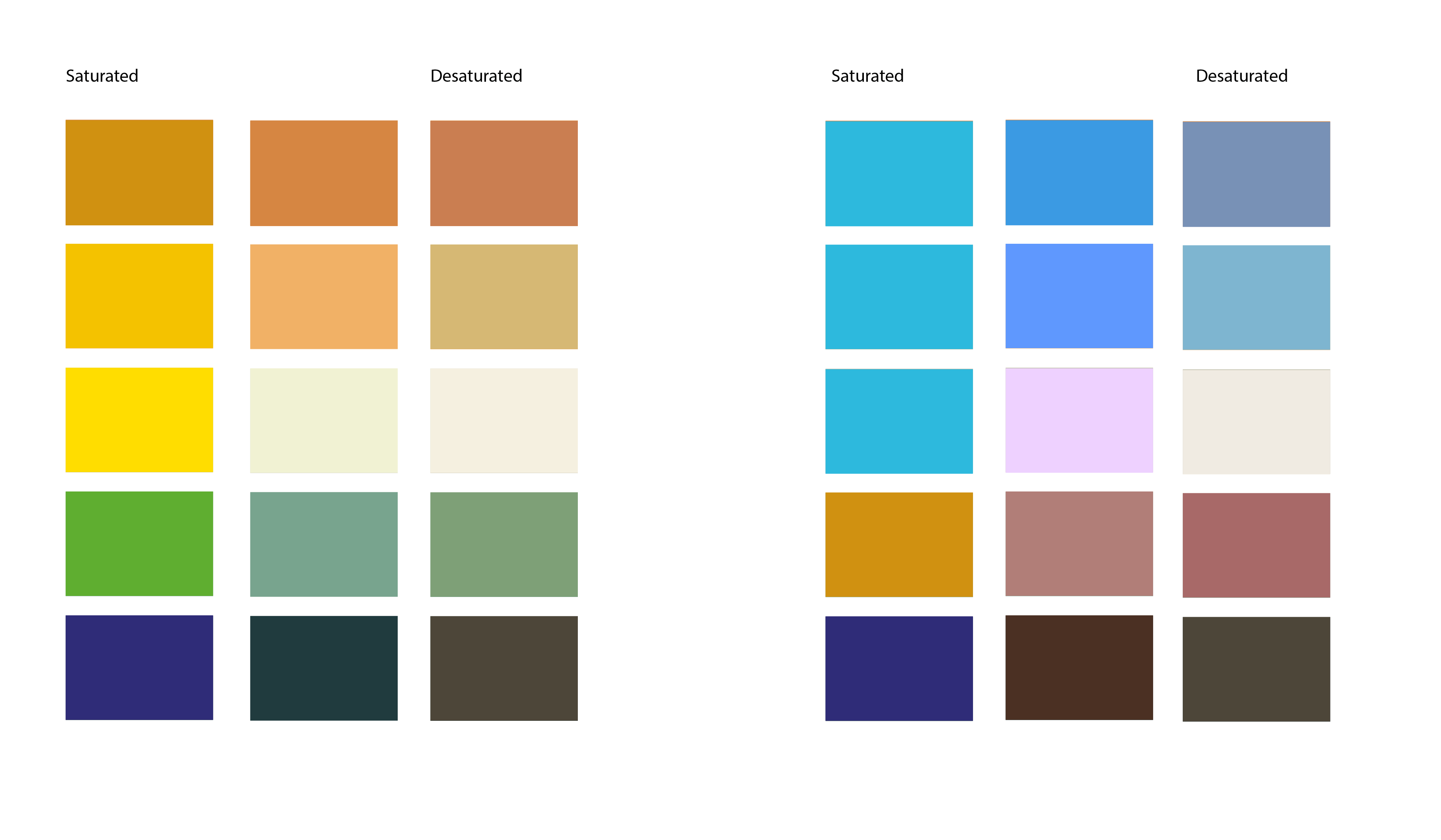
My favourite one out of all of these experiments was the last one of ‘The Wanderer’ which I have included already in my research for my logo. I really like the major contrast in the colours, however they work really well with each other. I placed these colours into Illustrator and experimented with Shades, Tints, Complimentary Colours and Saturation / Desaturation.

Colour Shades-01 Colour Complimentary-02 Colour Saturation-03


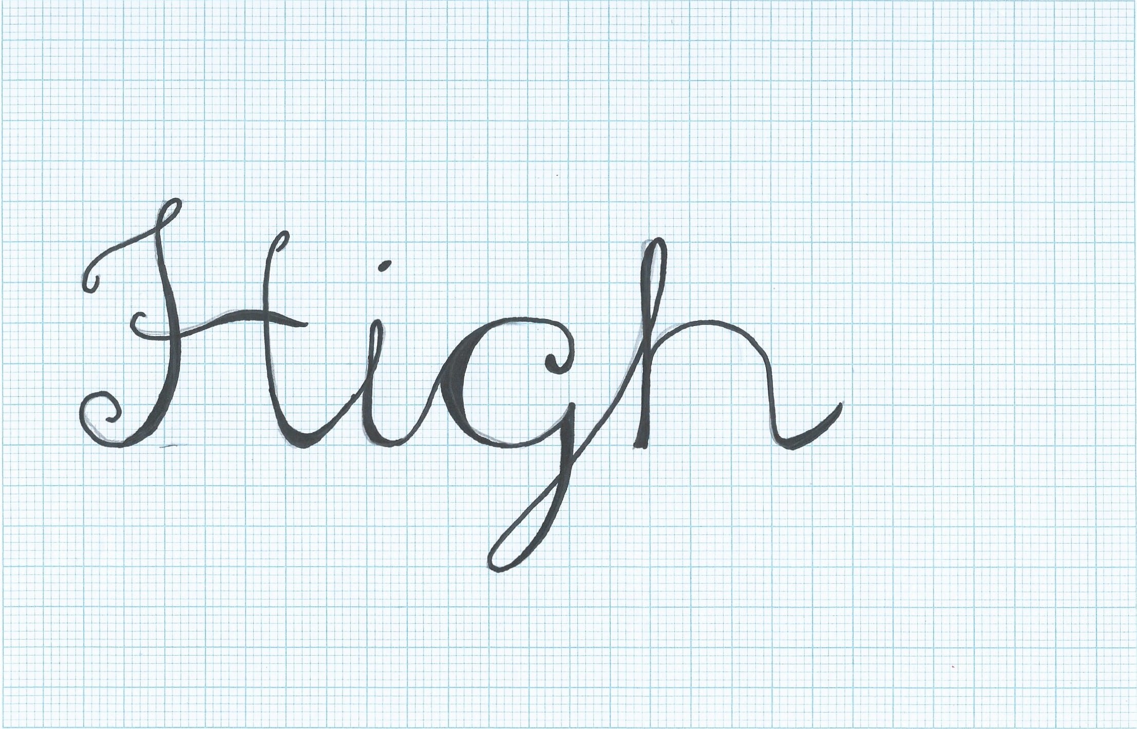
I really like this colour scheme and I am going to experiment with this one when creating more content for ‘High Seas Ink’. I will also develop another a colour scheme I like for a back up.

Logo Development.

I looked back into my influences and took this image:


34c966ce22c5ff3bdd1ec7a481ead958


I really like this image and decided to created my own version on this on graph paper:

Scan 160260001


I then scanned my sketch into illustrator and used the line, curvature and pen tool to create this digitally, I really like this design and I want to develop this further. I am considering adding ink splatters to this design, and adding colours that I would like to be the companies colour palette.

High Seas Ink Logo Idea

Further Development on Font

I spent last night drawing each type separately to develop the companies name further. I kept it similar to my previous styles, however I combined the two:

Scan 160250001-1Scan 160250001-2

Scan 160250001-3 Scan 160250001-4 Scan 160250001-5 Scan 160250001-6 Scan 160250001-7 Scan 160250001

Scan 160250001-10Scan 160250001-8 Scan 160250001-9

I then took this font and compared it to an updated font draft I also drew, to see if it went well with the style. I do feel like the font is too fancy compared to the theme of pirates. I also am not completely satisfied with the logo design as there’s too many elements and I feel like the logo should be kept simple for it to be successful.

Scan 160250001-11

I want to re-design this and combine the anchor and a ship together, inspired by an image I saw on Pinterest earlier last week. I am also going to experiment with drawing the font in a rope style.

Developing A Font and Logo

I have been researching into popular tattoo fonts and also looking more into the possibly logo inspirations. I started drawing this weekend what my font and logo could look like, I decided I’m going to go for an anchor as my main base but somehow include elements of a 1800’s HMS Ship. This was my rough first idea:

Scan 160250025


I then started thinking in more depth about my typography that I wanted to use for the companies name. I looked on dafont.com and searched for ‘script’ types. I found two tattoo inspired fonts and then combined the two, this was my first sketch:

Scan 160250027


I really liked this style, however I was a bit too fancy for what I needed. I drew it again, with less curves and made sure the capital letters joined up to each other


Scan 160250027-1


I like the boldness of the font and the different thickness in the form of each letter. I like the fact it keeps in the ‘tattoo script’ style but strays away from it through the spacing and the different parts of thicker line. I plan on developing this more, focusing on each letter separately.

FINAL POSTER.

After some feedback from Chris in the workshop, I decided to add the colour scheme and the ‘noise’ style from my web design to make sure each design relates to each other. I also changed the annotation lines to make them darker and more symmetrical. I am very happy with my end result, I feel its simple yet very aesthetically pleasing. From a 14 years old opinion I think it doesn’t go into too much detail and it’s not over complicated. I tried to design it so it could go in a physics text book, or equally in a text book on Einstein as well as being related to my ‘website’. I also made it to be more of a ‘fun fact’ about Einstein, but also keeping it educational. I created all the icons and the timeline in Illustrator. I then added the text through InDesign, using the SpaceCard and Space of Time font that I downloaded from dafont.com. I then had to place the text back into Illustrator to create the background and colour scheme.

A higher quality pdf can be found using this link: FINAL A2 POSTER

FINAL A2 POSTER BLOG