I did some experiments on how I would layout my logo and text together. I took my chosen font and my logo so far and started to fiddle round with sizes, curves and placements:
Circles
Yesterdays lecture we learnt a bit more about logos and the term branding. One part of the lecture stood out to me and made me include it into my logo, this was the subject of the circle. A circle shows protection and safety, even represents trust, all of these factors I feel are relevant to High Seas Ink as they want their customers to trust their company and want to be reassured that they are safe and I feel that adding a circle around my design is a nice subtle way of showing this. I added a different variety and styles of circles around my logo design:
The one that stands out to me the most is the bottom left design . I really like how the circle doesn’t break unlike come of the others and it has some different shades, lines and tones. I think this works rely well and suits the logo itself.
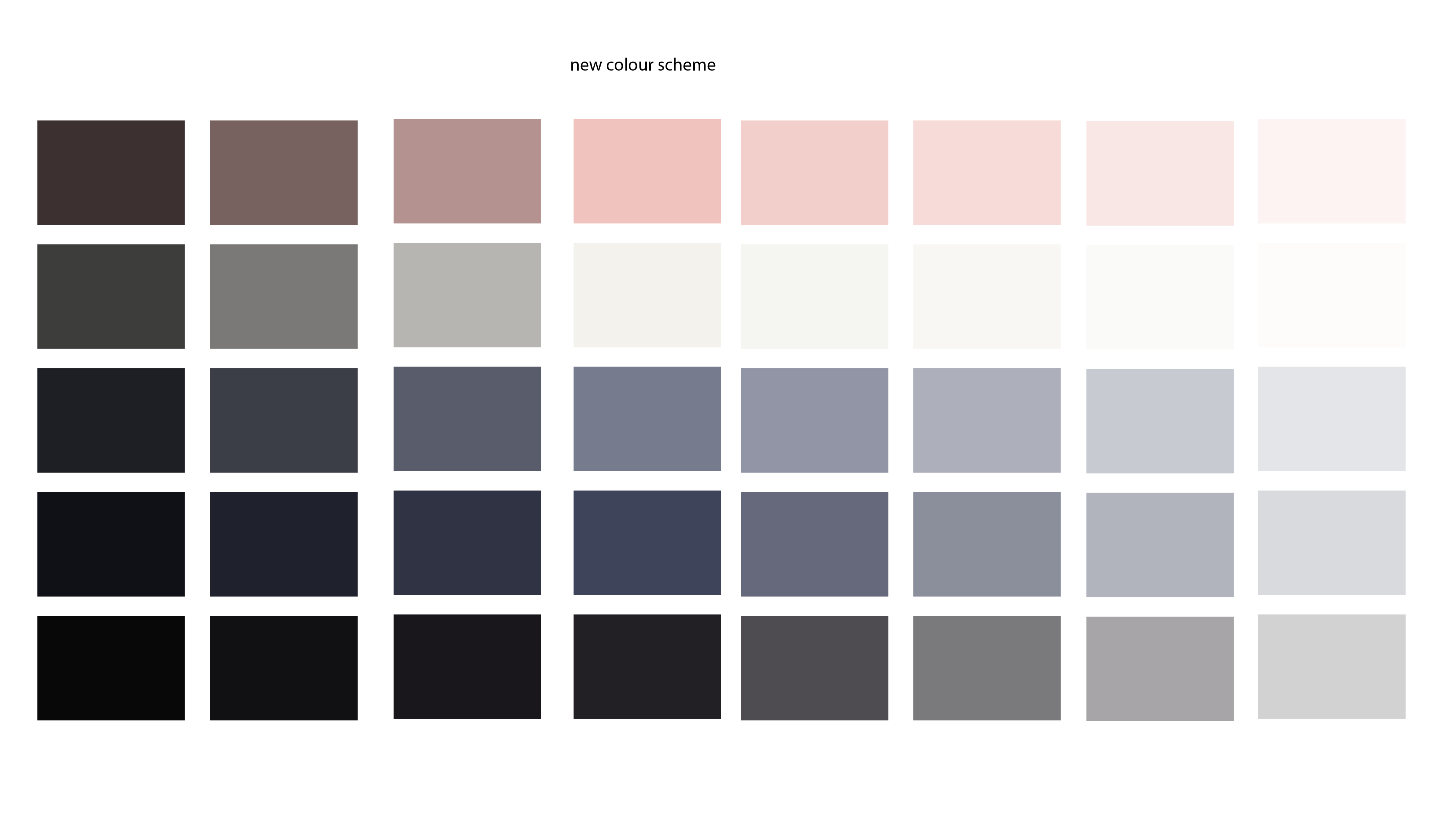
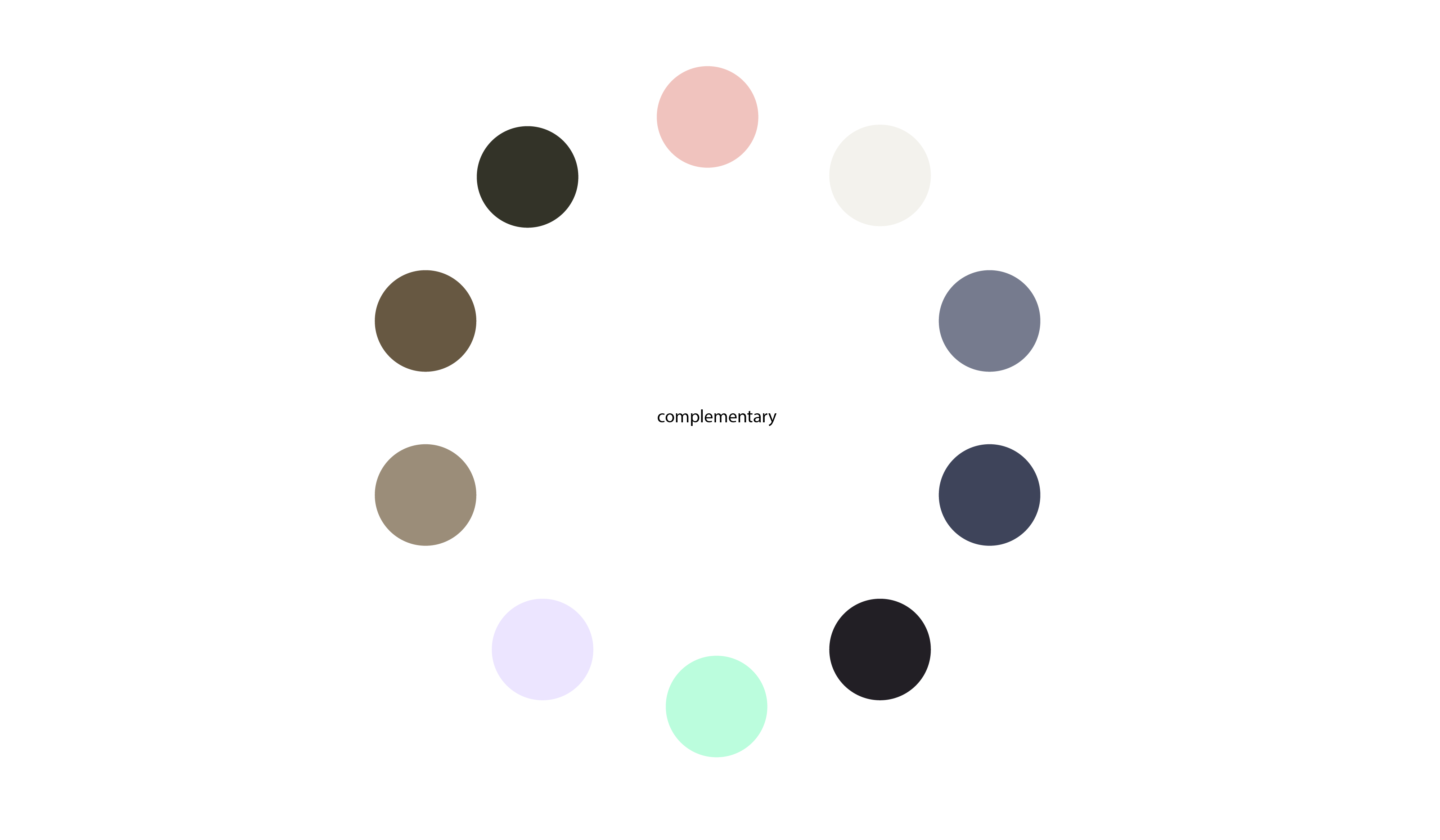
New Colour Scheme.
After experimenting around with my last colour scheme mixed with the font, I felt as if it didn’t fit into the context of my company. So I went back into my colour mood board and decided to take a different route for my colours. My new colour scheme has a lot more darker tones and colours in which goes well with the ‘tattoo’ style and fits into the theme of ships a little better, making it less ‘cartoonish’ and more sophisticated.
Developing a Final Font.
I started to focus more on my font for the companies title. I felt as if my previous font was too fancy for what I wanted to convey, despite it being a traditional tattoo style. I decided to go back to drawing on graph paper and roughly drew the companies name. I did a couple in italics and the others accurately measured up straight to the graph. I really like the effect some of these have so I decided to scan my favourites into illustrator and created them digitally.
Once I put my chosen fonts into illustrator I used the curvature tool to outline the fonts then I used different outlines for each letter to make it seem more relaxed. These were my three outcomes:
The font I have chosen to pick to go alongside my logo is the top one. I like that it sticks with the theme of ‘scripture’ yet has my own take on it as its my handwriting. I am going to experiment with this next to my current logo.
Second Logo Idea
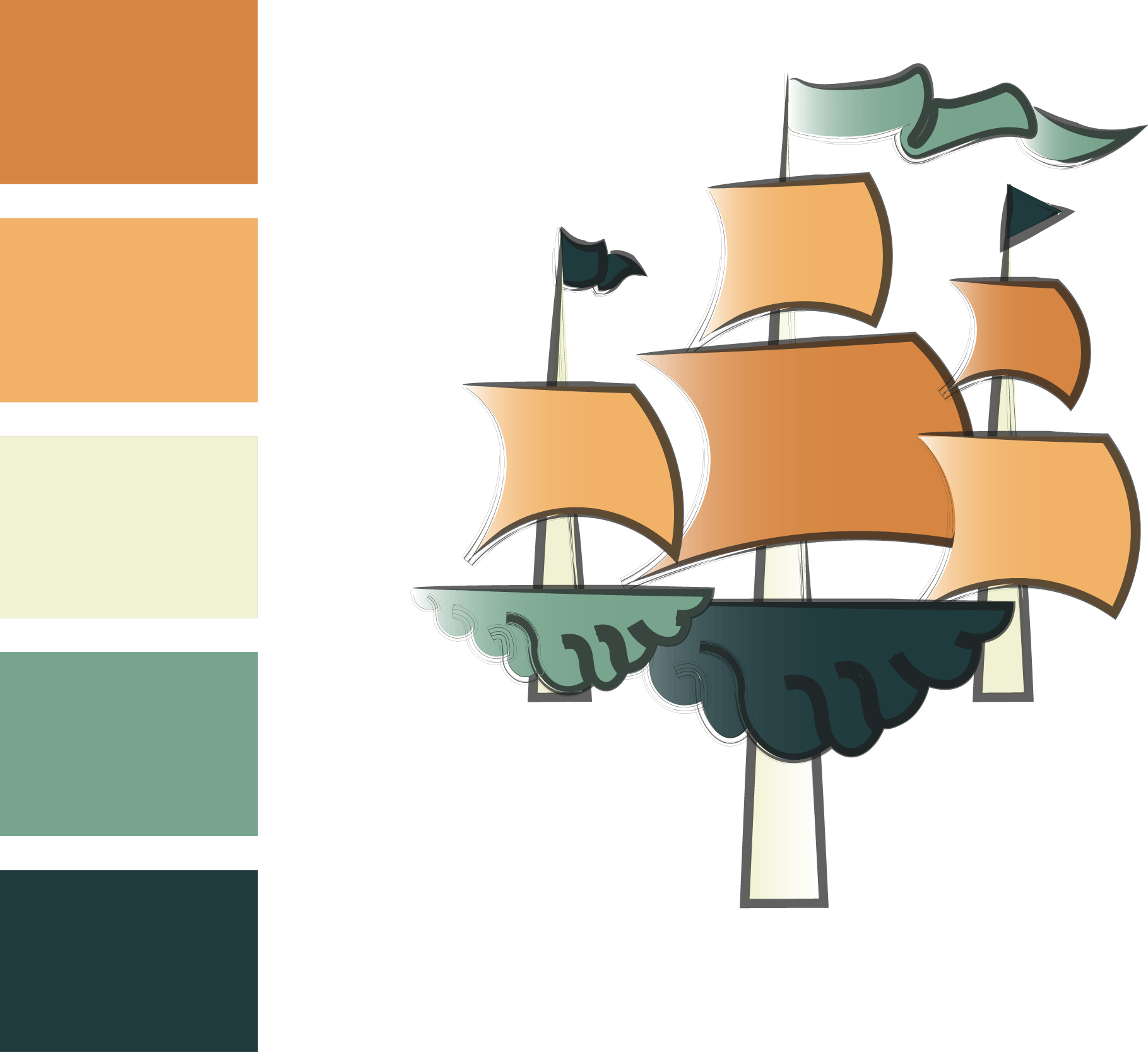
I was a little worried my original logo wouldn’t look as good when shrunk down in size due to the lines of the ship, I also didn’t majorly like the anchor part of the logo. So I decided to create something a little different to see if it would look better and experiment it with the colour scheme:
This design still needs a lot more work to do to it before its finalised however I have decided that I don’t want to use this colour scheme as I feel it looks too cartoonish and in my opinion it appeals to a much younger audience. I feel this logo would look a lot better shrunk down however I do prefer my previous logo idea and I have decided to work on that one as it fits a lot better with the context of the project.


