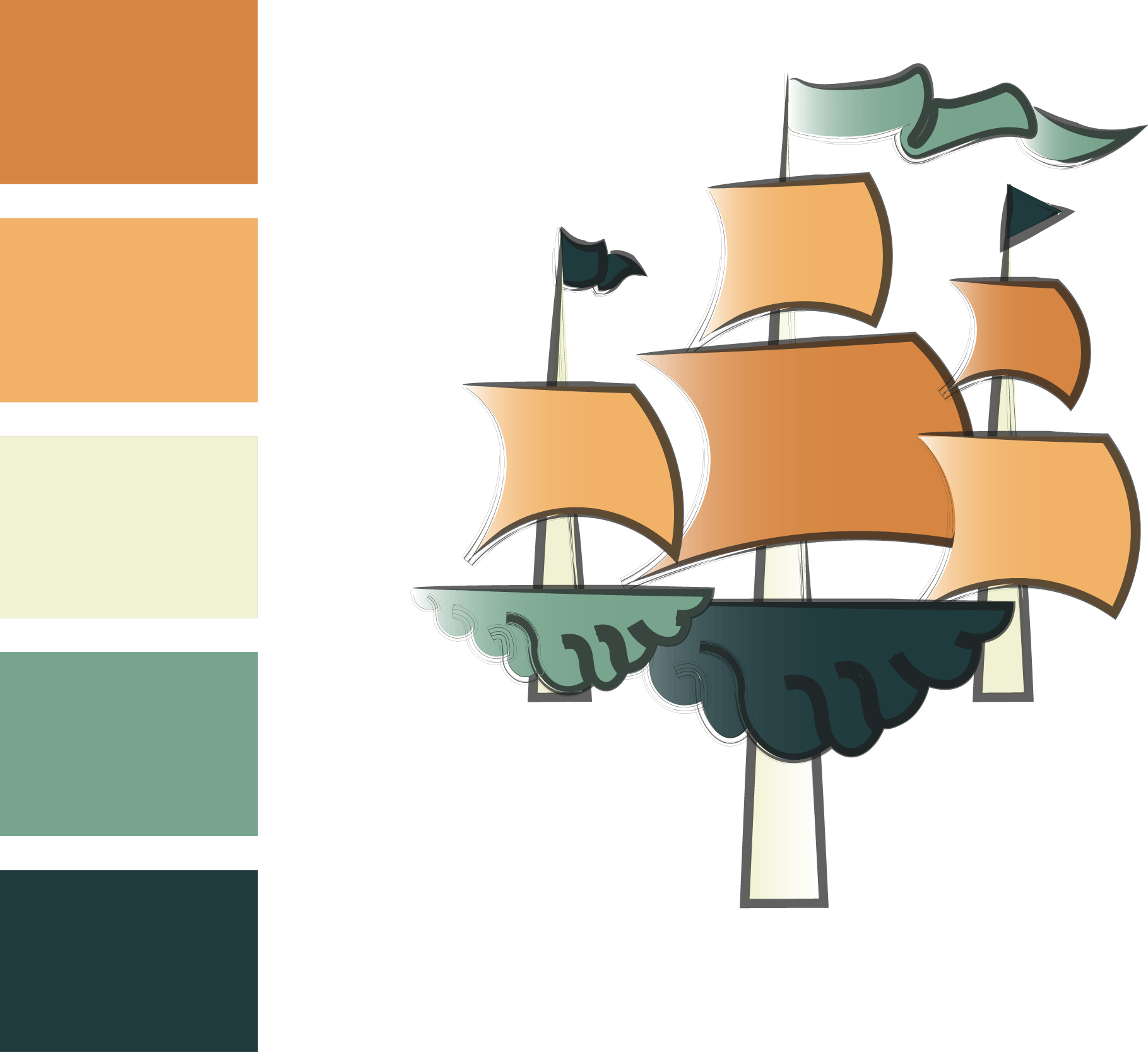
I was a little worried my original logo wouldn’t look as good when shrunk down in size due to the lines of the ship, I also didn’t majorly like the anchor part of the logo. So I decided to create something a little different to see if it would look better and experiment it with the colour scheme:
This design still needs a lot more work to do to it before its finalised however I have decided that I don’t want to use this colour scheme as I feel it looks too cartoonish and in my opinion it appeals to a much younger audience. I feel this logo would look a lot better shrunk down however I do prefer my previous logo idea and I have decided to work on that one as it fits a lot better with the context of the project.
