COFFEE STENCILS

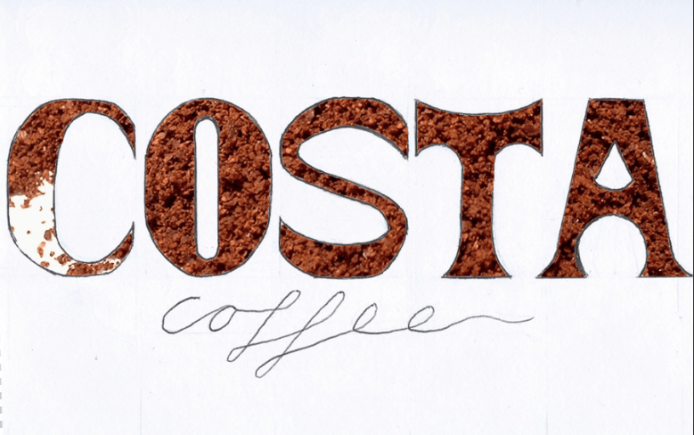
After a week of experimenting and developing with the digital version of the ‘stencil’ style and my font, I decided to go back to creating something ‘hands-on’. I got some coffee granules and made a stencil out of card and created these:

Coffee Granules


Granules


Untitled-2


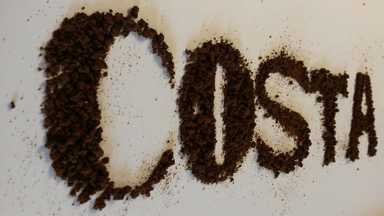
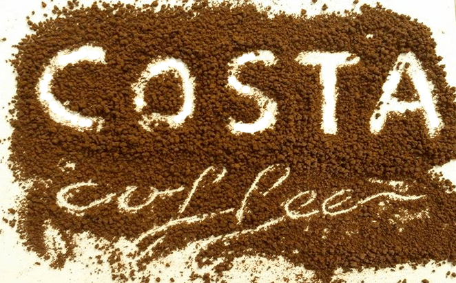
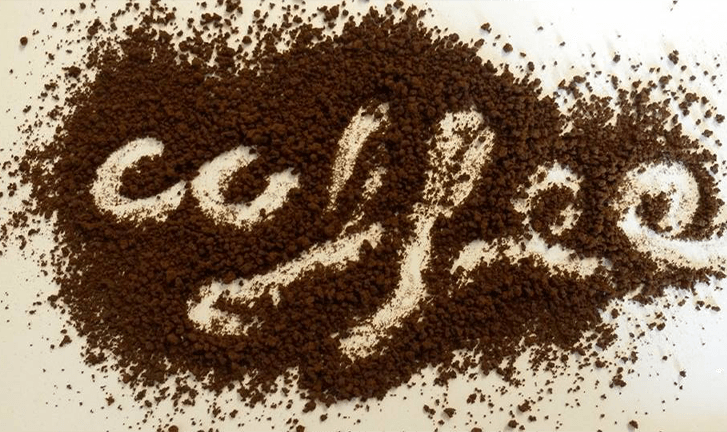
I really like the effect of this, despite the bad photo quality. I am definitely going to further this style, and take more pictures of this using different fonts and creating lower case letters. I also like the texture it creates, its a lot harder to get texture like this when I created something similar on photoshop and illustrator.

PRESENTATION ON INDESIGN

In our workshop today we looked at creating professional presentations using Indesign. We did this by following a step-by-step guide that Chris made prior the workshop.

First we typed our name and experimented with different adjustments and placements.

Example Poster


After we did this, we printed the image and cut it into shape so we had no excess white parts. I then scanned the image back through the the computer with the scanner lifted up so it created a nice effect on the letters.

[Untitled]


After doing this I opened up Indesign and created a 6 page practise presentation, including images from Indesign and scanned images.

PRESENTATION

DEVELOPMENT VIA PHOTOSHOP

I have taken the final font I have decided on and scanned it into photoshop to experiment with the stencil style.


Screen Shot 2015-10-10 at 20.56.50


Screen Shot 2015-10-10 at 21.10.42


First I used a picture of coffee beans as the background, however I don’t feel as this works well and doesn’t look that visually appealing. I then changed it to a picture of coffee powder.

Screen Shot 2015-10-13 at 20.48.05

I prefer this a lot more than the coffee beans. I especially like the difference in texture in the ‘C’ to the rest of the letter forms. I plan on creating a physical form of this design using real coffee powder and making my own stencil of the font I have come up with.

FURTHER DEVELOPMENT WITH FONT

I feel that its time to get a final design or idea for my font. I started drawing a serif font as I felt I was sketching mostly sans serif designs. However I thought id subtly twist it and add a more curved effect to it. I wanted to do this because I thought it added a more creative feel to it, instead of dull straight lines.

Scan 152810001-1


I feel like there is potential in this type and I really liked the curviness contrasting with the straight lines. I felt I needed to keep the ‘A’ straight as capital ‘A’s’ work a lot better with a point. I also needed to widen the ‘T’ as it looked very submissive next to the other typefaces.

Scan 152810004


I plan on expanding this style further, and potentially add a stencil effect. I plan on keeping the style of ‘coffee’ to keep the sophisticated feel to it.

VECTOR TYPE

In todays workshop we learnt more about vector graphics and how to create them on Adobe Illustrator. We did this by following a step by step guide given it to us by Chris. This was my end outcome.

LINCARC

I feel this is really useful to know and I will apply this to my own designs as I will be applying my font to all different kinds of objects which will vary in sizes.