Further Development on Font

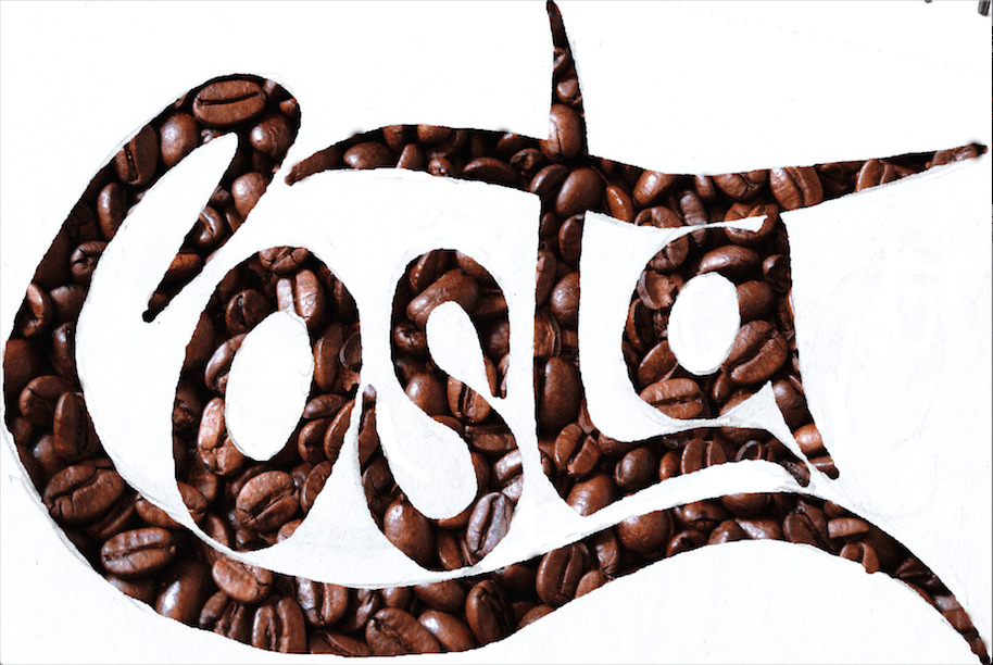
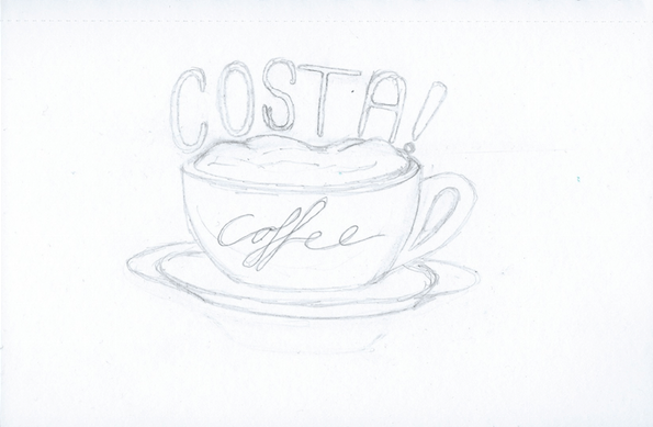
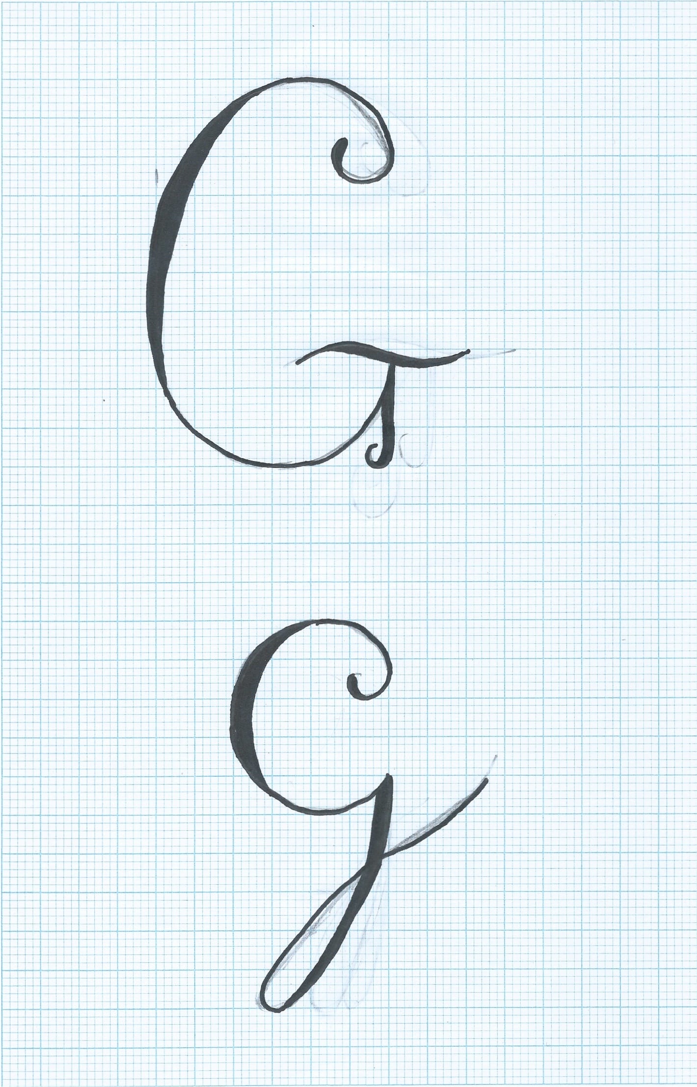
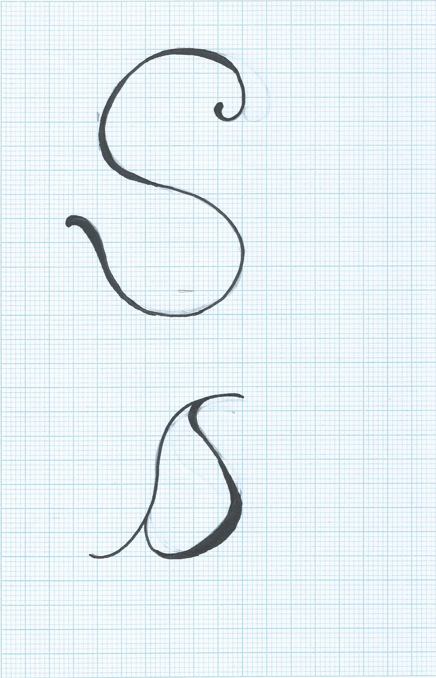
I spent last night drawing each type separately to develop the companies name further. I kept it similar to my previous styles, however I combined the two:

Scan 160250001-1Scan 160250001-2

Scan 160250001-3 Scan 160250001-4 Scan 160250001-5 Scan 160250001-6 Scan 160250001-7 Scan 160250001

Scan 160250001-10Scan 160250001-8 Scan 160250001-9

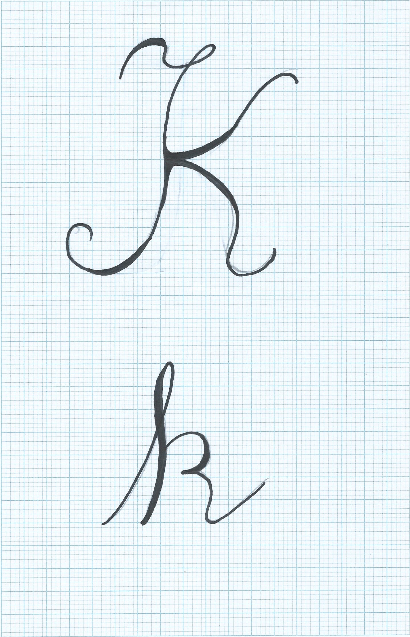
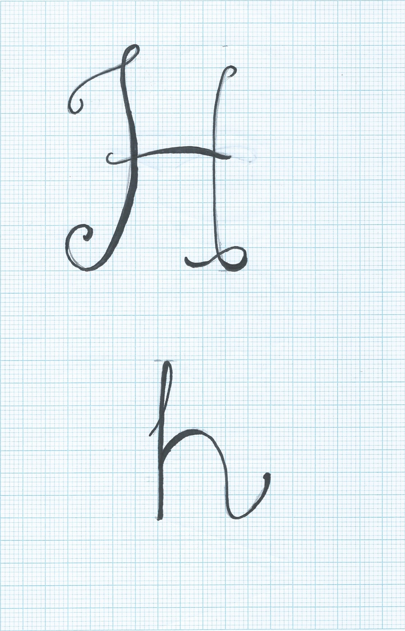
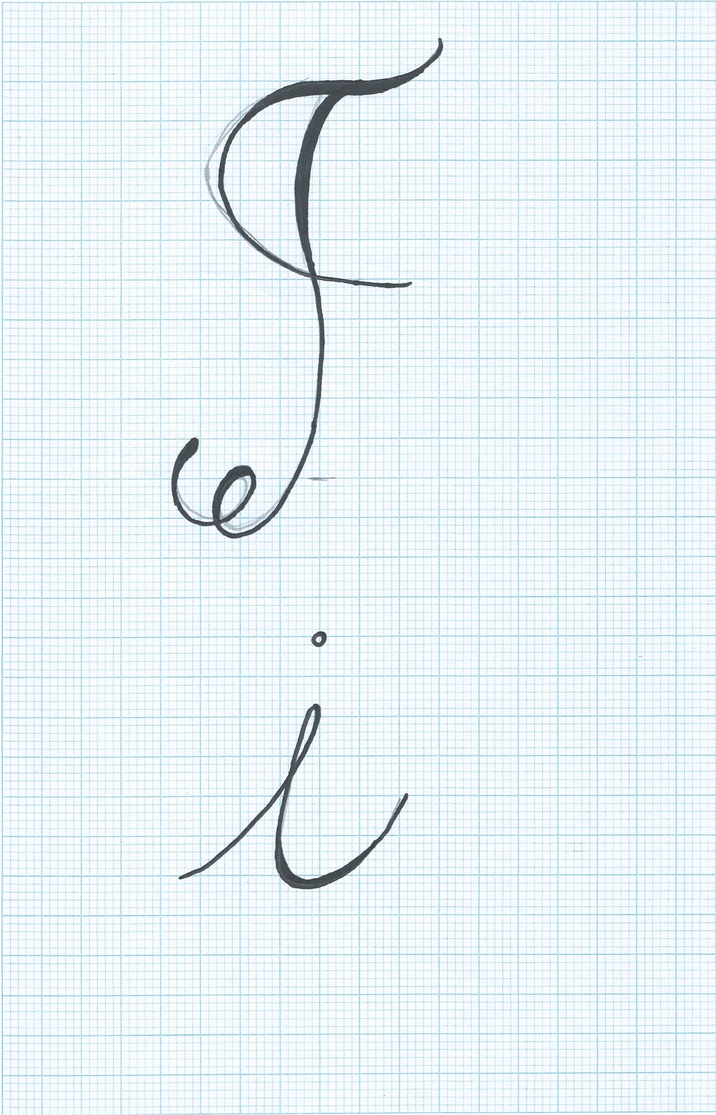
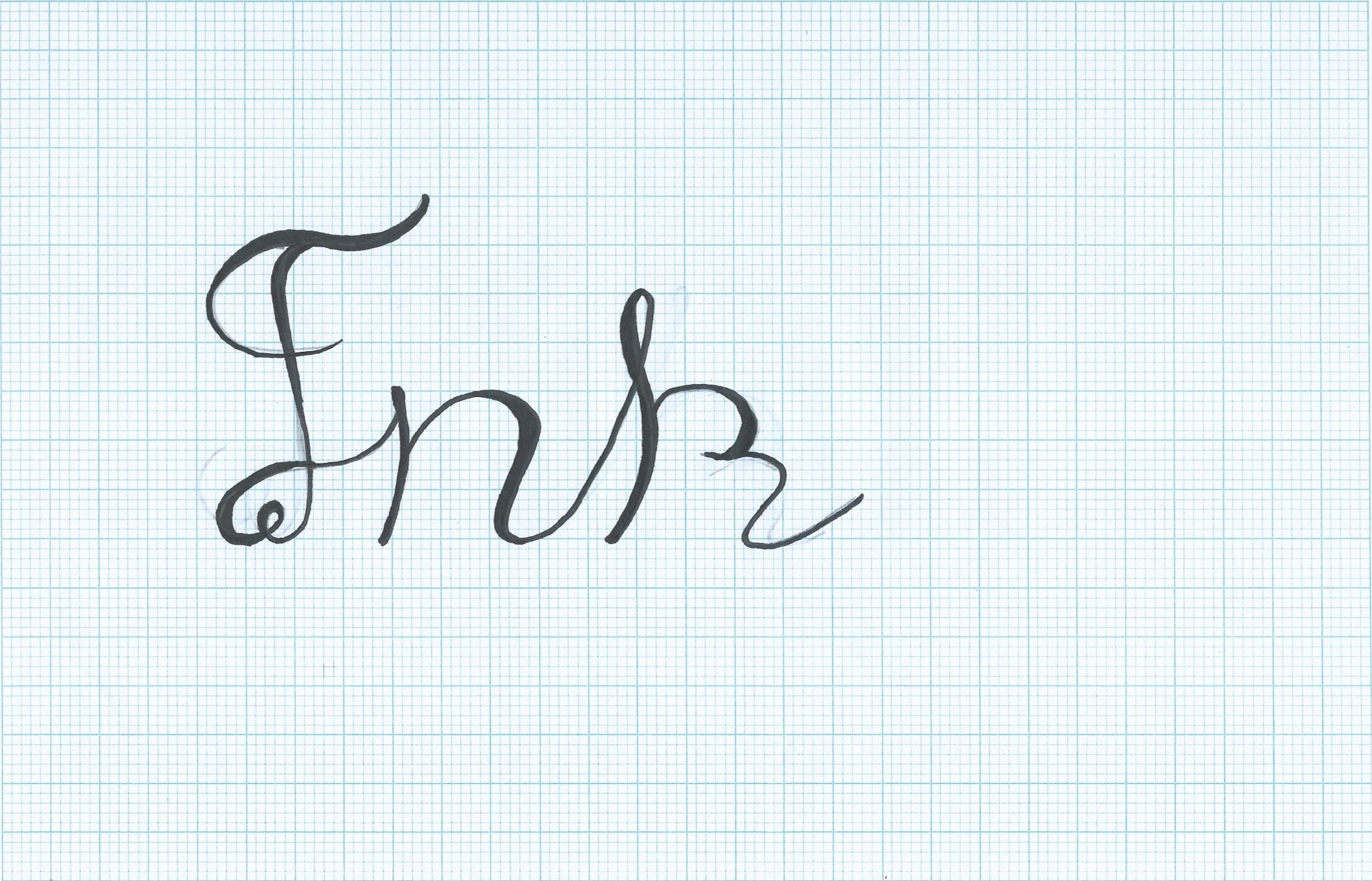
I then took this font and compared it to an updated font draft I also drew, to see if it went well with the style. I do feel like the font is too fancy compared to the theme of pirates. I also am not completely satisfied with the logo design as there’s too many elements and I feel like the logo should be kept simple for it to be successful.

Scan 160250001-11

I want to re-design this and combine the anchor and a ship together, inspired by an image I saw on Pinterest earlier last week. I am also going to experiment with drawing the font in a rope style.

EXPERIMENTING WITH STENCILS IN DIGITAL FORM

I took the overall style and idea of stencils and I started to draw my own designs that I could scan into the computer and apply this digitally.

Scan 152750001


Screen Shot 2015-10-05 at 12.15.00


I wanted to experiment with putting an image of coffee beans behind the stencil, I like this effect however I feel it doesn’t look as appealing on white. I was influenced by the ‘Coca Cola’ font, I used the idea of carrying on the bottom part of the ‘C’ under the whole text. I feel it works really well however I do not like the placement of the ‘A’.

I also drew this design. This type was inspired by a font I saw in ‘Pinterest’. It is very simple but I like the ‘block’ style. I also like the contrast it has to the flowing ‘coffee’ type. Even though these two types are vey different, I feel they work really well together despite the contrast.

Screen Shot 2015-10-05 at 13.36.49

 I really liked the font used for the word ‘coffee’ so I decided to draw a cappuccino mug using a similar design as the one above. This was the first outcome:

Screen Shot 2015-10-05 at 13.36.39

Again, I really like this design and I’m going to experiment with using font inside of objects, particularly the font used for the word ‘coffee’ as I feel it is a very sophisticated and touches on italian traditional type.

COSTA FONT CONTEXT.

I did some research and I started looking at the Costa font and typefaces, I found out that they (Costa Coffee) usually use ‘Clarendon’ / ‘Clarendon-esque Rosewood’. The reason for this is to remind us of the two Italian migrants who came over to England and stated that they ‘couldn’t find a decent cup of coffee’ by showing us a traditional English background ‘for large prints of Roman cityscapes’. Unfortunately I couldn’t find any other information on the actual logo and who created it.