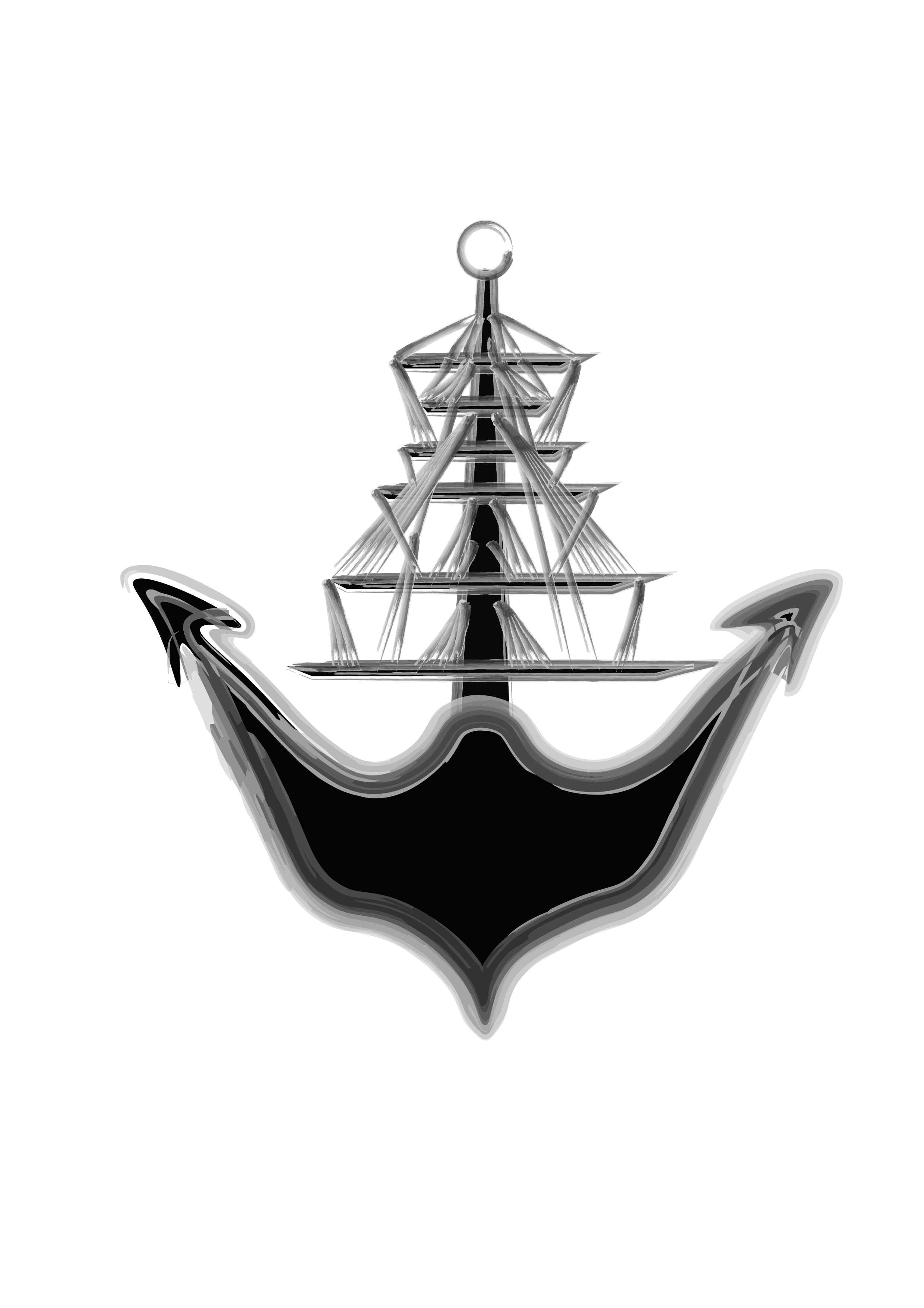
After analysing my logo in more depth and asking for some critical opinions of others, I realised that the logo I previously created looked like skeleton hands when it should look like rope. This wasn’t what I wanted to show so I decided to go back and change it. Instead of using a grunge brush for the lines, I found a watercolour pack and decided to use that instead to see what it looked like.
I really like the outcome of this and I with this development I feel I am one step closer to my final idea for a logo.
