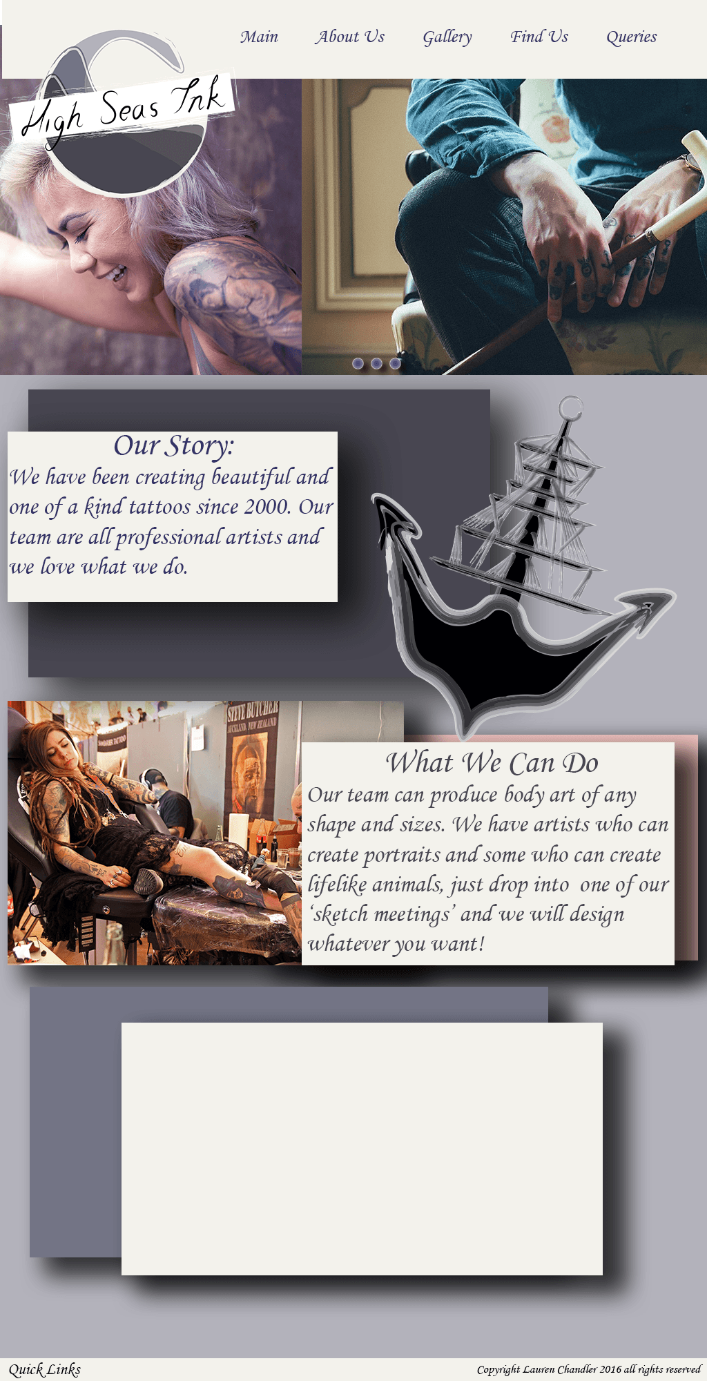
For my company website layout, I wanted to keep mine a simple grid layout to show text box’s and images in a clear manner. For inspiration I looked at website layouts on Pinterest to see what worked well and keeping it modern in terms of style and trends.
I realised that most of these designs stuck to a grid layout and used a lot of images. I took these designs in mind and started designing my own website. I used my colour scheme and placed my logo on the top left of the page with the navigational bar along the top. I need wanted images that swiped across the page and hyperlinked to different pages. I also searched for free stock images to include in my webpage of people with tattoos and tattoos being created. I did my first website draft in photoshop, this is what I was working on, however I stopped and started it again but developing it in InDesign:


