I have been researching into popular tattoo fonts and also looking more into the possibly logo inspirations. I started drawing this weekend what my font and logo could look like, I decided I’m going to go for an anchor as my main base but somehow include elements of a 1800’s HMS Ship. This was my rough first idea:
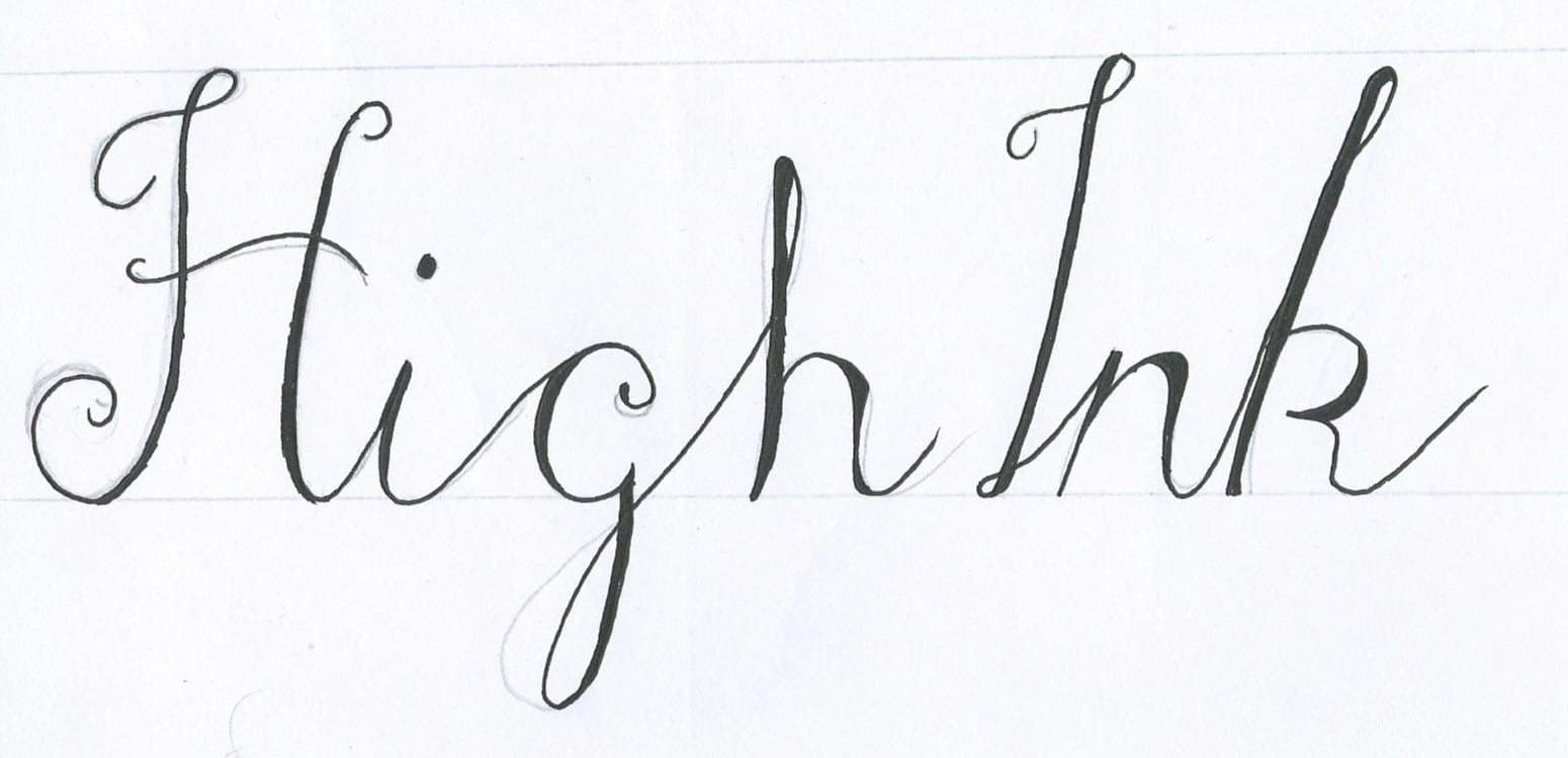
I then started thinking in more depth about my typography that I wanted to use for the companies name. I looked on dafont.com and searched for ‘script’ types. I found two tattoo inspired fonts and then combined the two, this was my first sketch:
I really liked this style, however I was a bit too fancy for what I needed. I drew it again, with less curves and made sure the capital letters joined up to each other
I like the boldness of the font and the different thickness in the form of each letter. I like the fact it keeps in the ‘tattoo script’ style but strays away from it through the spacing and the different parts of thicker line. I plan on developing this more, focusing on each letter separately.


