This week was the first week of lessons, we were introduced to the course and to our first brief, which is Typography. The aim of this brief is to create six original letter forms in both upper and lower case and also create example of the type being used in context. In our workshop we spent time looking on Pinterest searching for typography. By doing this I was able to get a rough idea of what kind of style I wanted to take on and what kind of ‘context’ I would like my font to be related too. I took time away from the work shop to carry on looking through Pinterest and then drawing some of my favourite fonts that I saw.
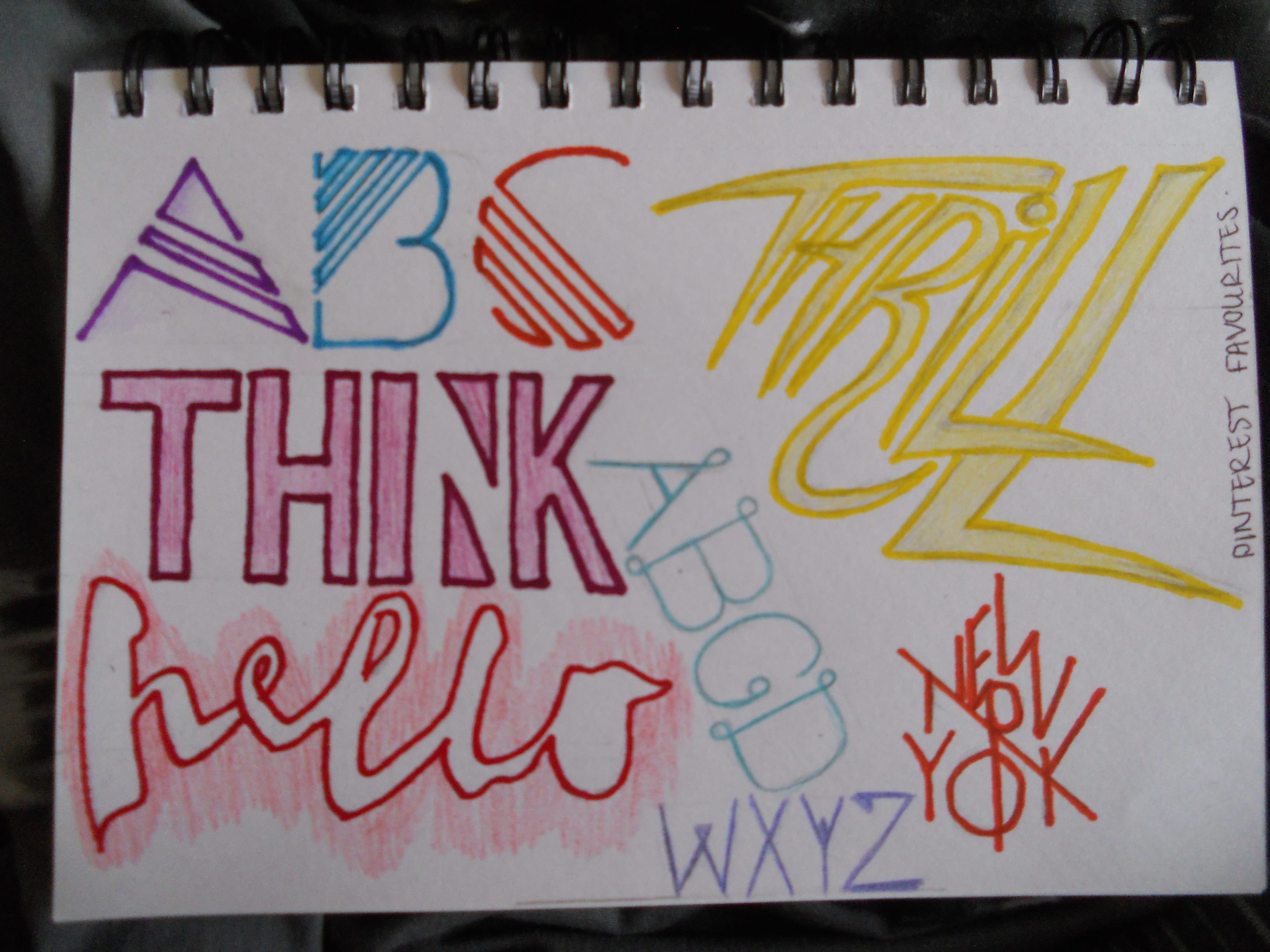
Out of all the fonts I really liked ‘Thrill’ I thought it was a fun, expressive and very unique font style, it definitely grabs attention and I think any bold colour would work really well with this. This helped me narrow down that I wanted to create a font that was very expressive and striking. I would also prefer to use lots of colours or a bold colour that really jumps out to the spectator. I then went on to brainstorming ideas of context for my font, as I think if I have an idea on what item, product, advertisement etc that I am going to create the font for, I will work much better when it comes to creating the type.
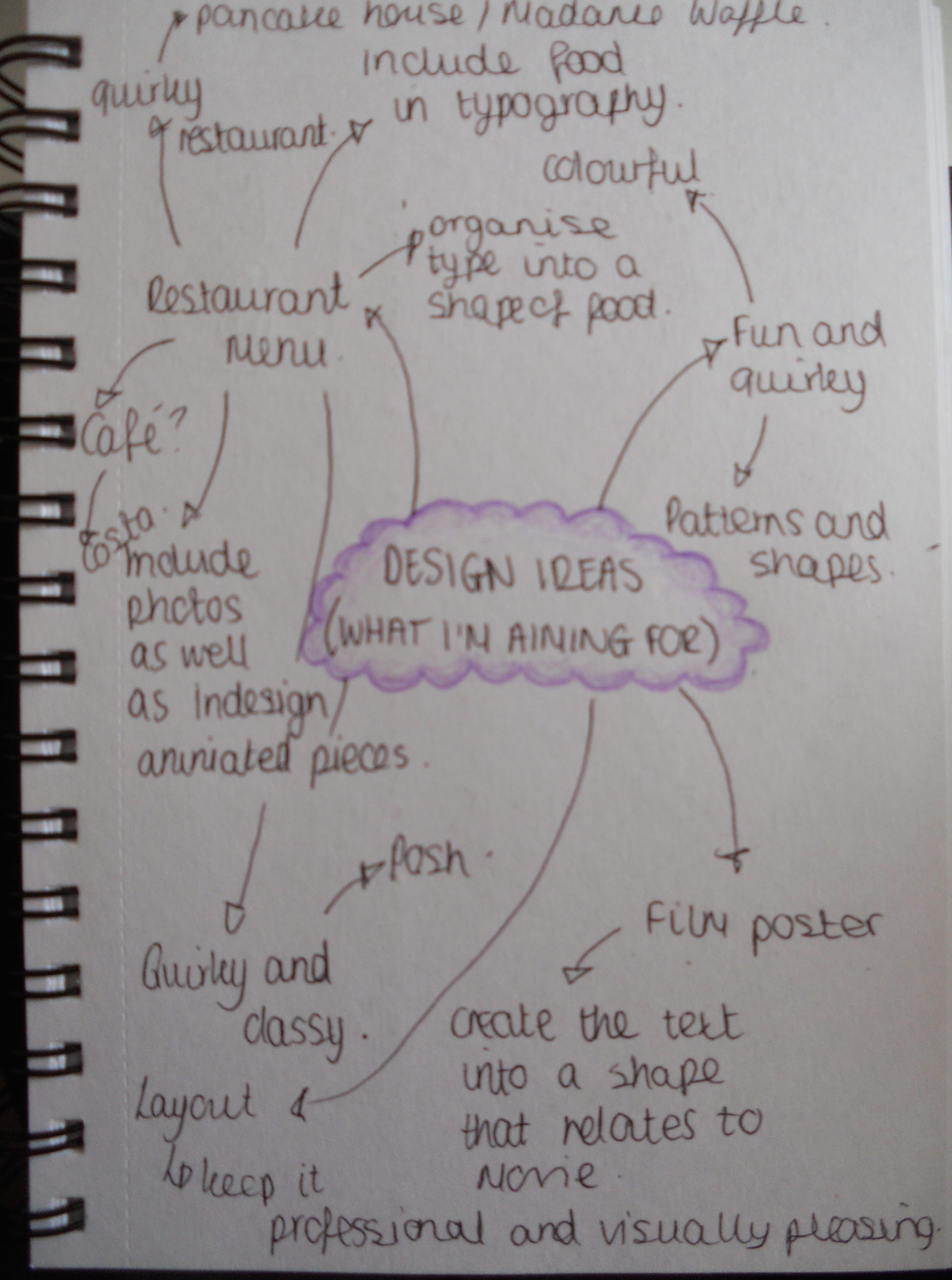
Overall, I have narrowed down, what I believe are the strongest ideas. These ideas are to create a font to go into either a restaurant or cafe menu. I think this is very unique to the brief and I can relate the font onto loads of products such as uniforms, napkins, cups, plates etc as well as the menus themselves.