Initial Alligator Design.

For my initial alligator design I took on the style from my first pastiche from illustrations I found on Pinterest. Firstly I drew out my alligator to make sure I get the right proportions before I make it digital. I then stuck with the colour scheme when putting the illustration all together.


I then decided I still like the grain effect and applied this to my design. I also decided that I didn’t want to add any drop shadows and just keep it as a flat image. I then darkened the colour of the alligators body and added eyes. I then went back to look at the other illustrations I created and really liked the effect of the two tone gradient colour scheme of the body so I added this effect to my alligator in the main body, feet and spine. I also added more teeth.
Story Research

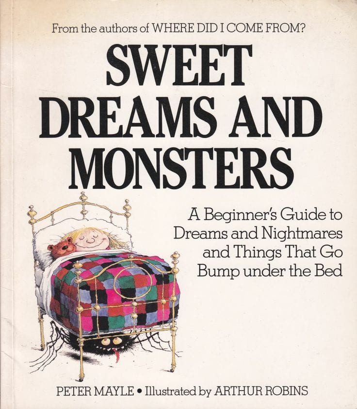
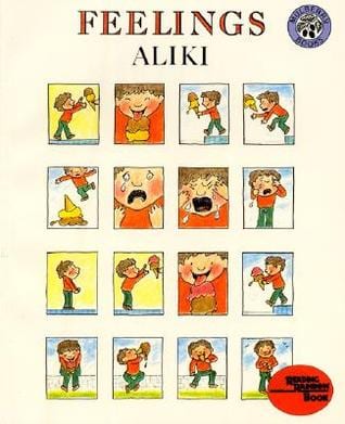
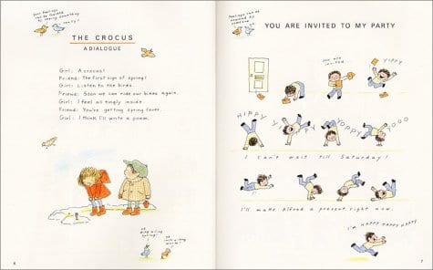
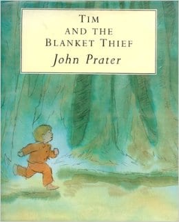
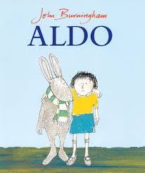
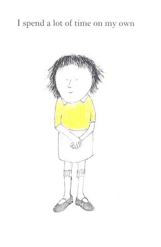
The main overall topic that I wanted to cover in my children’s picture book was about mental illness, in particular, Anxiety and Loneliness. I found a few books that have already covered these issues in children’s books specifically aimed at 3-12 year olds. I wasn’t taking illustration ideas from these books, just story plots as I was quite worried that mental illness would write well in a book. Stories I looked at were:

Sweet Dreams and Monsters by Peter Mayle:

cade9cb0d7025418fc98b73859ae8914


Feelings, Aliki:

316891 41S08Z653NL


Tim and the Blanket Thief, John Prater:

61eHW99FOQL._SL500_SX258_BO1,204,203,200_


Aldo, John Burningham:

Unknown parsons_1


I think I’m definitely going to try to convey the topic about anxiety as it is a very common mental issue that kids have in todays culture and society. Its also something something personal to myself, as I know the symptoms so I feel that I could convey it well.

Picture Book Brief – Project 4

For our next project we are looking into designing and illustrating our own children picture books aimed at a demographic of 3-7. I started looking at children books that were my favourite when I was younger and looked at their designs, I looked at books such as:

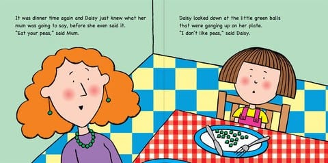
“Eat Your Peas”

480x480bb-85


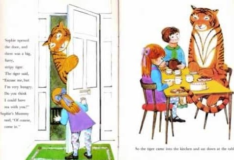
“The Tiger Who Came To Tea”

hqdefault


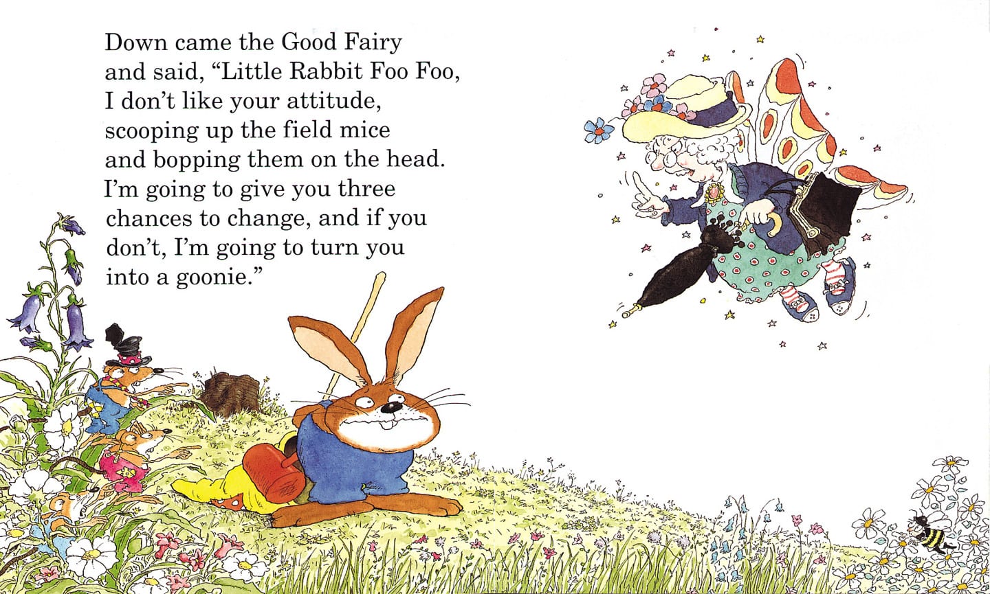
“Little Rabbit Foo Foo”

Little rabbit foo foo 1


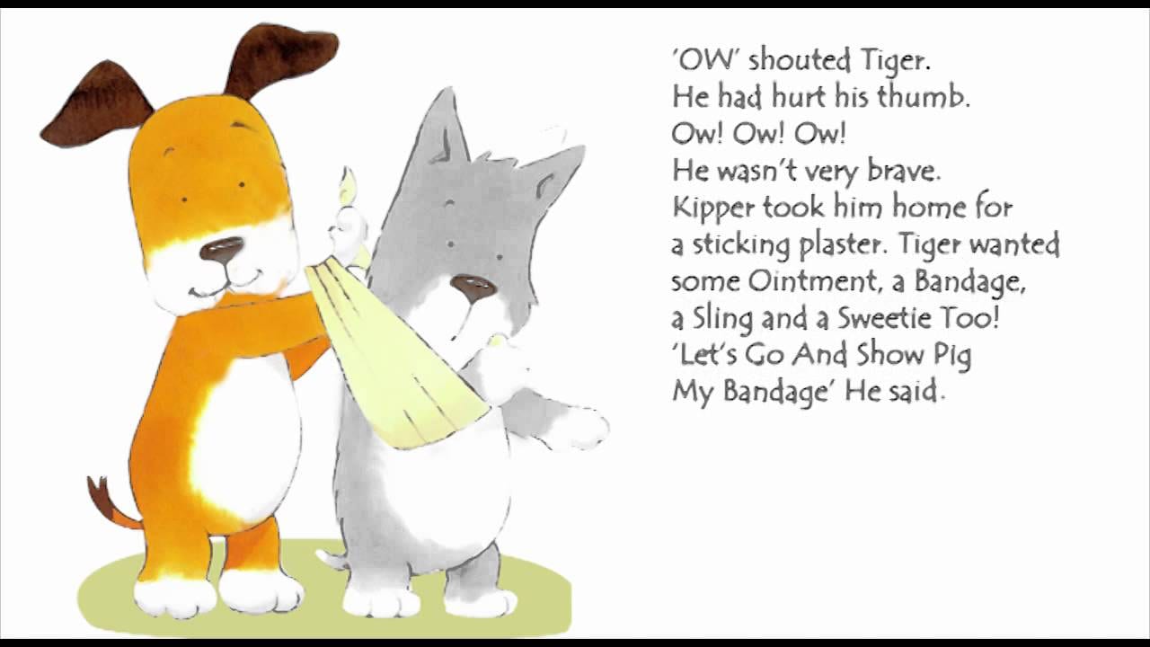
“Kipper”

maxresdefault

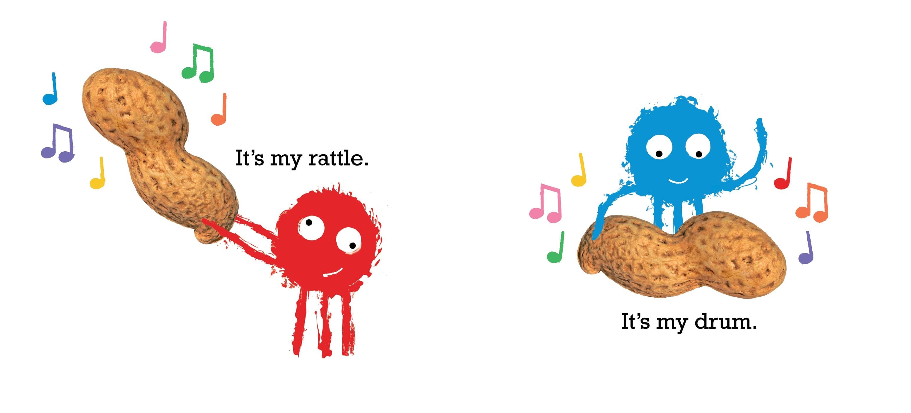
Looking at these designs are very illustrative and designs like the ones in “Little Rabbit Foo Foo” and “The Tiger Who Came To Tea” made me decide that I want to go down the simplistic and minimalistic route for my picture book. So I then went onto looking at the pictures books by Simon Rickerty, especially “Monkey Nut” and “Crayon”, I really like how simple these designs are and keeping a simple colour scheme.

the-peanut-9781442483644.in01 the-crayon-9781481404754.in02


I also really like how he has added real photos of objects that are crucial to the story. I am going to keep my style similar to this as it is very visually engaging without being too overcrowded or busy.