![]()
![]()
![]()
Development
Logo Development.
I took the logo breakdown I did and choose my favourite. It was between the floral design and the watercolour design. Even though I was going with the watercolour design initially I have decided to go for the floral design instead as I feel it is more striking and would work better when its shrunk down and enlarged.
![]()
Developing Logo.
After analysing my logo in more depth and asking for some critical opinions of others, I realised that the logo I previously created looked like skeleton hands when it should look like rope. This wasn’t what I wanted to show so I decided to go back and change it. Instead of using a grunge brush for the lines, I found a watercolour pack and decided to use that instead to see what it looked like.
![]()
I really like the outcome of this and I with this development I feel I am one step closer to my final idea for a logo.
Developing my Logo Idea.
I was experimenting with my logo and I tried changing the outline to the style of one of the grunge brushes that I found on illustrator that I also used to create the watercolour effects, I thought this came up with really interesting textures and lines. The only I issue I have with this particular logo sketch is what it may look like when its shrunk down for the brochures. I would like to combine this with the watercolour effect somehow and include the font with it.
![]()
When applying the watercolour effect I made sure I kept the same colour scheme I wanted and just applied those. I first tried it with black and white, to see how the texture looked before applying colour.
![]()
I really like the turn out of the ones at the top, however it didn’t seem to have the same effect on the anchor part and no matter what I did, it wasn’t really changing. So I gave up on this for now and started to apply to colour scheme, this is what I created:
![]()
Again, I really liked the outcome of the lines, however the anchor didn’t look as good to me. I would like to keep the ship lines in my logo however I may change the anchor part into another image as I don’t feel satisfied or happy with it.
Developing Digital Watercolour Splats.
One major part of this project that I was really excited to develop and learn how to do was the create ink splats or watercolours marks through illustrator without using actual watercolours. I watched a couple youtube tutorials and then experimented myself with the methods, my first attempt showed good colours and contrast between these colours, however there wasn’t that watercolour effect that I wanted to get out of it. 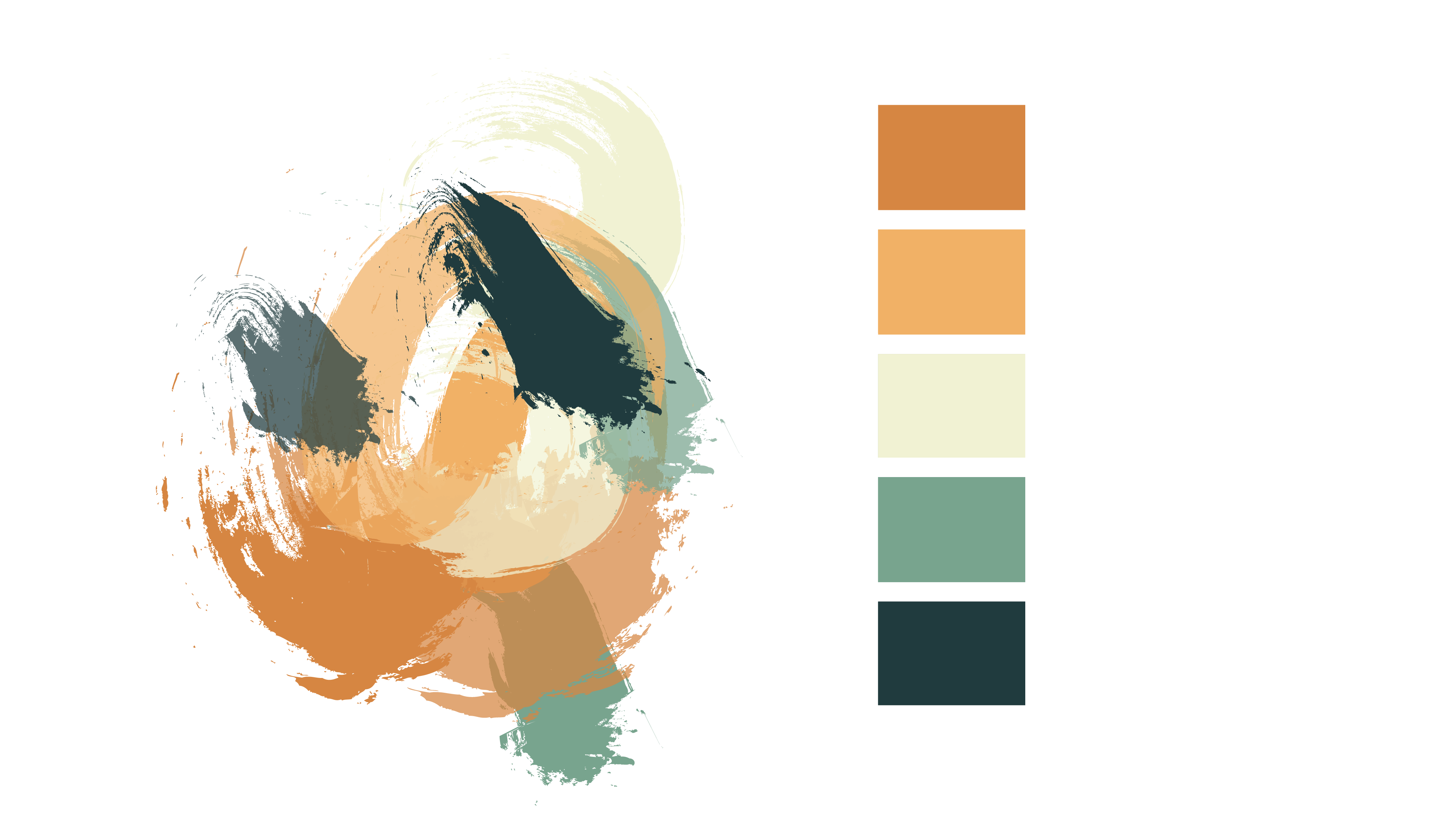
I then started experimenting with the gradient of each individual shape. I isolated each shape and worked on them individually. This was the outcome from this:
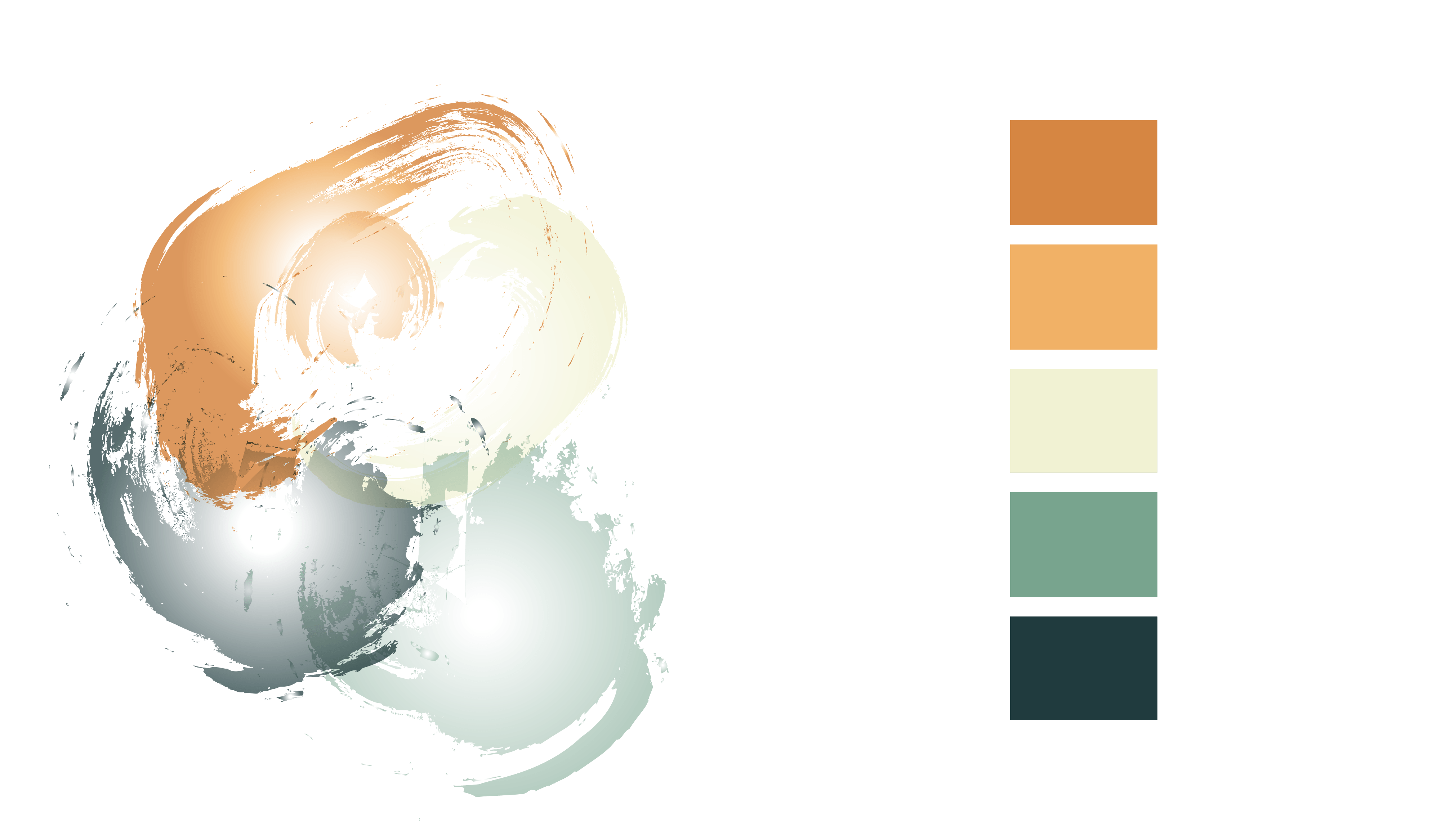
I liked this outcome, however I felt that having the darker shades on the outside of the shapes didn’t have the same effect as actual watercolour naturally does, and the white in the centre of each shape is too obvious, when I realised this I swapped the colours around and got this result:
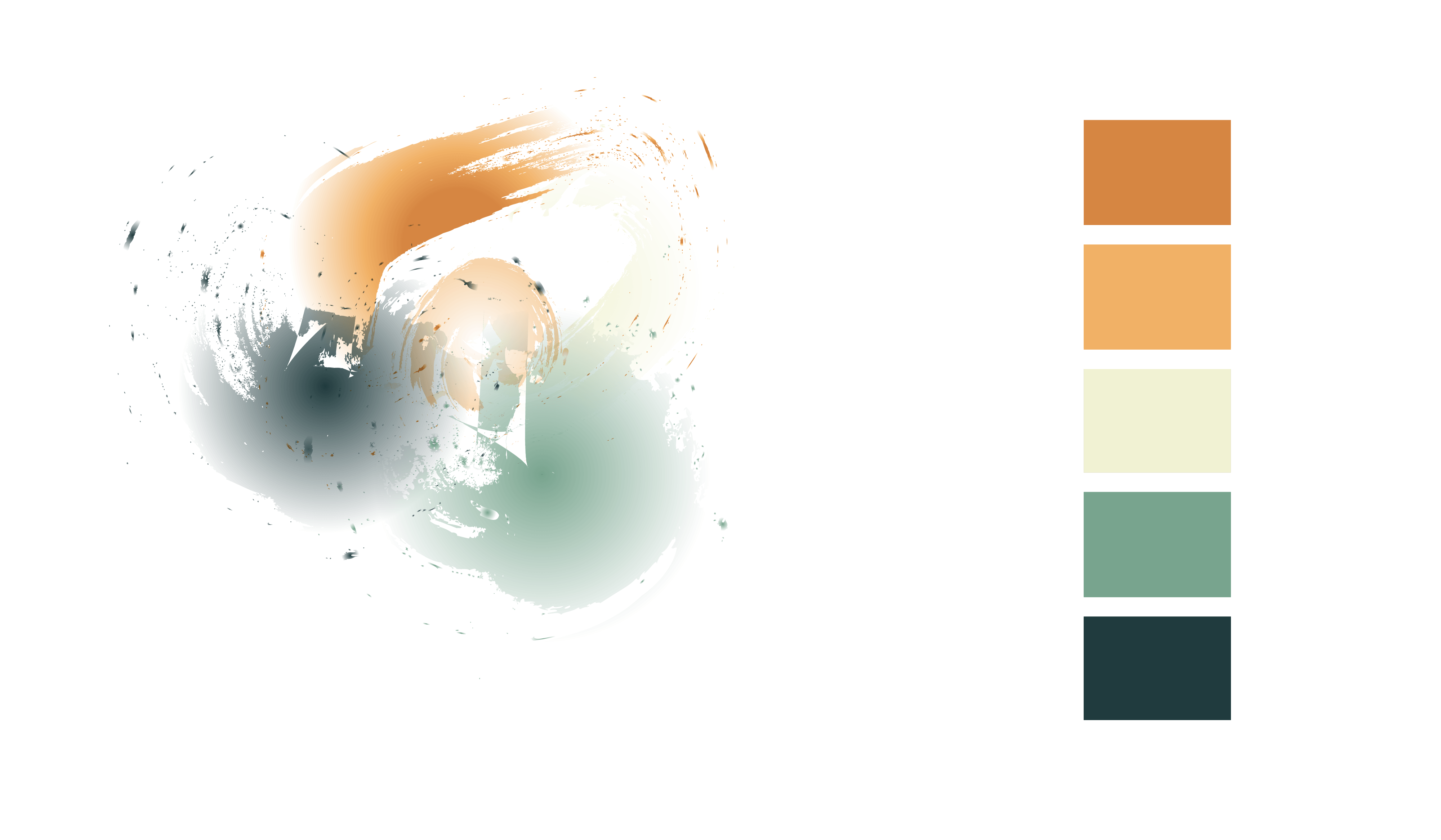
This is exactly what I wanted my result to be. I want to develop this further, using different colours and hopefully using it in my logo and brochures. I am very happy with the outcome of this experiment and I am definitely keeping this in my designs.