I was experimenting with my logo and I tried changing the outline to the style of one of the grunge brushes that I found on illustrator that I also used to create the watercolour effects, I thought this came up with really interesting textures and lines. The only I issue I have with this particular logo sketch is what it may look like when its shrunk down for the brochures. I would like to combine this with the watercolour effect somehow and include the font with it.
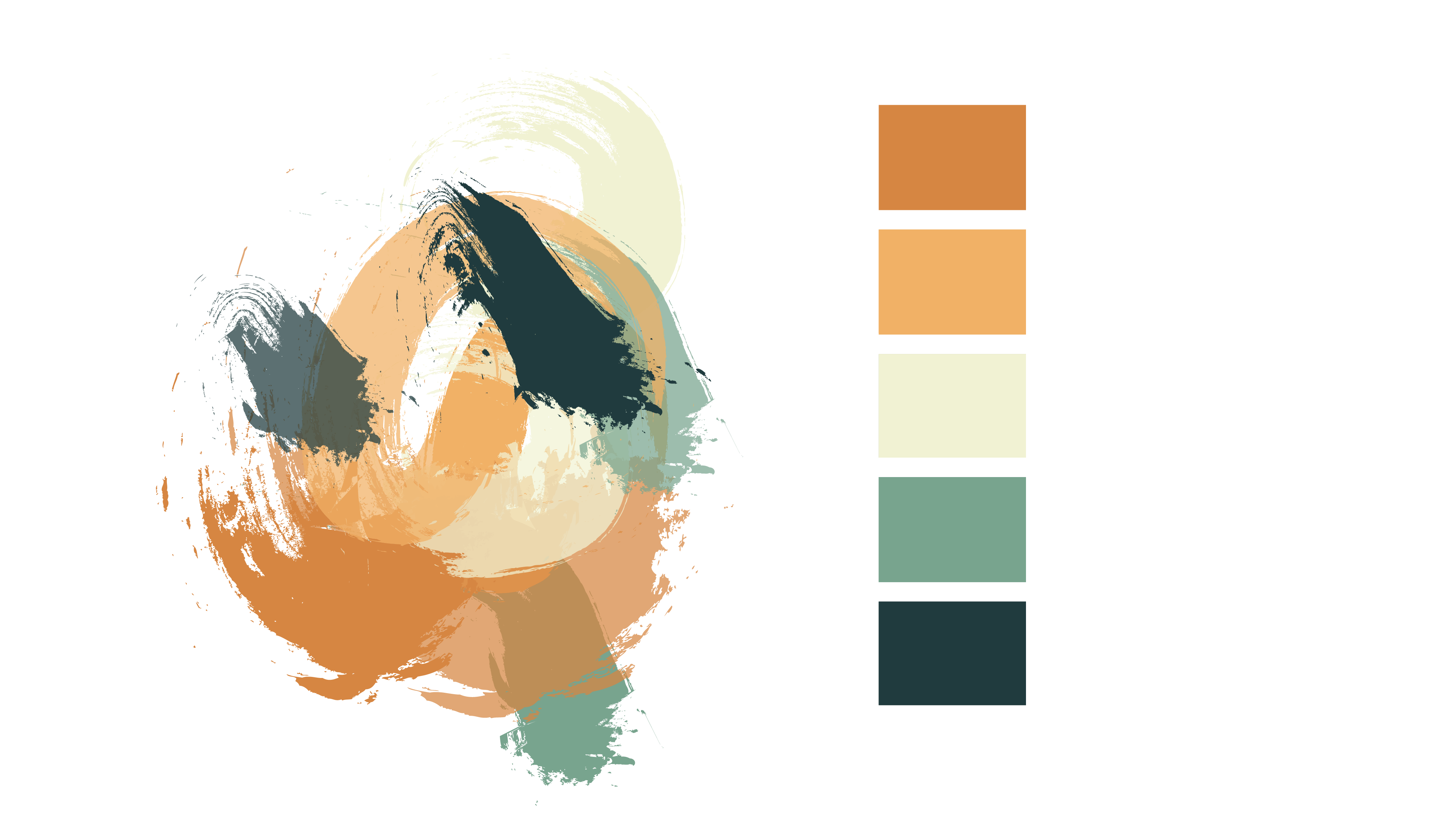
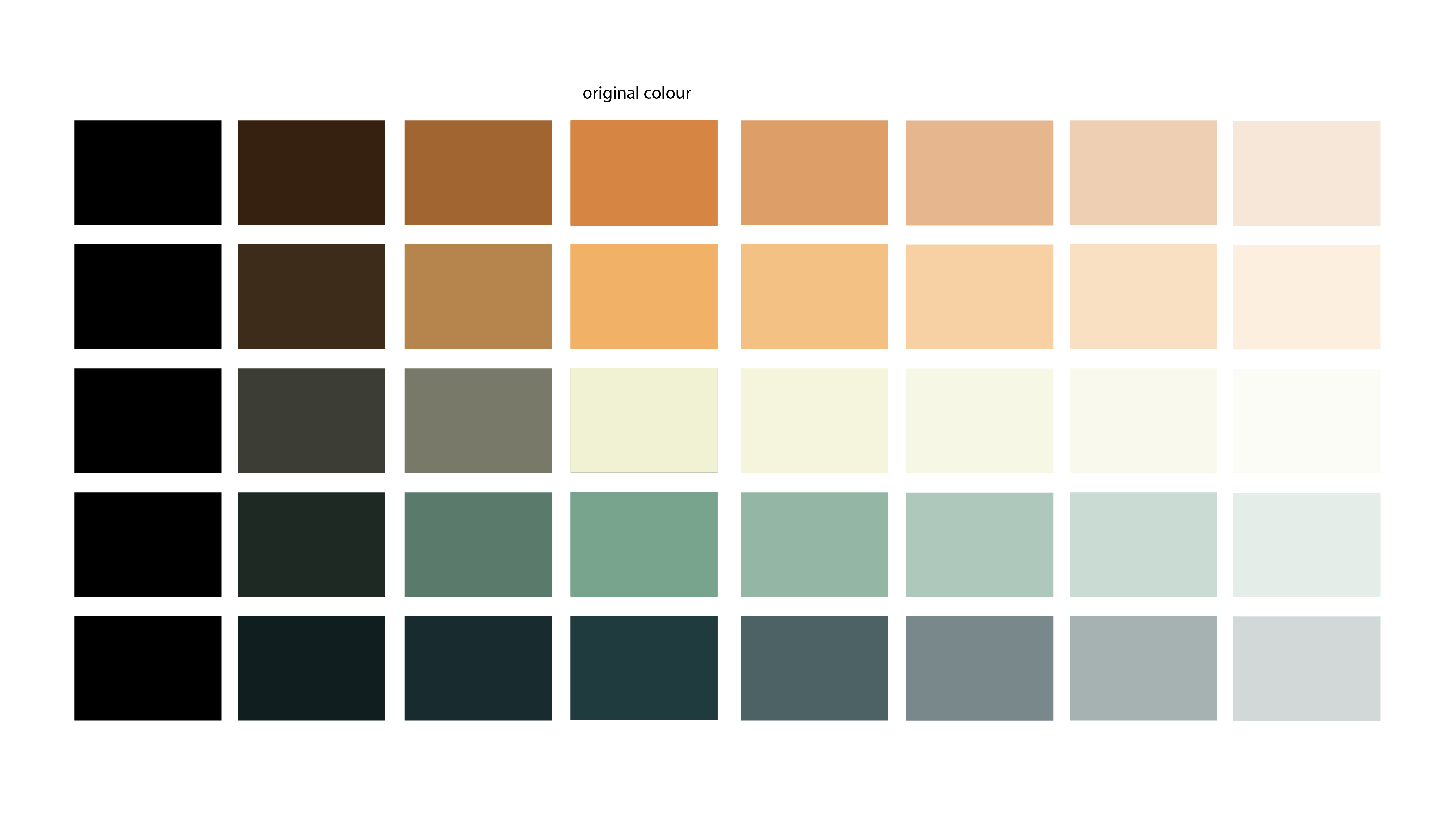
When applying the watercolour effect I made sure I kept the same colour scheme I wanted and just applied those. I first tried it with black and white, to see how the texture looked before applying colour.
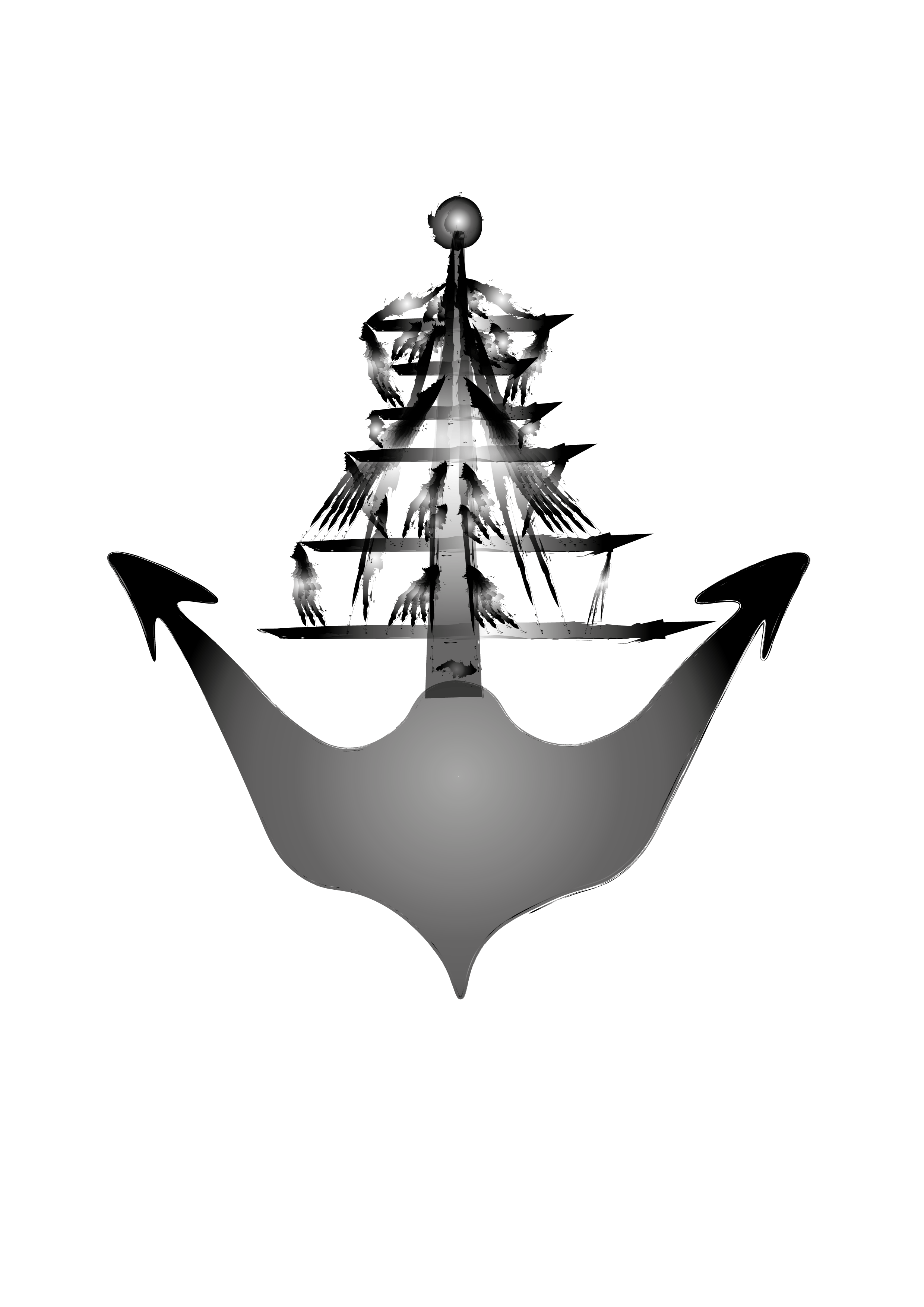
I really like the turn out of the ones at the top, however it didn’t seem to have the same effect on the anchor part and no matter what I did, it wasn’t really changing. So I gave up on this for now and started to apply to colour scheme, this is what I created:
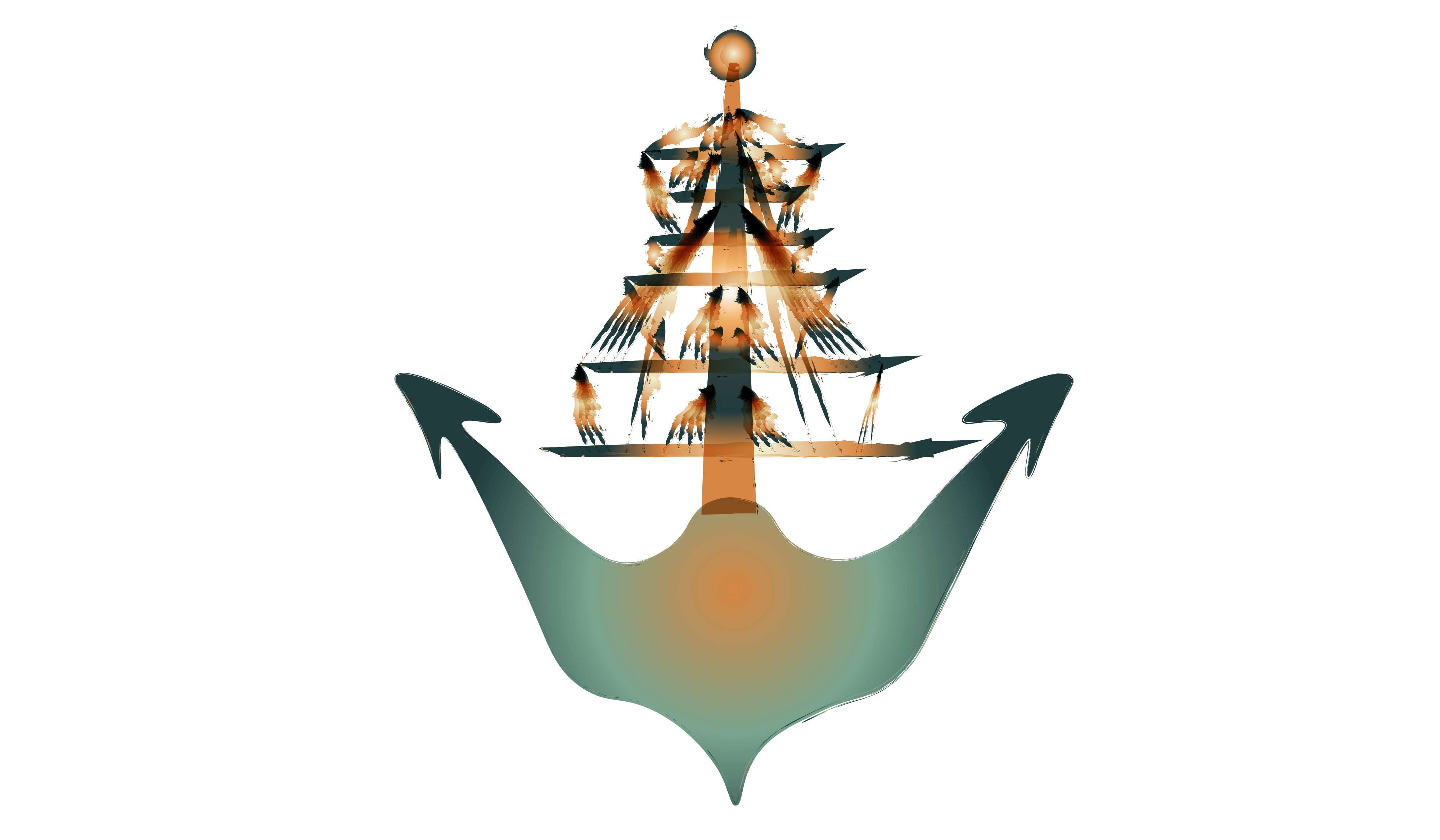
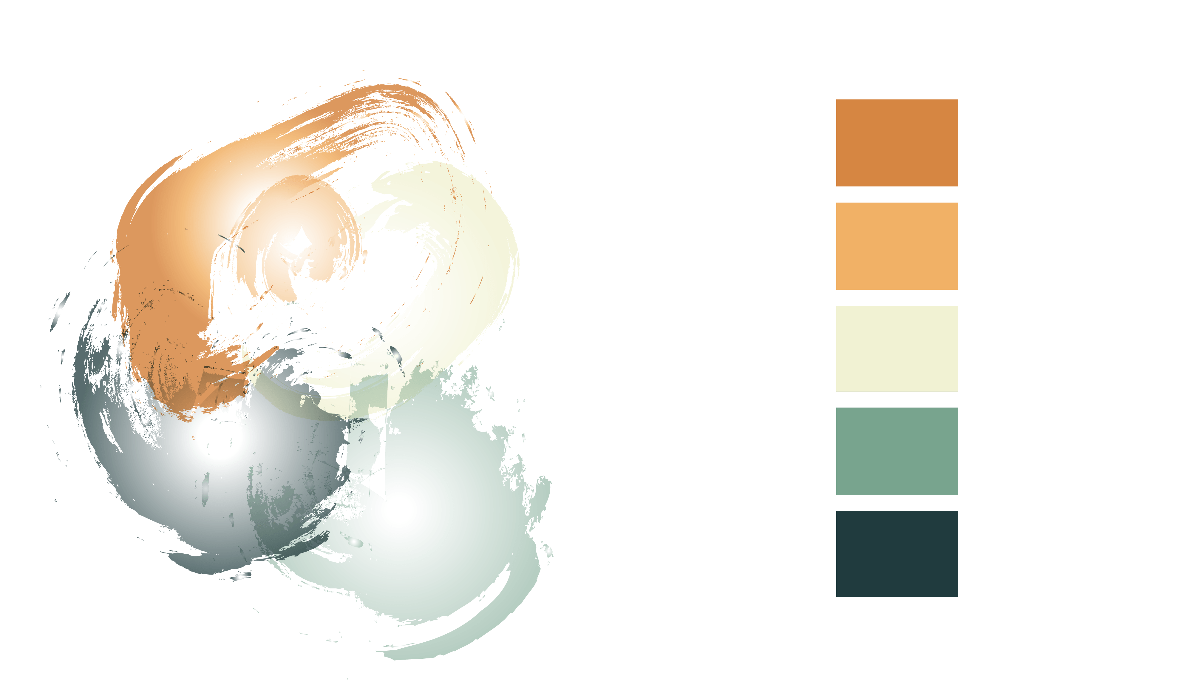
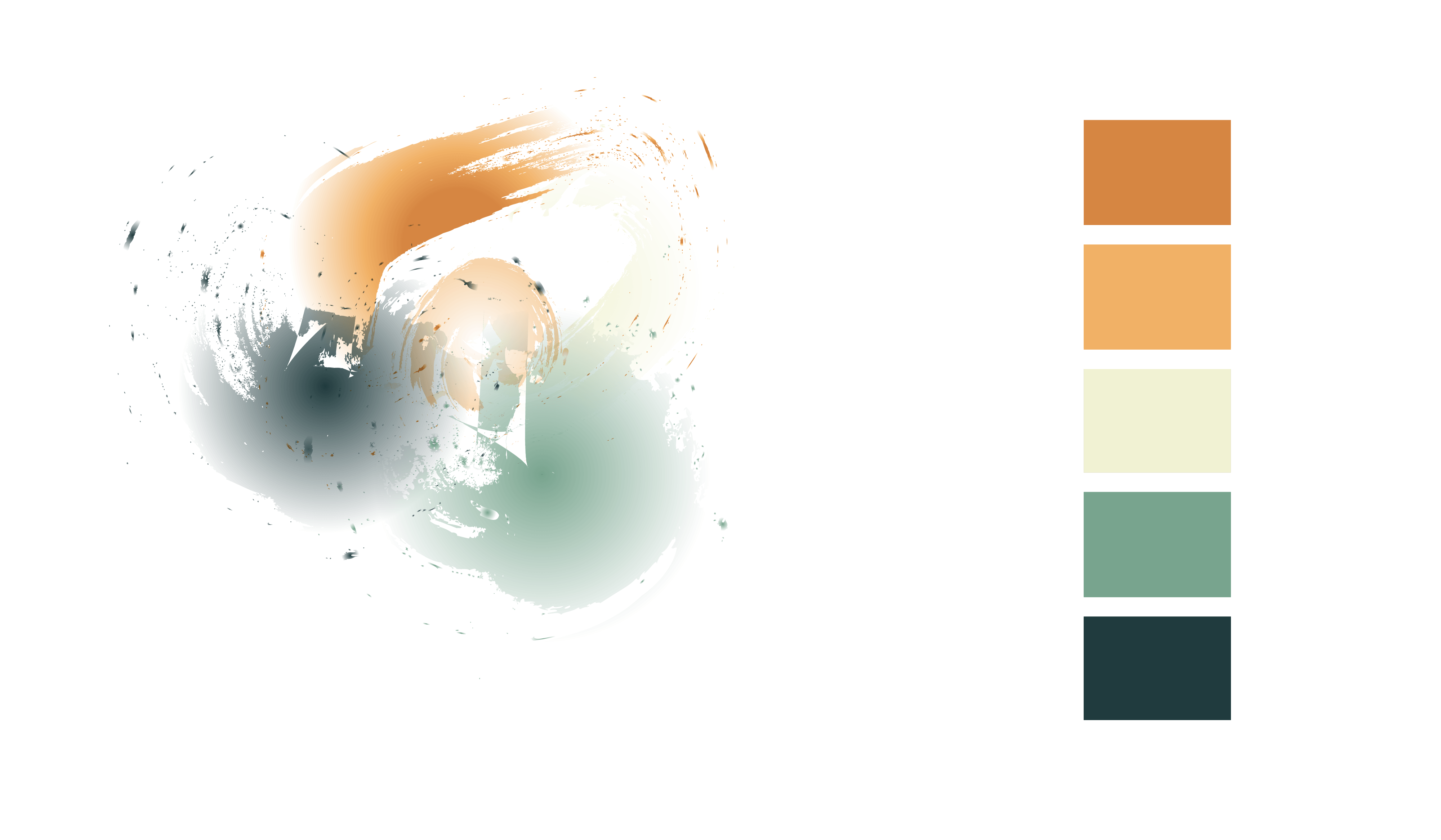
Again, I really liked the outcome of the lines, however the anchor didn’t look as good to me. I would like to keep the ship lines in my logo however I may change the anchor part into another image as I don’t feel satisfied or happy with it.