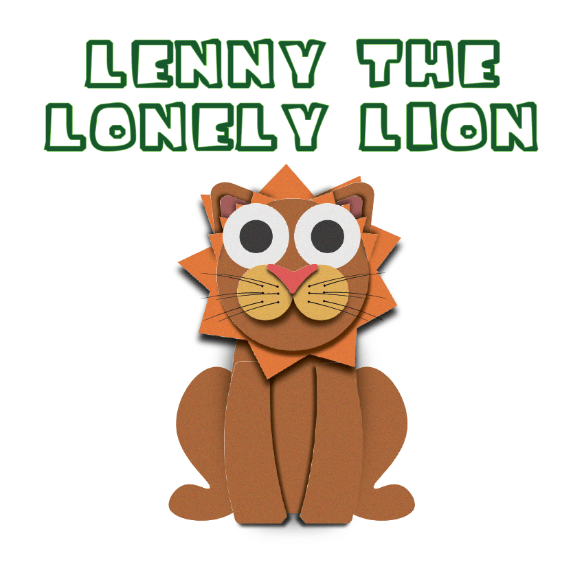
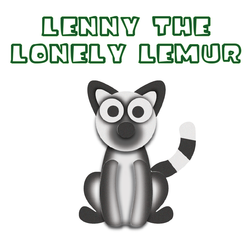
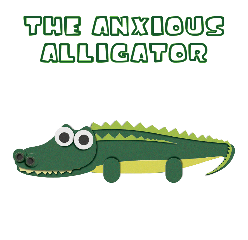
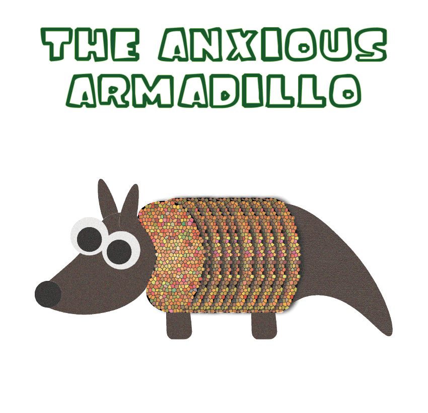
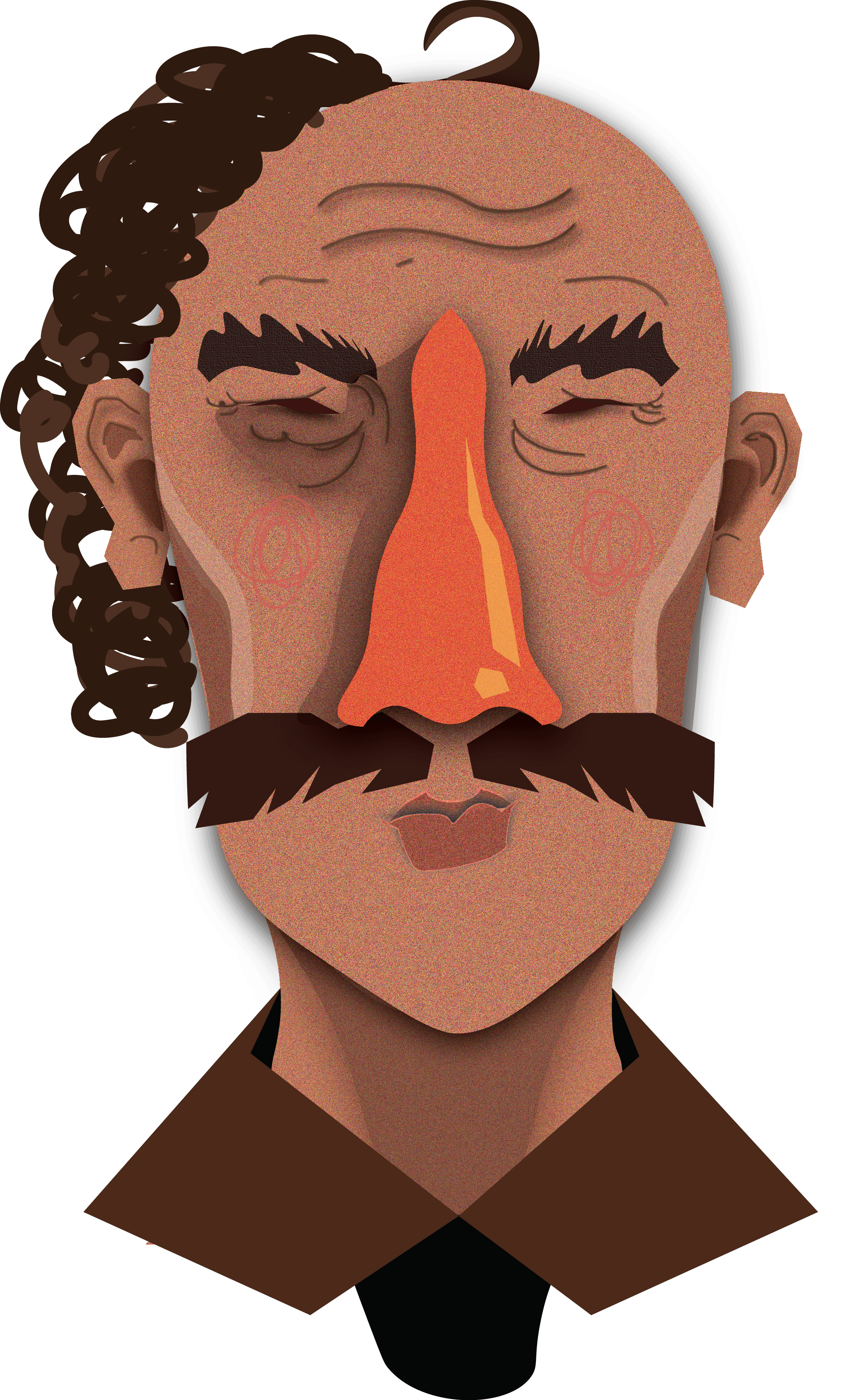
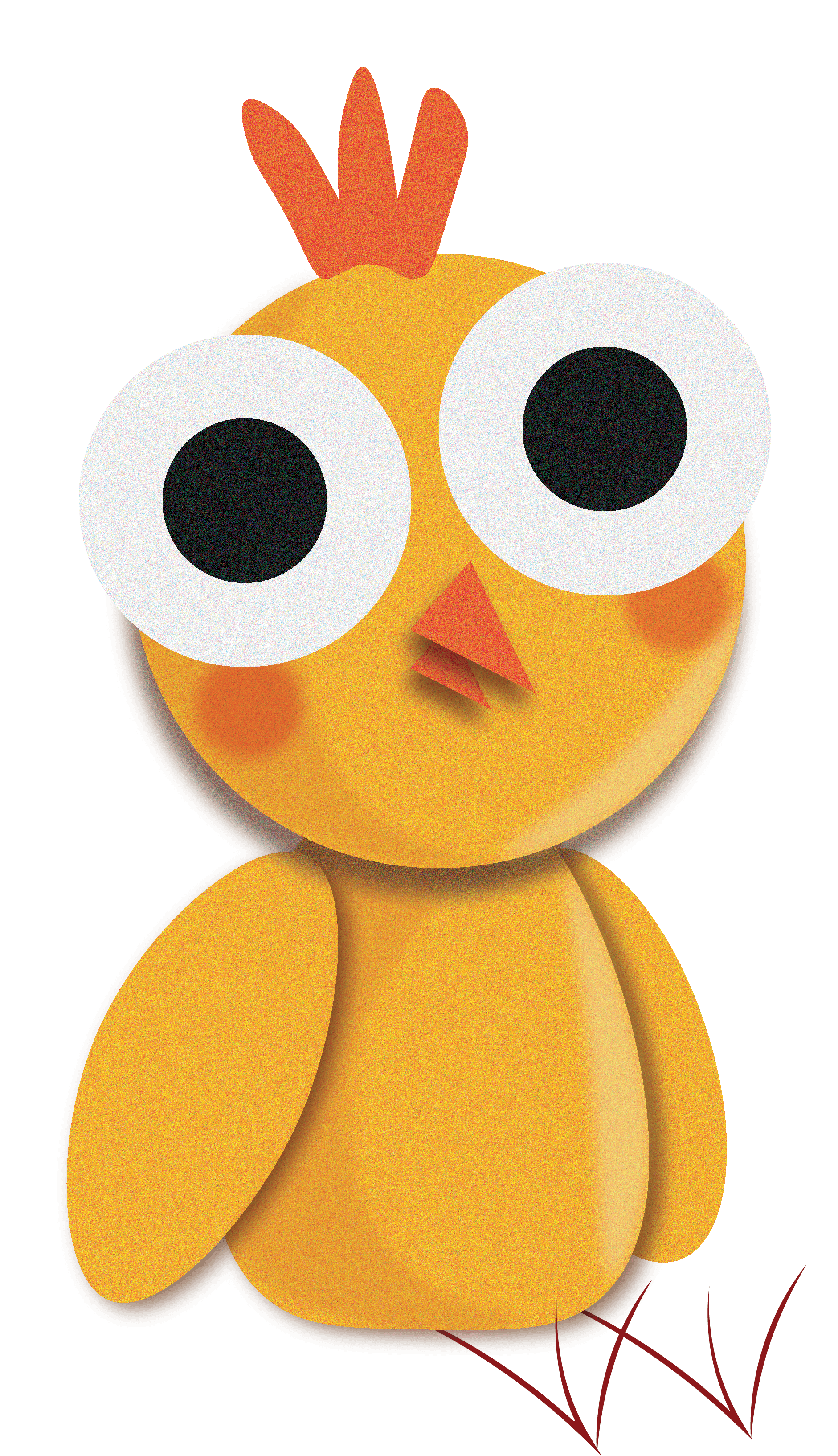
I have spent the last few days animating different animals on illustrator in the same style as the chick. I first made a dog and a caterpillar just to try out the technique out more and also experiment with shapes and colours.
I then went onto relating it to the theme of the story. As I was going along the lines of “loneliness” or “anxiety” I chose to create animals that started with an L or an A, as alliteration is quite traditional and common in children’s books. So the four animals I animated was a Lion, Lemur, Alligator and Antelope. I then downloaded a bold and simple font which was called “Ice Age” (from the Ice Age films)
What I am really enjoying about this style is the different textures, colours and tones. I am still undecided on which animal out of the four to chose from and I still have a bit of work to do on the antelope illustration, despite the fact I am leaning towards The anxious alligator design and the lonely lion. I am thinking of still using these other animal designs as supporting character designs, despite which one I pick. I also like the idea of having a complete white background. I may however, illustrate grass and some minor features for the background, however I do really like how its bare, I think it brings out the colours in the title and the animal really well.
