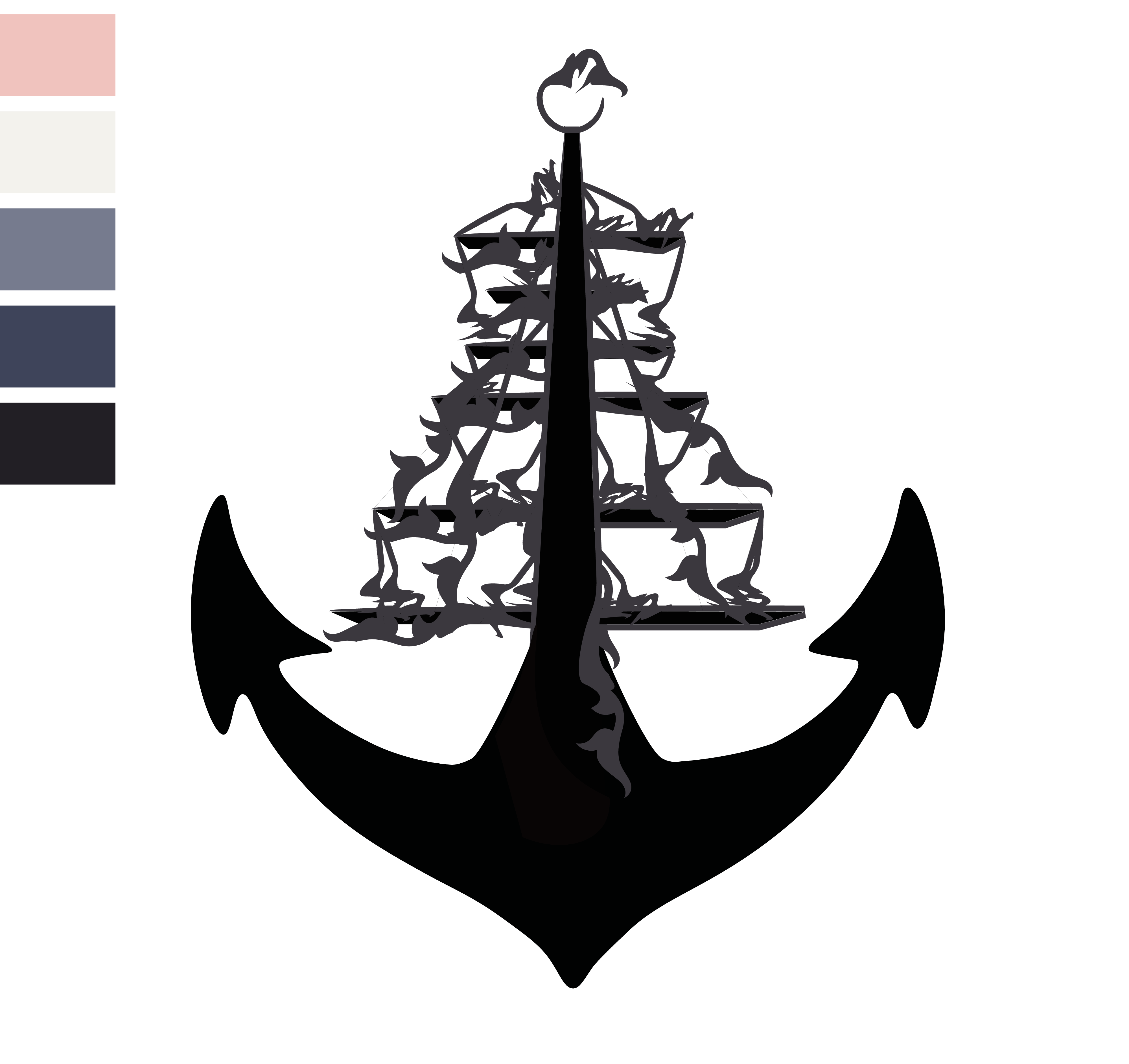
I took the logo breakdown I did and choose my favourite. It was between the floral design and the watercolour design. Even though I was going with the watercolour design initially I have decided to go for the floral design instead as I feel it is more striking and would work better when its shrunk down and enlarged.
Project 3
Logo Breakdown
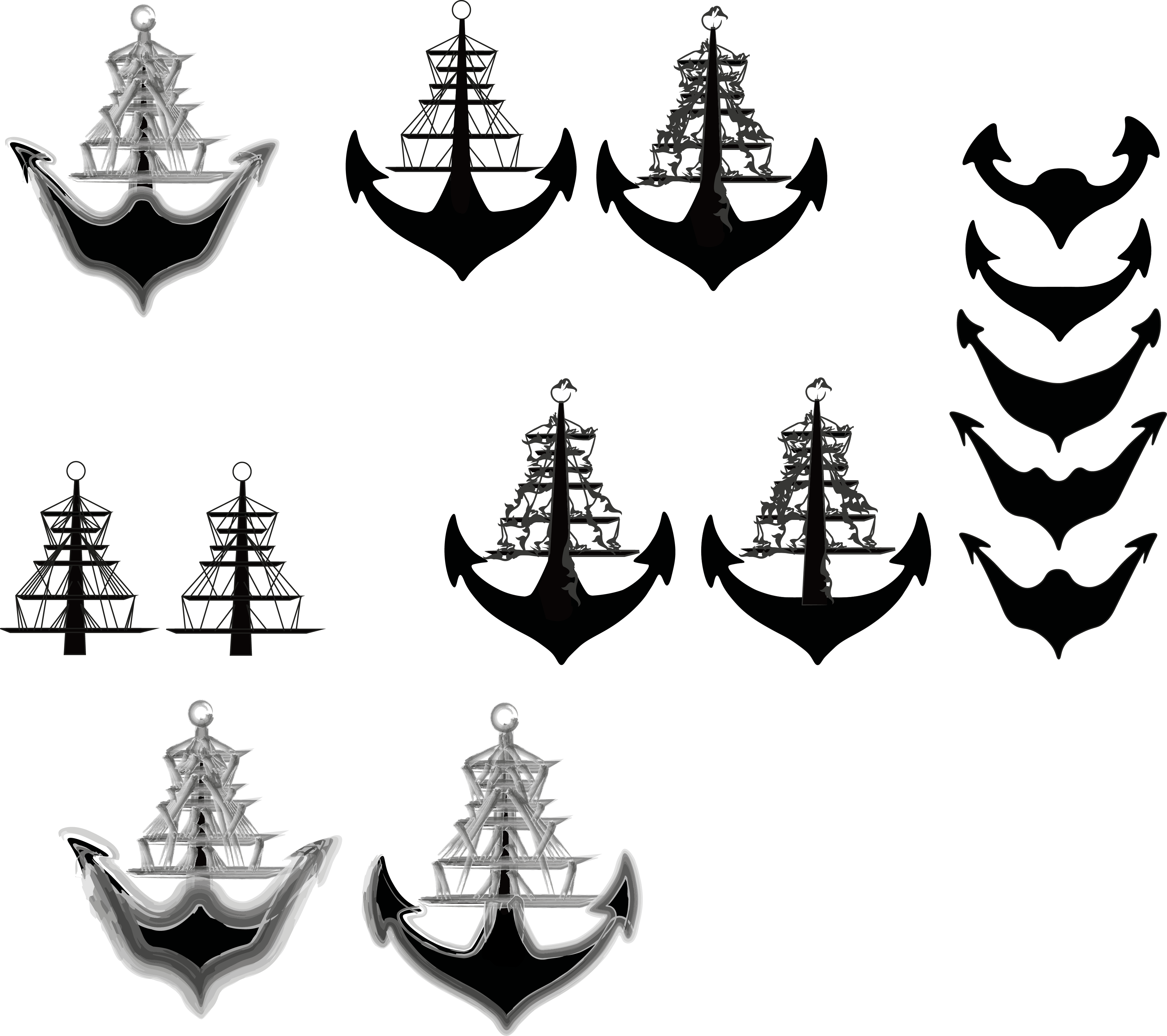
I still felt like there was a lot of work that needed doing to my logo so I decided to break the logo down and work on bits of it individually. I needed to work on the bottom part of the anchor as it wasn’t portraying what I wanted very well. I decided to expand this shape further with different widths and curves in different places. I also decreased the amount of lines I had in the ‘ship’ part of my logo and I also experimented with another line effect I found which added a ‘flower’ decorative approach to the ship, this effect makes it look closer to the tattoo context which I do like and it definitely competes with my original idea of the watercolour effect.
Photoshop Workshop.
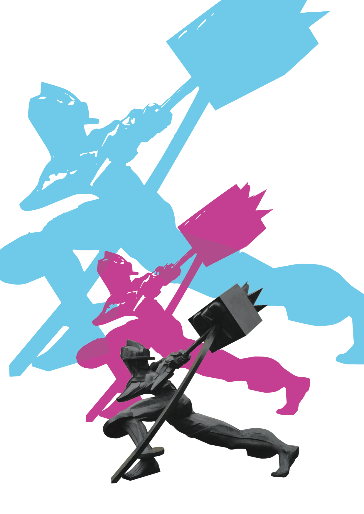
In Wednesdays workshop, we learnt how to use photoshop in a more professional way when it comes to masking and cutting out an image at a good quality with smooth edges. I really liked this activity as it opened up more knowledge on how photoshop works, especially when I’m not that confident with photoshop unlike softwares like Illustrator and Indesign. I created this poster as an example. I may use this for my piece with my own colour scheme as I think it would look quite appealing on a brochure as supporting graphics.
Layout.
Circles
Yesterdays lecture we learnt a bit more about logos and the term branding. One part of the lecture stood out to me and made me include it into my logo, this was the subject of the circle. A circle shows protection and safety, even represents trust, all of these factors I feel are relevant to High Seas Ink as they want their customers to trust their company and want to be reassured that they are safe and I feel that adding a circle around my design is a nice subtle way of showing this. I added a different variety and styles of circles around my logo design:
The one that stands out to me the most is the bottom left design . I really like how the circle doesn’t break unlike come of the others and it has some different shades, lines and tones. I think this works rely well and suits the logo itself.


