I did some experiments on how I would layout my logo and text together. I took my chosen font and my logo so far and started to fiddle round with sizes, curves and placements:
Project 3 Experiments
Circles
Yesterdays lecture we learnt a bit more about logos and the term branding. One part of the lecture stood out to me and made me include it into my logo, this was the subject of the circle. A circle shows protection and safety, even represents trust, all of these factors I feel are relevant to High Seas Ink as they want their customers to trust their company and want to be reassured that they are safe and I feel that adding a circle around my design is a nice subtle way of showing this. I added a different variety and styles of circles around my logo design:
The one that stands out to me the most is the bottom left design . I really like how the circle doesn’t break unlike come of the others and it has some different shades, lines and tones. I think this works rely well and suits the logo itself.
Developing a Final Font.
I started to focus more on my font for the companies title. I felt as if my previous font was too fancy for what I wanted to convey, despite it being a traditional tattoo style. I decided to go back to drawing on graph paper and roughly drew the companies name. I did a couple in italics and the others accurately measured up straight to the graph. I really like the effect some of these have so I decided to scan my favourites into illustrator and created them digitally.
Once I put my chosen fonts into illustrator I used the curvature tool to outline the fonts then I used different outlines for each letter to make it seem more relaxed. These were my three outcomes:
The font I have chosen to pick to go alongside my logo is the top one. I like that it sticks with the theme of ‘scripture’ yet has my own take on it as its my handwriting. I am going to experiment with this next to my current logo.
Developing Logo.
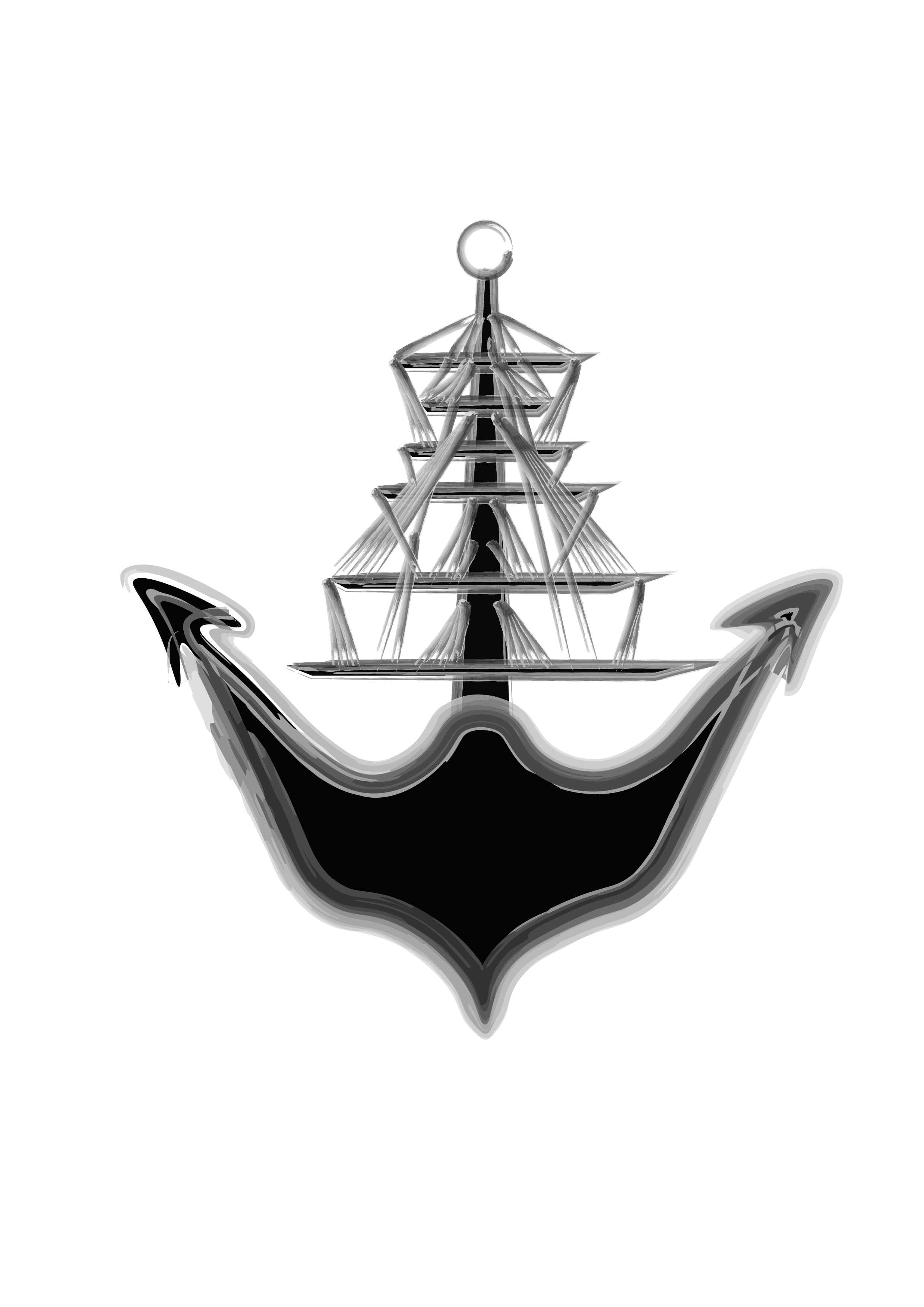
After analysing my logo in more depth and asking for some critical opinions of others, I realised that the logo I previously created looked like skeleton hands when it should look like rope. This wasn’t what I wanted to show so I decided to go back and change it. Instead of using a grunge brush for the lines, I found a watercolour pack and decided to use that instead to see what it looked like.
I really like the outcome of this and I with this development I feel I am one step closer to my final idea for a logo.
Developing my Logo Idea.
I was experimenting with my logo and I tried changing the outline to the style of one of the grunge brushes that I found on illustrator that I also used to create the watercolour effects, I thought this came up with really interesting textures and lines. The only I issue I have with this particular logo sketch is what it may look like when its shrunk down for the brochures. I would like to combine this with the watercolour effect somehow and include the font with it.
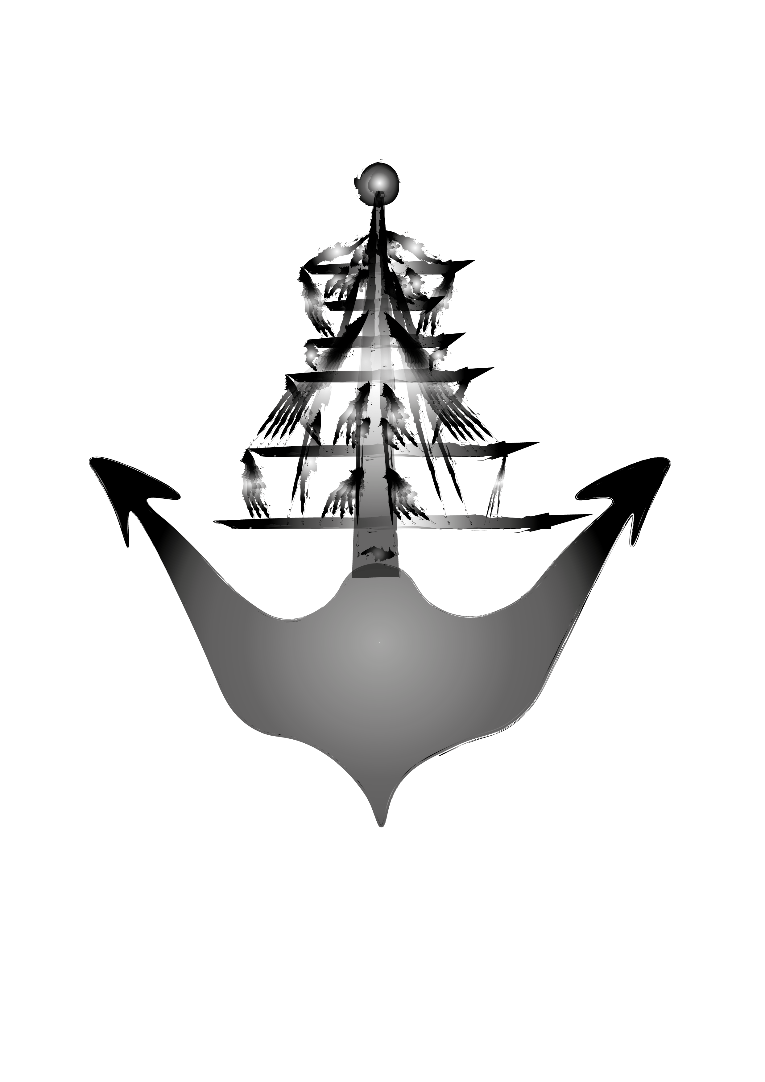
When applying the watercolour effect I made sure I kept the same colour scheme I wanted and just applied those. I first tried it with black and white, to see how the texture looked before applying colour.
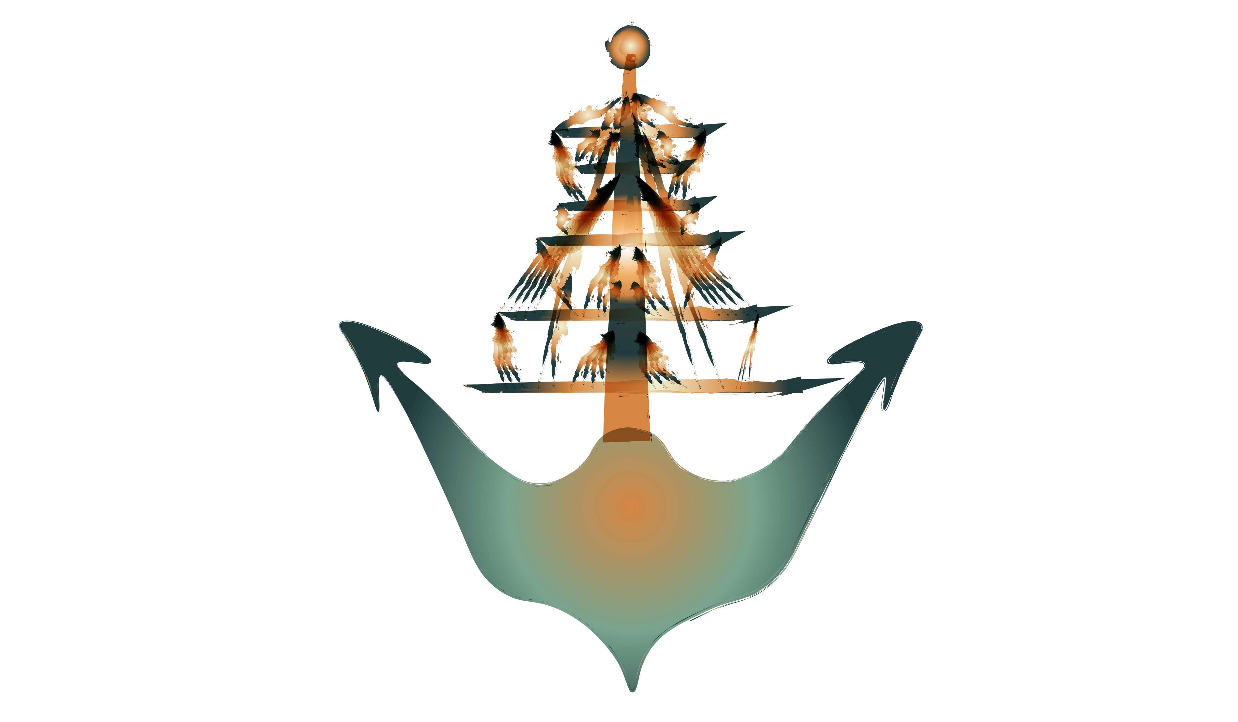
I really like the turn out of the ones at the top, however it didn’t seem to have the same effect on the anchor part and no matter what I did, it wasn’t really changing. So I gave up on this for now and started to apply to colour scheme, this is what I created:
Again, I really liked the outcome of the lines, however the anchor didn’t look as good to me. I would like to keep the ship lines in my logo however I may change the anchor part into another image as I don’t feel satisfied or happy with it.


