WEB PROTOTYPE DESIGN IDEAS.

For my online desktop design, I started to create a design that is suitable for children aged 14 and under. I wanted to use a blue and white colour scheme as it relates to the idea of space and ‘blue’ being one of the most popular colours. My initial idea was to create a website that has different pages that explained ways you can see relativity in real life (based on website: http://www.livescience.com/48922-theory-of-relativity-in-real-life.html) and explaining these with infographics and icons that I will design. I made this design as my first initial thought:

Relativity Online Desktop

I then asked an opinion of a web design student from a different university of his opinion on my design and if it would work well. This was when he suggested that it would possibly work better if I kept it on all one page. I developed this idea further and decided to design another prototype with keeping the same layout but with different info-graphics when selected each sub heading.

 

ICONS!

I have done some research into the theory of relativity to see if I could get my head around it and hoping it would make this project a little easier if I actually had the knowledge of the actual science. Unfortunately, science is not my strong point. However, I found a website that told us some ways you can see the theory of relativity in real life. – http://www.livescience.com/48922-theory-of-relativity-in-real-life.html. This gave me a great idea for my online desktop prototype and I got to work at creating some icons and graphics. I wanted to stick to  simple black and white colour scheme for the icons however for my infographics I want to use bright and bold colours to make them stand out and look interesting to my audience.

Nuclear Plant Icon


Gold Icon


Einstein

Development of New Font.

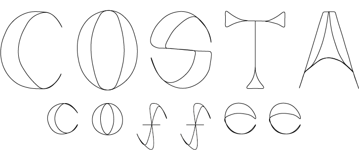
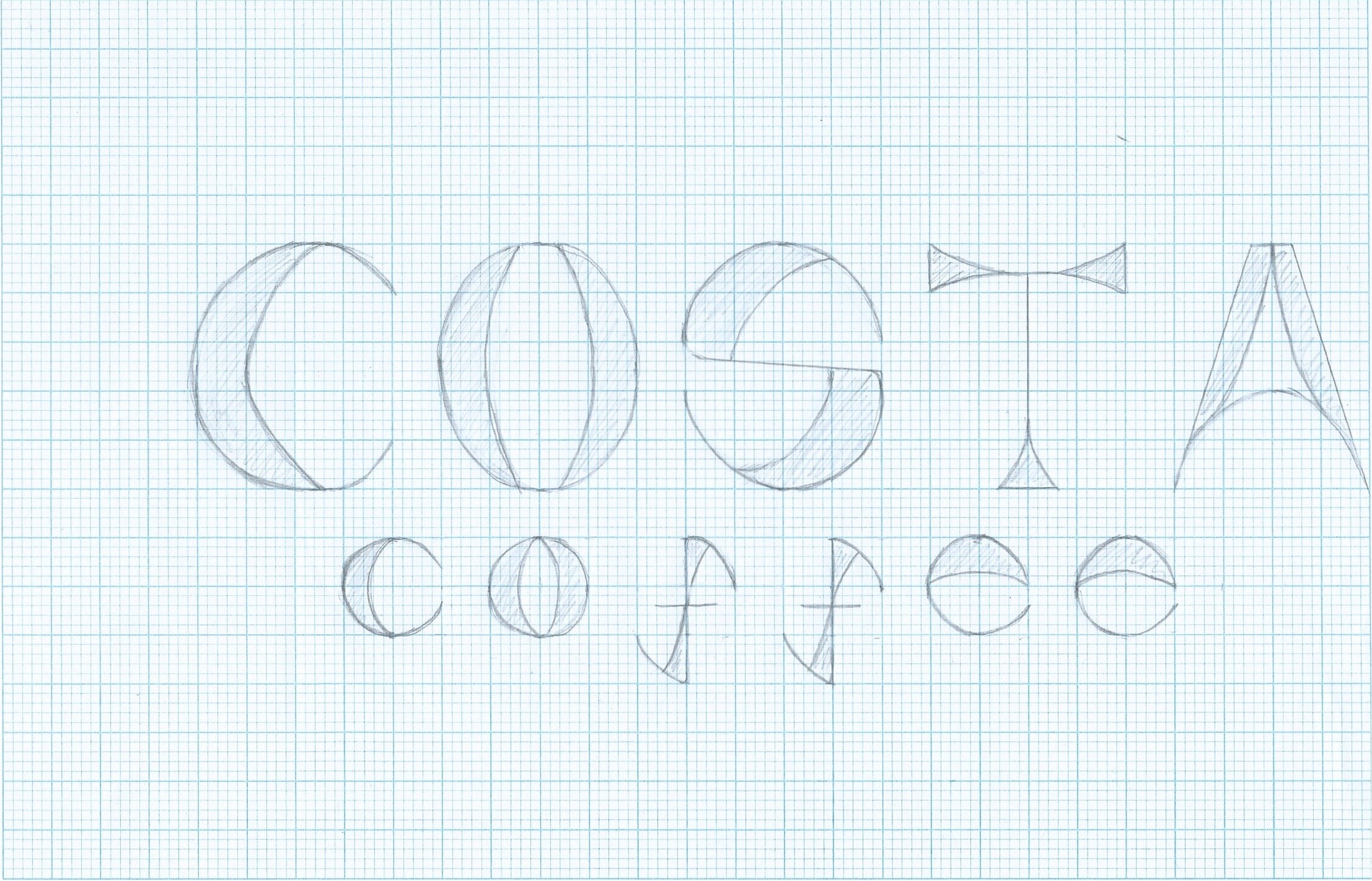
I took the new font I made and applied it to ‘Costa Coffee’ instead of using a different font for the word ‘coffee’ I made sure I used lower case letters for this. By doing so, I feel like it makes my font a lot more consistent and looks a lot more visually pleasing than my previous one.

Scan 152980001


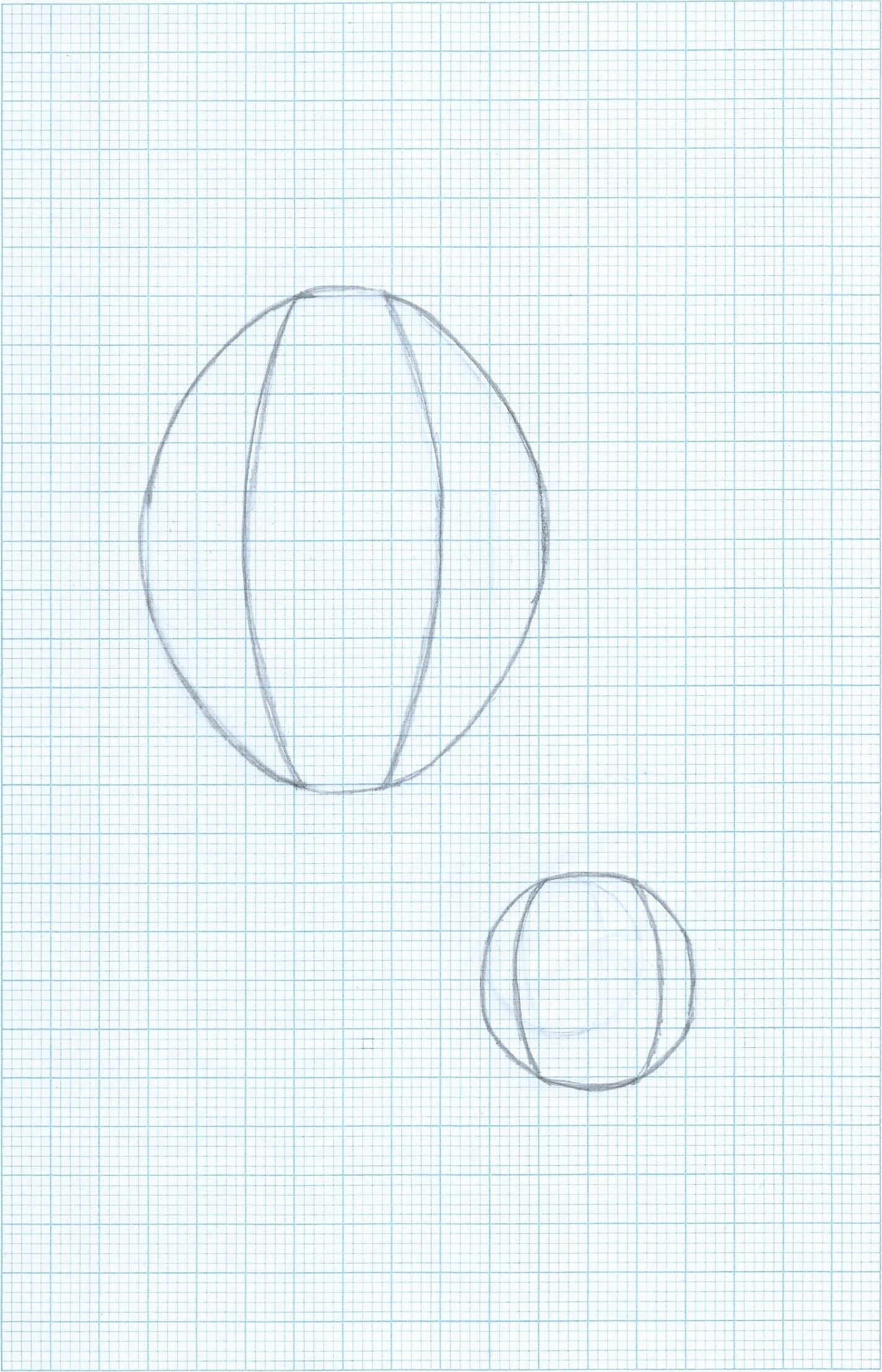
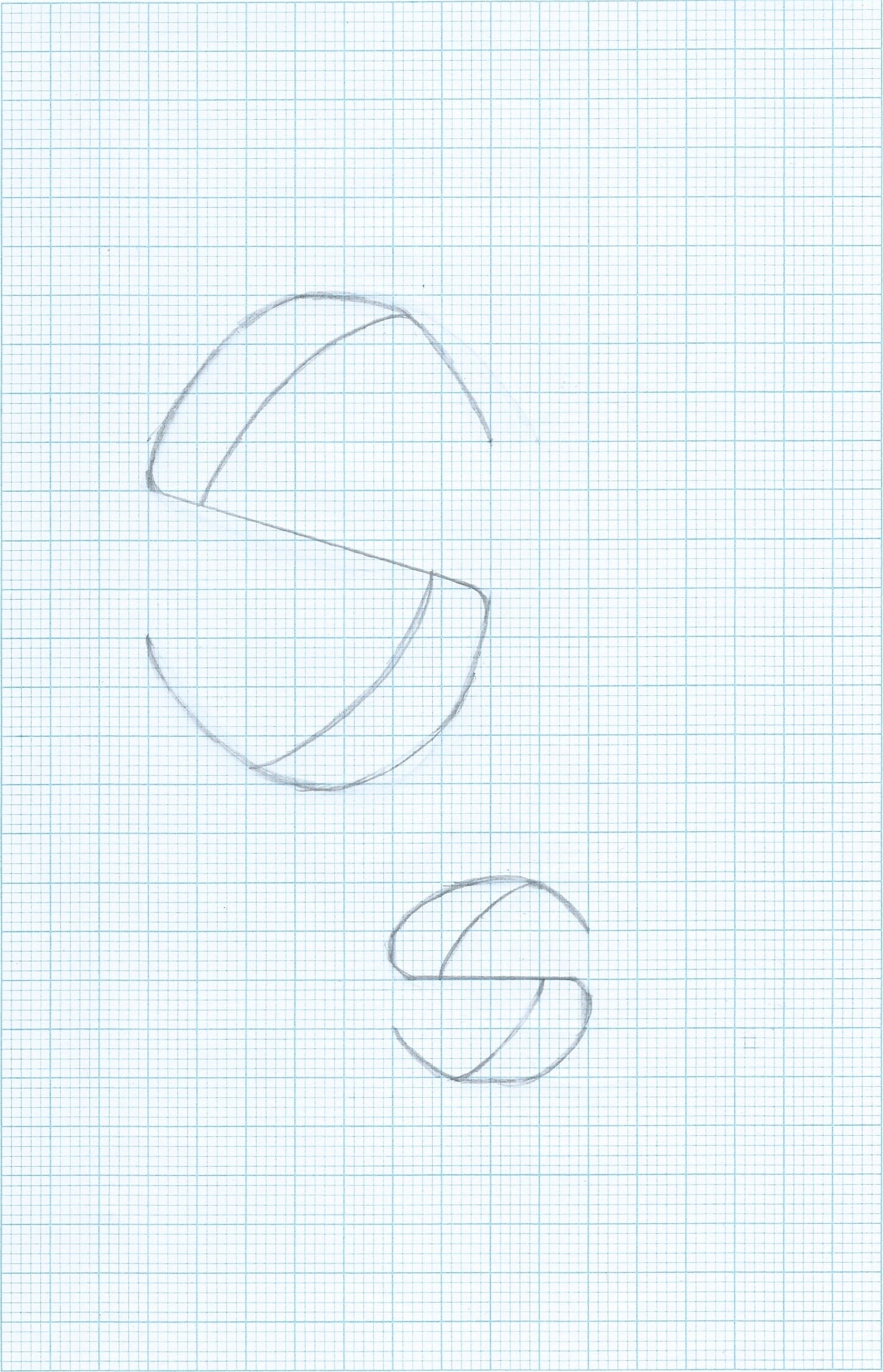
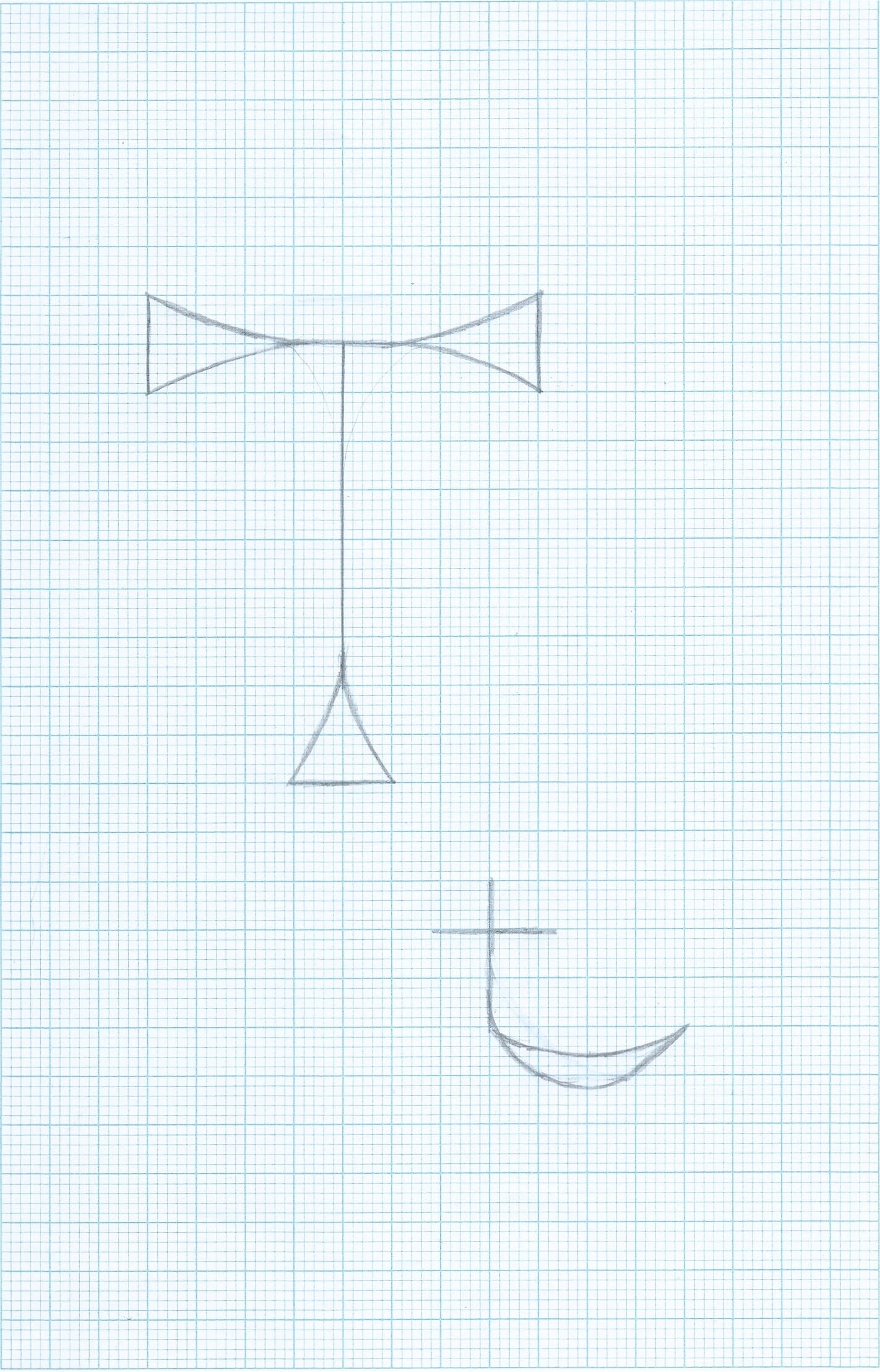
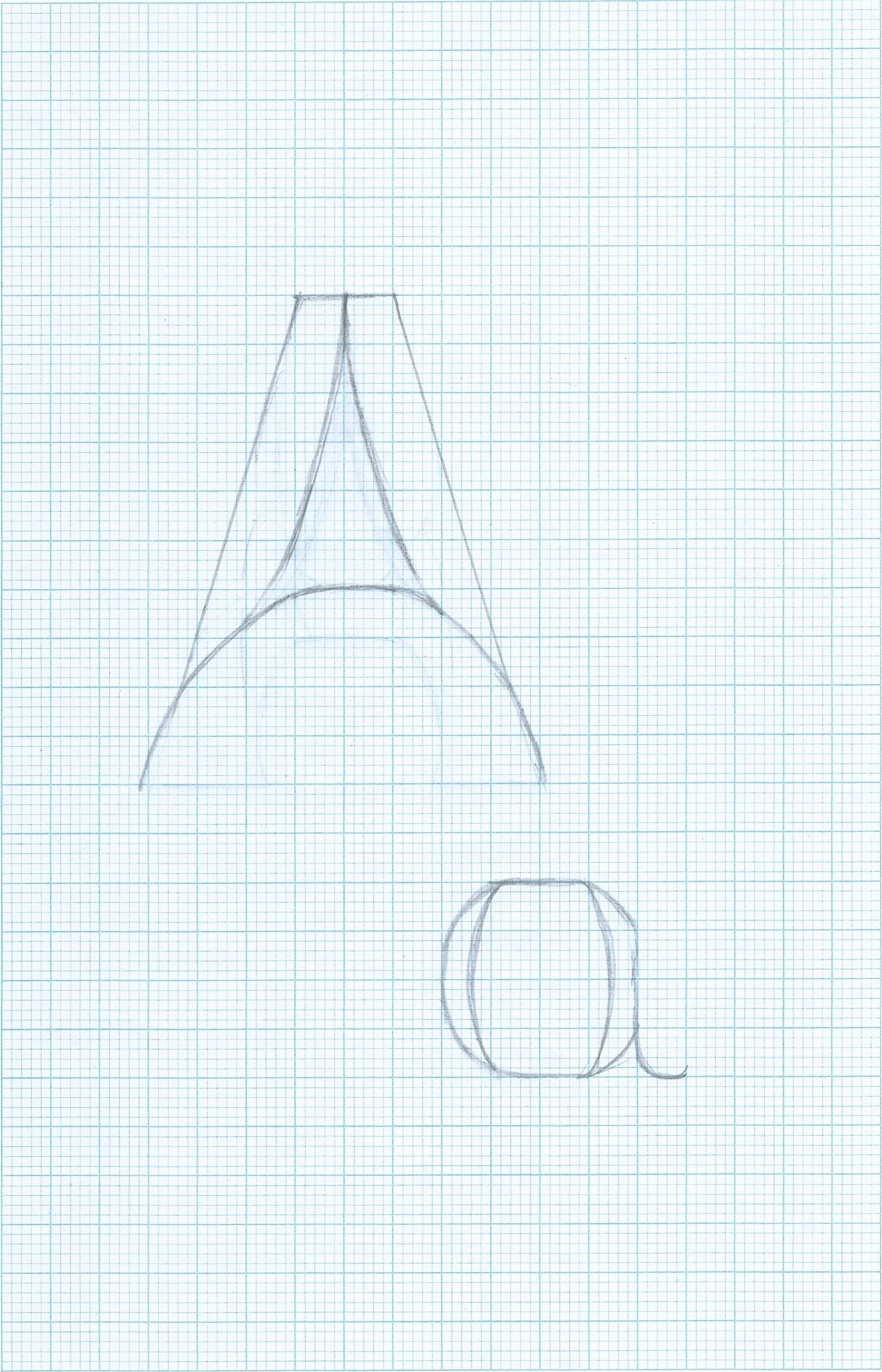
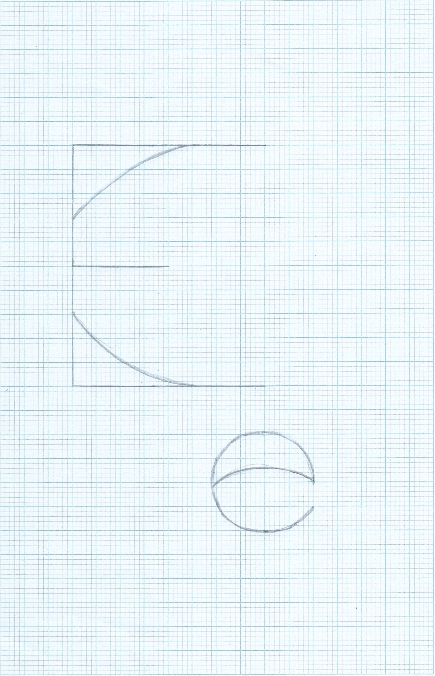
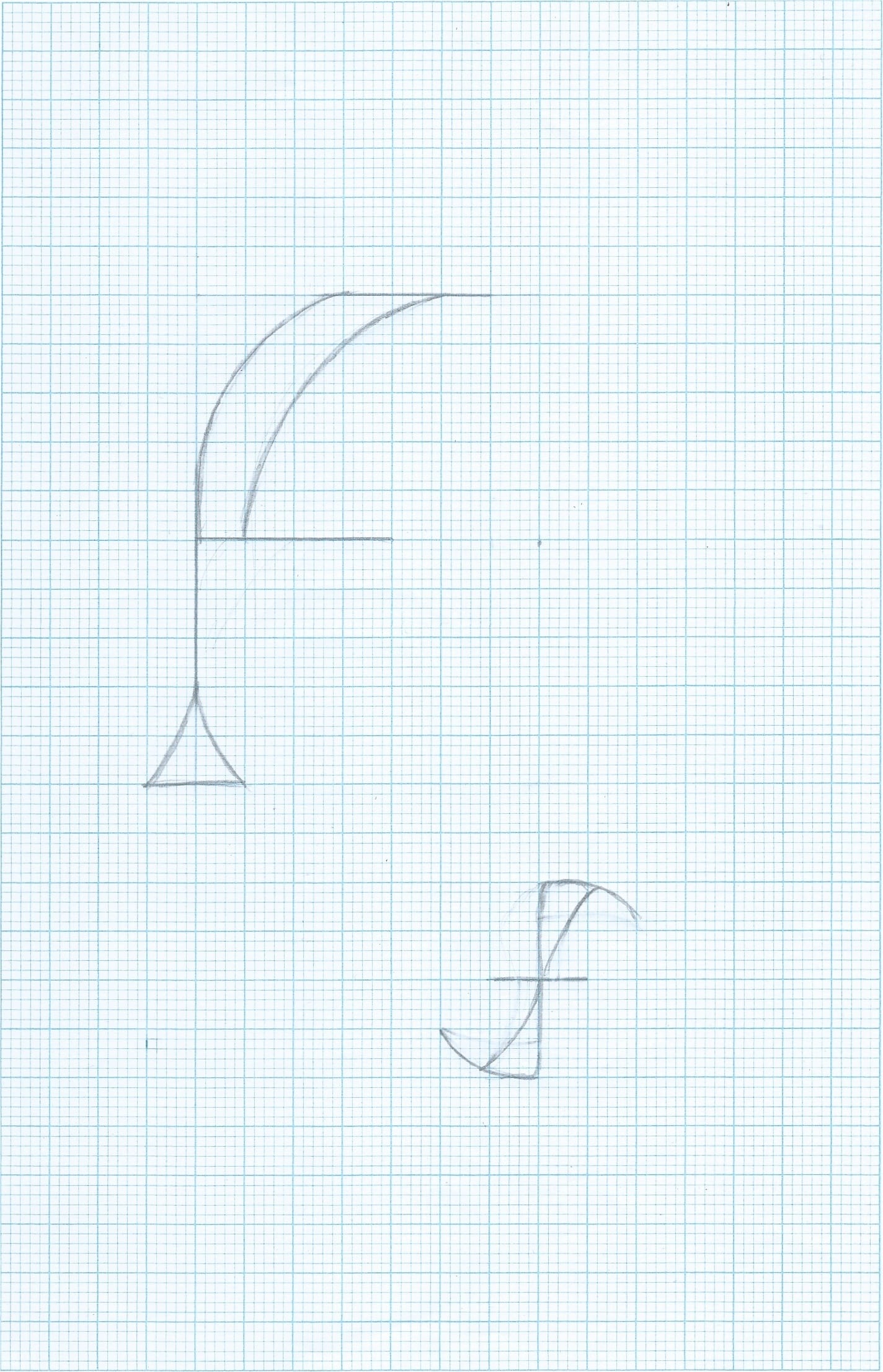
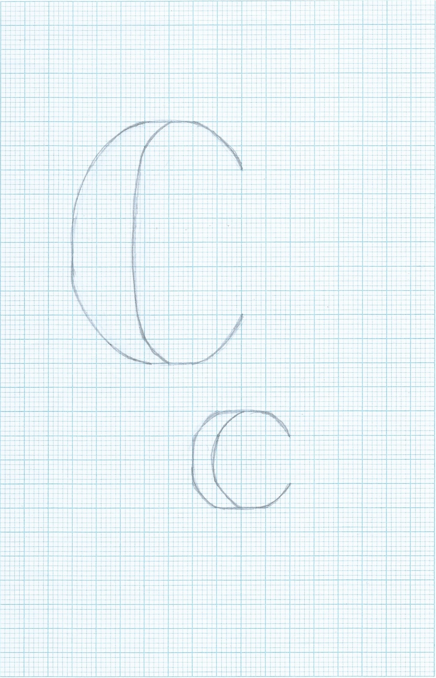
I drew this out on graph paper, I then scanned this into my computer and edited it with the curvature tool to make it look neater and make the lines stand out.

New font


I am going to further this by creating it into a stencil.

Development.

After this weeks workshop and group review, I have hit a brick wall with my idea and design. I feel like my final font idea isn’t original and also feel like I need to develop it more, and add lower case letters. I’ve been feeling unconfident with my designs and initial idea on my font, so I went back into looking at influences and other ways I could incorporate coffee into my designs. I started recreating my letter forms, making lines thinner and using sans serif fonts instead of serif. This is what I came up with.

Scan 152980003-1 Scan 152980003-2

Scan 152980003-3

Scan 152980003-4

Scan 152980003-5

Scan 152980003-6

Scan 152980003

COFFEE STENCILS

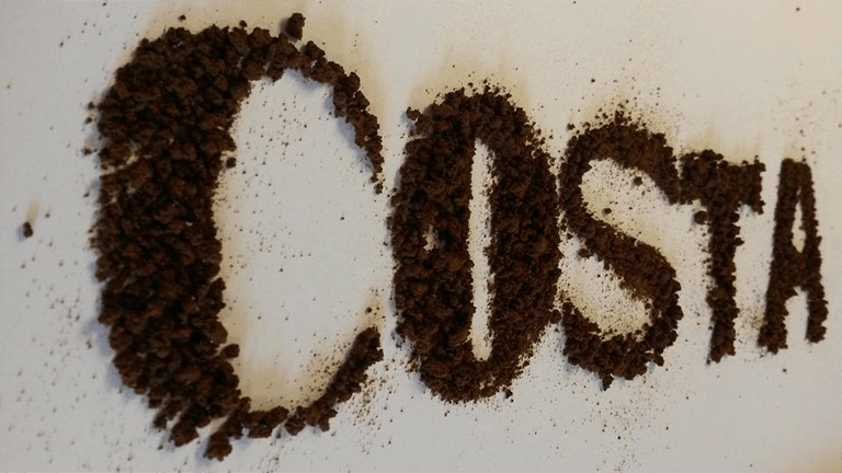
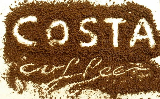
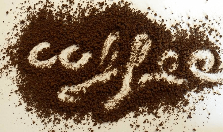
After a week of experimenting and developing with the digital version of the ‘stencil’ style and my font, I decided to go back to creating something ‘hands-on’. I got some coffee granules and made a stencil out of card and created these:

Coffee Granules


Granules


Untitled-2


I really like the effect of this, despite the bad photo quality. I am definitely going to further this style, and take more pictures of this using different fonts and creating lower case letters. I also like the texture it creates, its a lot harder to get texture like this when I created something similar on photoshop and illustrator.