In todays workshop we were focusing on colour play. This included learning the difference about RGB and CMYK. We then went off to experiment ourselves. I went straight onto Pinterest and looked onto images that I was drawn too specifically for their colour schemes. I then downloaded these into Indesign and with using the eyedropper tool I was able to select the images and it came up with the strongest colours that it could pick up. I then put these into a presentation pdf:
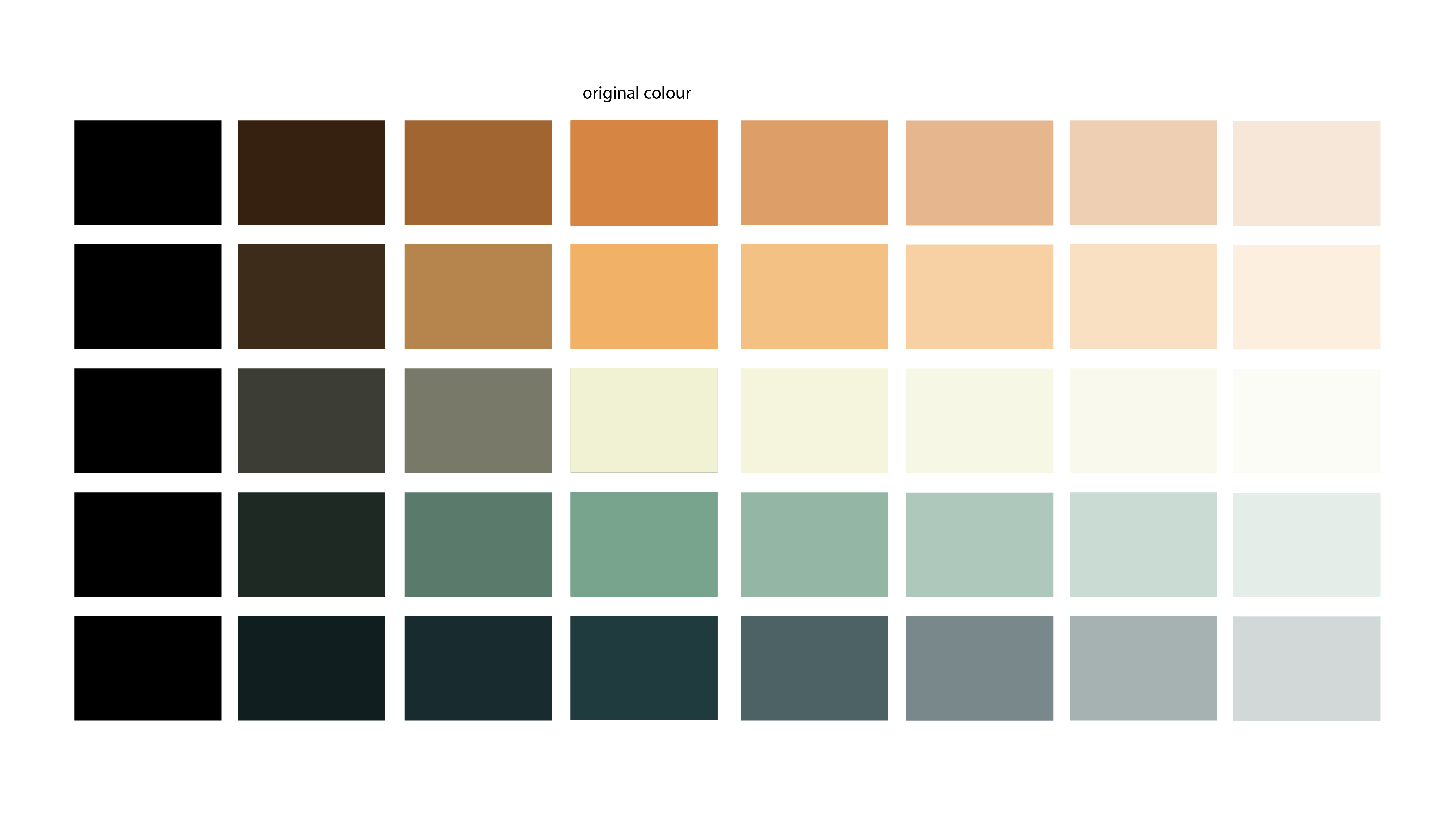
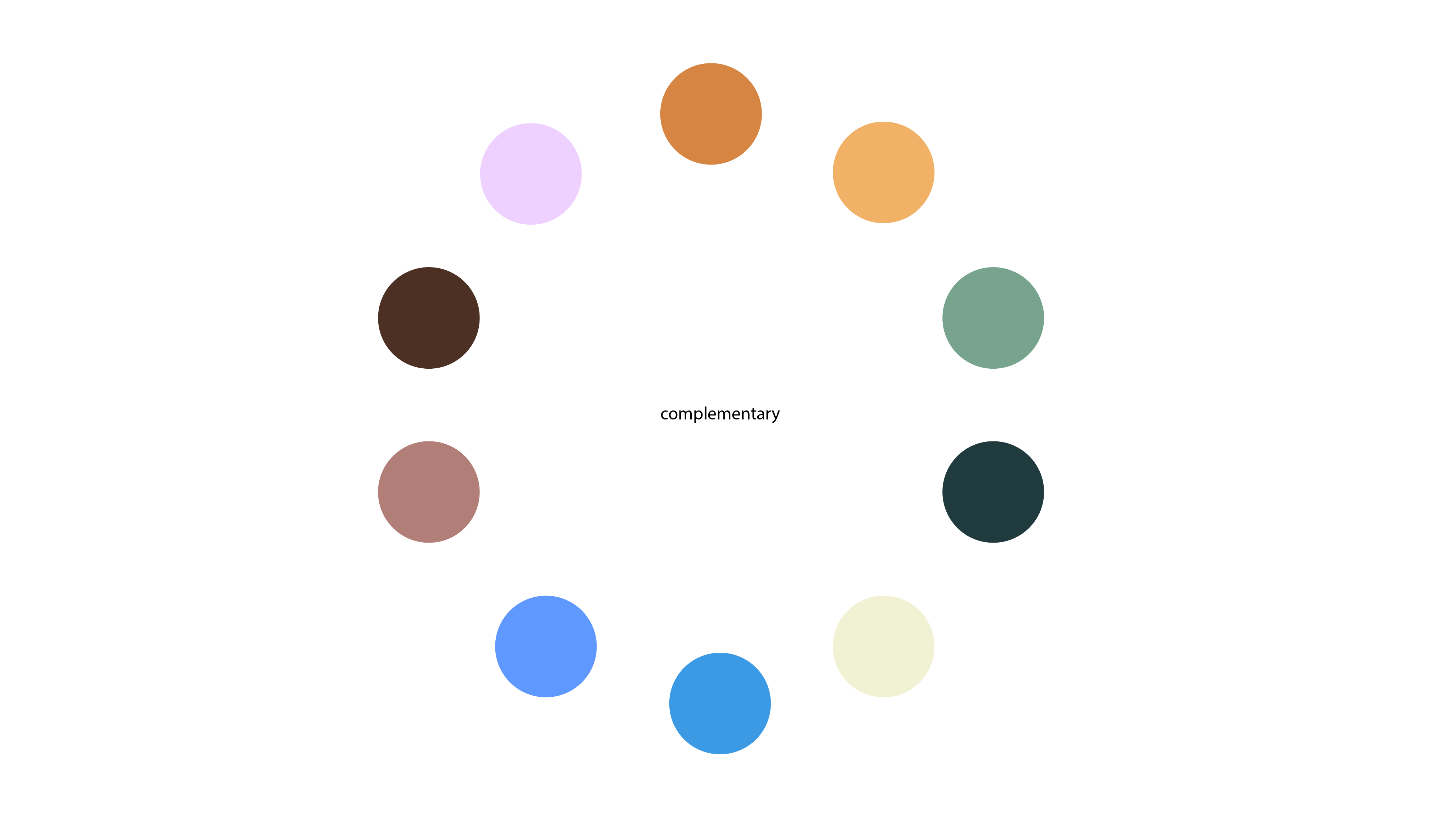
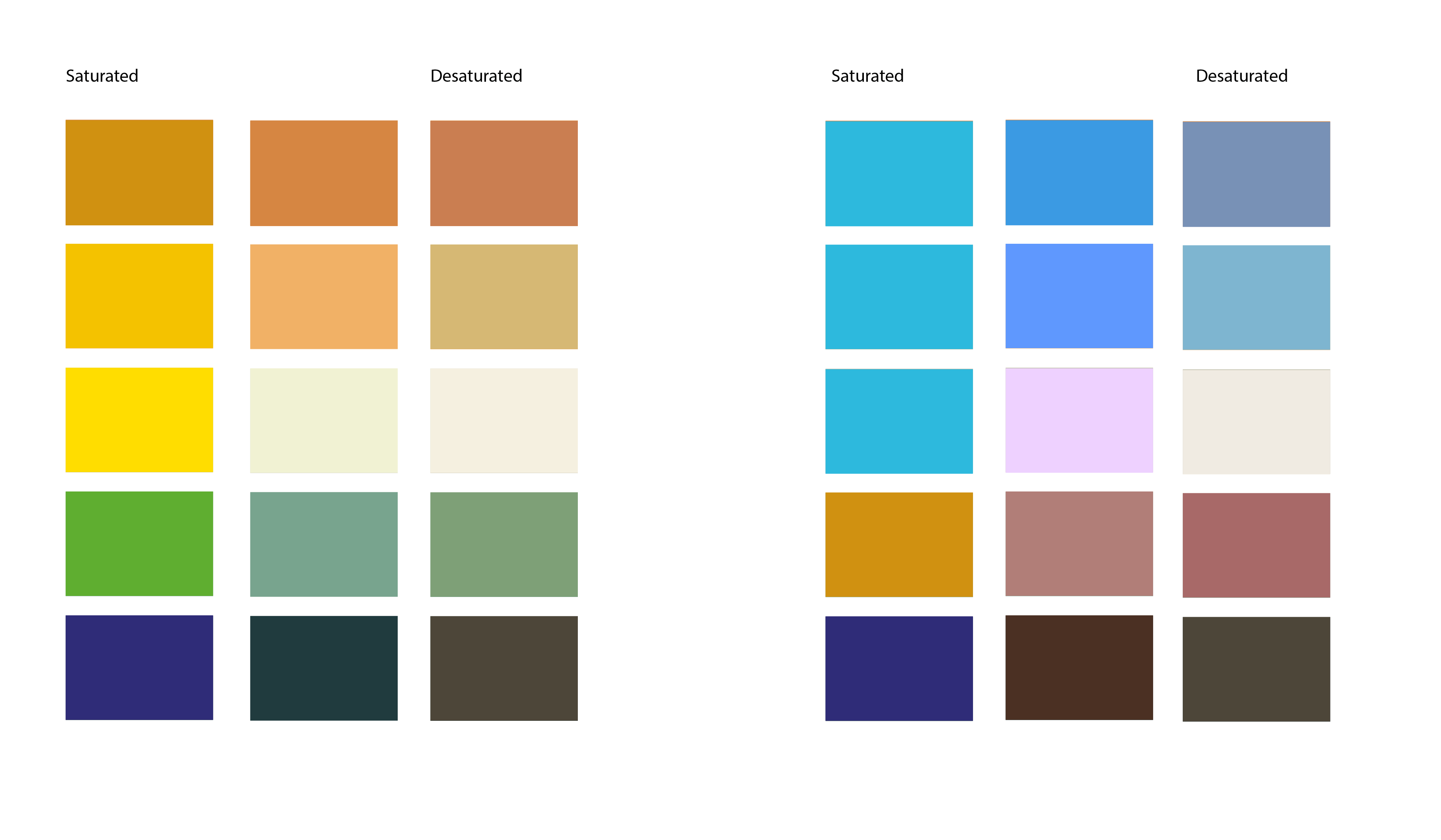
My favourite one out of all of these experiments was the last one of ‘The Wanderer’ which I have included already in my research for my logo. I really like the major contrast in the colours, however they work really well with each other. I placed these colours into Illustrator and experimented with Shades, Tints, Complimentary Colours and Saturation / Desaturation.
I really like this colour scheme and I am going to experiment with this one when creating more content for ‘High Seas Ink’. I will also develop another a colour scheme I like for a back up.


