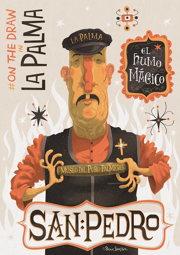
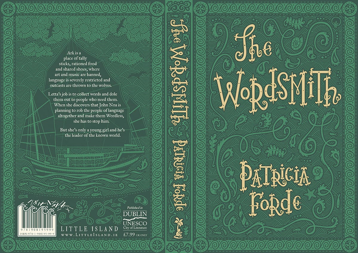
To prepare for project four I had a look over one of my favourite illustrater and graphic designer, Steve Simpson. He has won over 50 awards for his package design and illustrations and his style is inspired by 50’s advertising and the arts and crafts movement. What I like most about Simpsons work is the use of colours, shapes and lines. Its a very unique style which I like, it is quite similar to Tim Burtons film style and touching on Mexico culture. I like his character drawings the most, as he is able to give them all personality through style and colours, whenever I look at his character illustrations I also seem to see the full personality and back story. I also like his typography and the placement of this typography, which is shown through the book cover design of The Wordsmith.
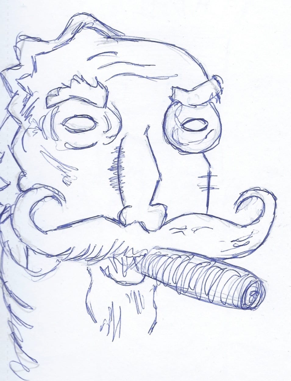
I have taken this style and done a couple of pastiches to grasp his illustrative technique onto my work. I feel that this would go really nice in a children’s picture book, due to its detailed, bright and imaginative feel to it.
