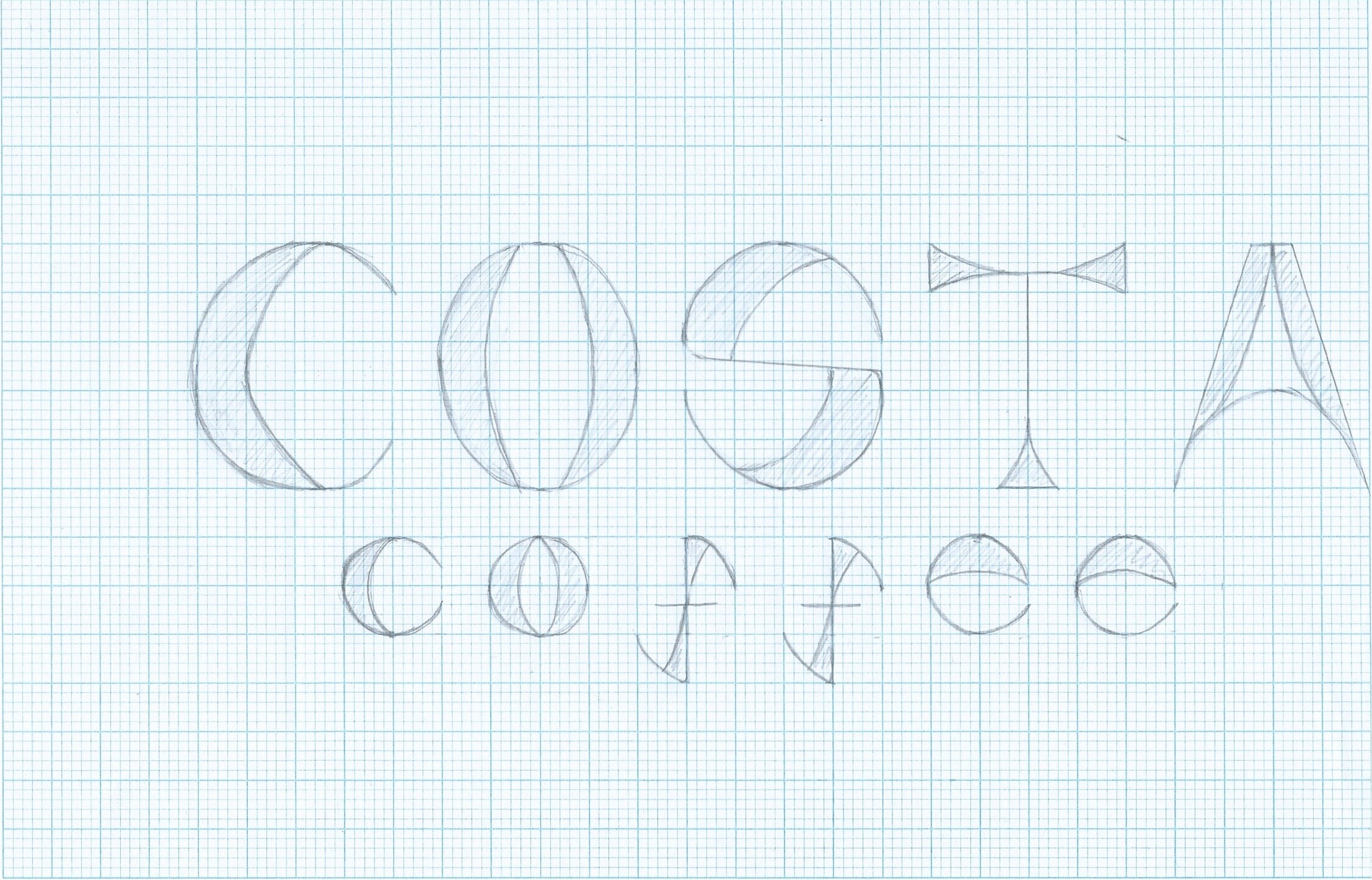
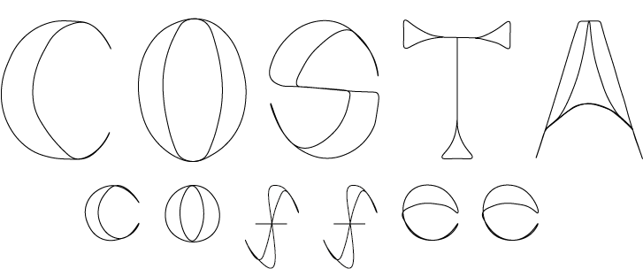
I took the new font I made and applied it to ‘Costa Coffee’ instead of using a different font for the word ‘coffee’ I made sure I used lower case letters for this. By doing so, I feel like it makes my font a lot more consistent and looks a lot more visually pleasing than my previous one.
I drew this out on graph paper, I then scanned this into my computer and edited it with the curvature tool to make it look neater and make the lines stand out.
I am going to further this by creating it into a stencil.

