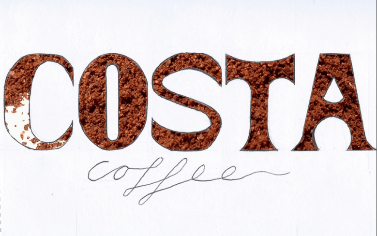
I have taken the final font I have decided on and scanned it into photoshop to experiment with the stencil style.
First I used a picture of coffee beans as the background, however I don’t feel as this works well and doesn’t look that visually appealing. I then changed it to a picture of coffee powder.
I prefer this a lot more than the coffee beans. I especially like the difference in texture in the ‘C’ to the rest of the letter forms. I plan on creating a physical form of this design using real coffee powder and making my own stencil of the font I have come up with.


