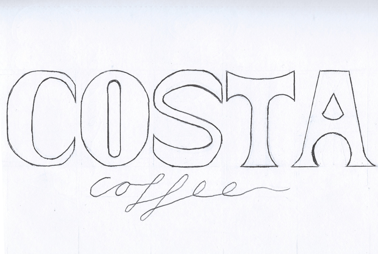
I feel that its time to get a final design or idea for my font. I started drawing a serif font as I felt I was sketching mostly sans serif designs. However I thought id subtly twist it and add a more curved effect to it. I wanted to do this because I thought it added a more creative feel to it, instead of dull straight lines.
I feel like there is potential in this type and I really liked the curviness contrasting with the straight lines. I felt I needed to keep the ‘A’ straight as capital ‘A’s’ work a lot better with a point. I also needed to widen the ‘T’ as it looked very submissive next to the other typefaces.
I plan on expanding this style further, and potentially add a stencil effect. I plan on keeping the style of ‘coffee’ to keep the sophisticated feel to it.

