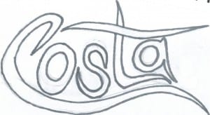
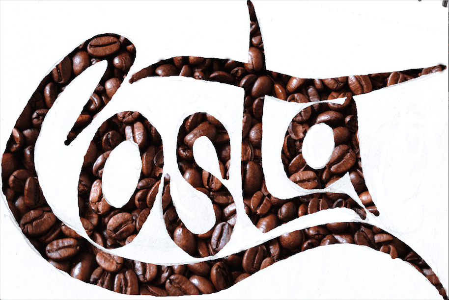
I took the overall style and idea of stencils and I started to draw my own designs that I could scan into the computer and apply this digitally.
I wanted to experiment with putting an image of coffee beans behind the stencil, I like this effect however I feel it doesn’t look as appealing on white. I was influenced by the ‘Coca Cola’ font, I used the idea of carrying on the bottom part of the ‘C’ under the whole text. I feel it works really well however I do not like the placement of the ‘A’.
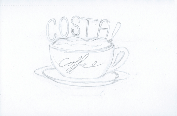
I also drew this design. This type was inspired by a font I saw in ‘Pinterest’. It is very simple but I like the ‘block’ style. I also like the contrast it has to the flowing ‘coffee’ type. Even though these two types are vey different, I feel they work really well together despite the contrast.
I really liked the font used for the word ‘coffee’ so I decided to draw a cappuccino mug using a similar design as the one above. This was the first outcome:
Again, I really like this design and I’m going to experiment with using font inside of objects, particularly the font used for the word ‘coffee’ as I feel it is a very sophisticated and touches on italian traditional type.


