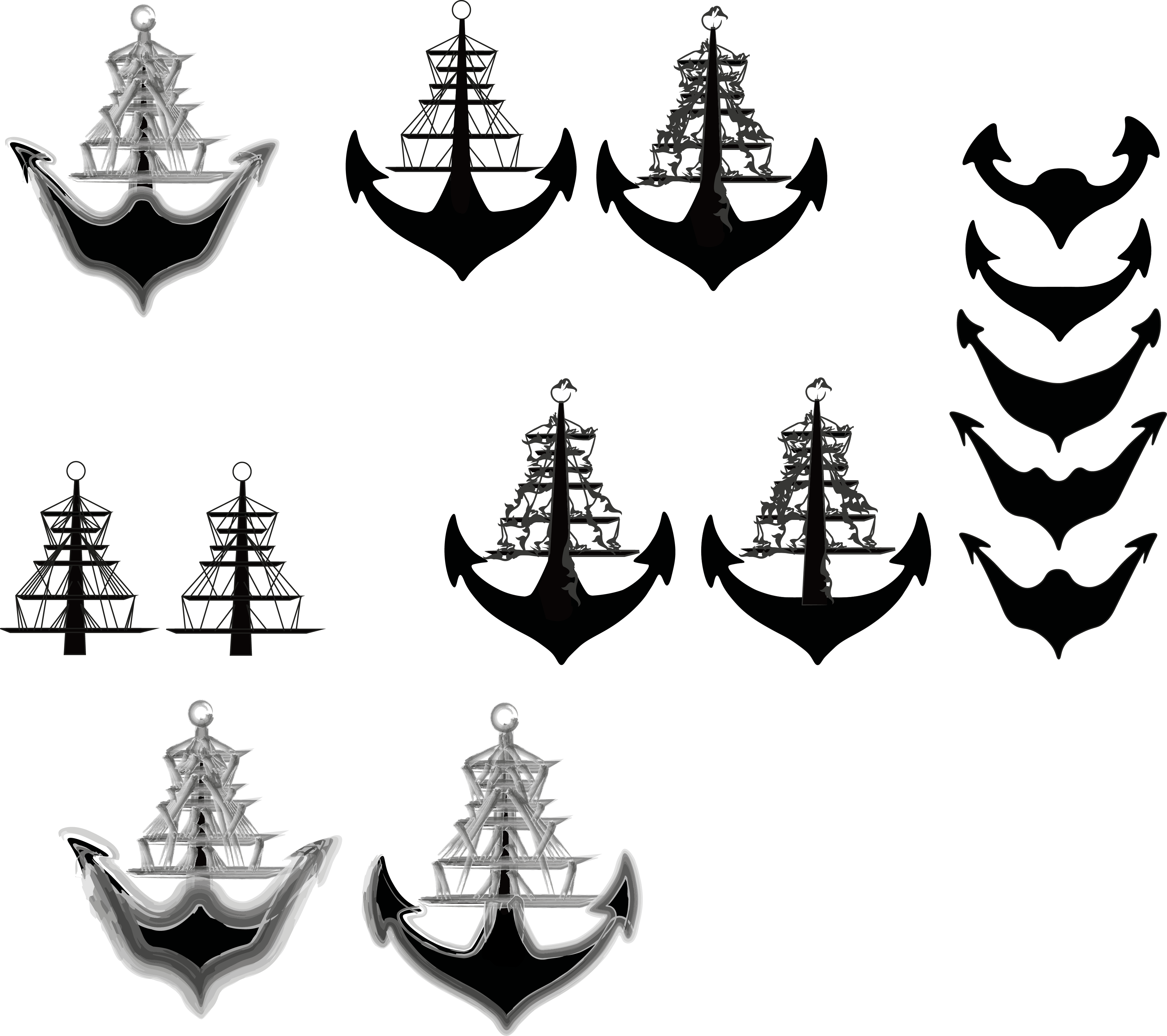
I still felt like there was a lot of work that needed doing to my logo so I decided to break the logo down and work on bits of it individually. I needed to work on the bottom part of the anchor as it wasn’t portraying what I wanted very well. I decided to expand this shape further with different widths and curves in different places. I also decreased the amount of lines I had in the ‘ship’ part of my logo and I also experimented with another line effect I found which added a ‘flower’ decorative approach to the ship, this effect makes it look closer to the tattoo context which I do like and it definitely competes with my original idea of the watercolour effect.
